Houzz Tour: Unplugging From High Tech in a Texas Farmhouse
The warp-drive takeover of high-tech gadgetry has ironically spawned a renewed desire for some of the lowest-tech things you can imagine: farmhouses. That's OK with Austin, Texas, architect Tim Cuppett, who's built a number of modern farmhouses, which he says surged in popularity when the recession and fast-paced tech jobs sent people looking for simpler homes. “We went through the crazy ’90s with gigantic houses, and now that’s not so popular," he says. "People want comfortable. And farmhouses are like comfort food.”
He recently designed a warm, modern farmhouse for a husband and wife — surprise! They work at tech companies — who relocated to Austin from Chicago with their two toddlers. They wanted something simple, family friendly and full of light. After looking at photos together on Houzz, Cuppett and his clients decided on a one-room-wide design with plenty of sunshine and a no-frills interior that nods to simpler times. “If you look at great old houses that stood the test of time, they were always simple, with light coming from all directions through windows needed for breezes — all elements that you need for comfort,” the architect says.
Houzz at a Glance
Who lives here: A couple and their 2 toddlers
Location: Austin, Texas
Size: Less than 3,500 square feet; 4 bedrooms, 3 bathrooms
Team: Tim Cuppett, architect; Wilmington-Gordon, general contractor
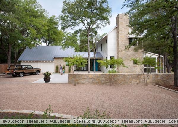
The site also influenced the design. The house sits on the edge of a big field of wildflowers, nestled under live oak trees set far back from the street and neighbors. “Their site felt like it wanted that house,” Cuppett says.
And because the most important room to the wife is the kitchen — she's an avid cook — Cuppett put that space on the best possible spot on the site: under the live oak trees at the edge of the property and looking out to the pasture. He then designed the house around that. “When she’s in the kitchen, she’s looking at the best part of the site,” he says.
The house is only one room wide to bring in sunlight and cross breezes from two sides everywhere in the house. It's stacked into the trees, giving it a tree house feel.
Because the driveway is long, paving would have been overwhelming. Cuppett opted for gravel instead, which has an added benefit. “On a property with a farmhouse, it’s just nice to hear the crunch of gravel,” he says.
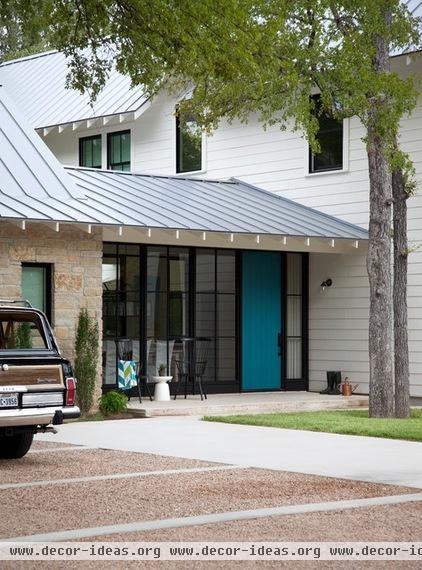
A glass-walled dining room connects the main house to the garage and recalls a breezeway. The front door opens to this room.
Wide overhangs and trees help keep direct sunlight at bay. Fiber cement siding was used for most of the exterior. “It’s got a nice effect for a medium-size budget,” Cuppett says. He used local limestone sparingly to keep costs down. It appears as a foundation wall, a fireplace and here on one garage wall.
Exterior paint: Gray Mist, Benjamin Moore; door paint: Naples Blue, Benjamin Moore; roof paint: Lead-Cote, Berridge
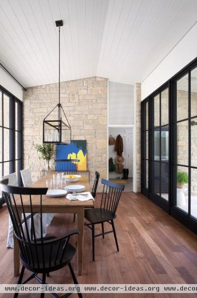
The limestone continues inside to form one of the dining room walls. The other wall is more fiber cement siding. With a V-groove plank ceiling common on porches, these moves make the space look like it's outdoors.
Custom wooden window frames surround independent window panes, creating more interesting reflections than one large pane would, Cuppett says. While the homeowners chose mostly budget-friendly materials, they splurged on 5-inch-plank walnut floors.
Table: custom; light fixture: Olampia; chairs: Vermont Farm Table
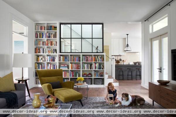
The dining room leads to the living room, where Cuppett used the stairway and a wood-framed window to bring light into the space from the second floor. The windows are actually wire glass, like those found in commercial stairwells. “You don’t notice it until you’re close, but it’s kind of fun,” Cuppett says.
Chair: Boden, Room & Board; rug: Cumulus Cloud, Bellbridge; sofa: Ethan Allen
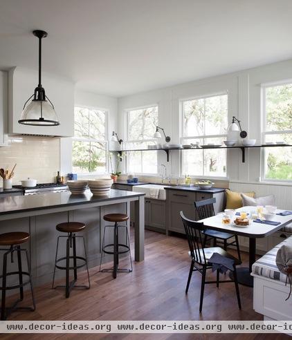
The kitchen has the best view in the house, nestled under live oak trees and facing the pasture.
Cuppett drew all the details of the space and designed the cabinetry and millwork. “The most important thing for farmhouse style is to keep it simple,” he says. “It all has to be really straightforward — no fancy shapes. All the trim we used is flat and very plain.”
Lower cabinet paint: Dolphin, Benjamin Moore; countertops: 3-centimeter Absolute Black granite; backsplash tile: 6- by 10-inch Studio Moderne in Blonde Gloss, Walker Zanger; sconces: Schoolhouse Electric; light fixture: vintage; bar stools: West Elm
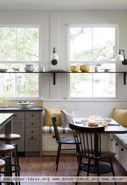
This steel shelf lets the family keep things that they use frequently in easy reach but doesn’t take too much of the view away. Drawers beneath the banquette seats hold placemats and linens. The table is custom made and has a plastic laminate top on a pedestal base.
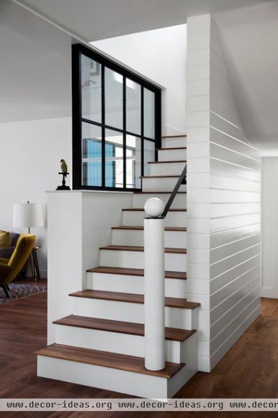
Cuppett likes designing homes where the stairs drop right into the kitchen. “It just feels comfortable and casual,” he says. This stairway also allows the family to stay connected to their children in the upstairs playroom.
He added the same wood boards found on the dining room ceiling to the stairway wall for texture and to stand up to wear and tear. “Kids always like to run around the corner of the stairs and kick and grab hold of the wall,” he says.
The newel post is a simple geometric play on a traditional design. “It was just a little whimsical gesture,” he says.
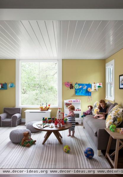
High-gloss paint on the second-floor playroom ceiling reflects window light. This space separates the main bedroom from the kids' rooms and also acts as another living room.
Wall paint: Anjou Pear, Benjamin Moore; sofa: West Elm; table: Crate & Barrel; rug: Dash & Albert
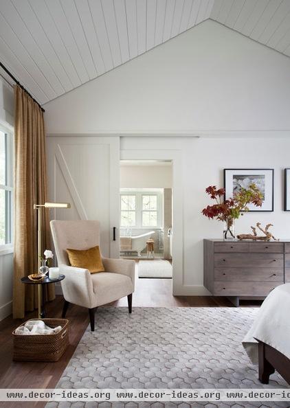
Though it looks large, Cuppett says the main bedroom is small and cozy. A vaulted ceiling adds volume, while a sliding barn door conveys farmhouse style.
Wall paint: White Dove, Benjamin Moore; rug: Loom Select Pasture in Smoke, Calvin Klein; dresser: Room & Board; chair: West Elm
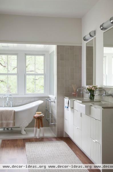
A small bathtub nook in the main bathroom punches out from the house and into the tree canopy for a tree house feel. The tile floor wraps around to form the shower.
Bathtub: Sunrise Specialty; counter, backsplash: Cinder 2020, Caesarstone; wall tile: 4½- by 5¾-inch Studio Moderne in Mica Gloss, Walker Zanger; bathtub floor tile: 1- by 2-inch Infusion mosaic in Gray Fabric, American Olean
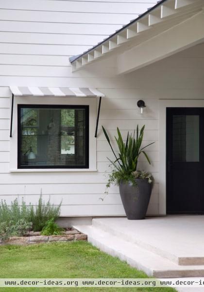
The kitchen leads to this back porch, where an awning shades a window.
Next: Tour another new take on contemporary farmhouse stye


