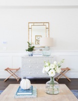
I'll Have the Same: How to Design With Monochromatic Color
http://decor-ideas.org 09/26/2013 01:10 Decor Ideas
We're taught from an early age that overindulgence is a bad thing. But sometimes it can be very, very good.
Repeating a single color throughout an entire room can be not only beautiful, but relatively easy to pull off. No worrying about whether the curtains go with the carpet. When everything's the same color, it's usually a match.
Granted, the look can be overwhelming. It works best in contained spaces where you don't spend a lot of waking hours, such as a bedroom. And while it's possible to match the color precisely in every detail, it's better (and easier) to vary the shade a bit — in terms of both hue and intensity, and texture and sheen. That keeps the repetition interesting.

One of the appealing things about a monochromatic interior is that colors you'd think would be too overpowering on their own become more demure when used en masse. The sheer quantity dilutes their ability to shock and makes even a strong color, like acid green, feel restful.
When working with bright colors, be mindful of the amount of light the room gets: This space could be blinding if it got a lot of intense, direct sun.
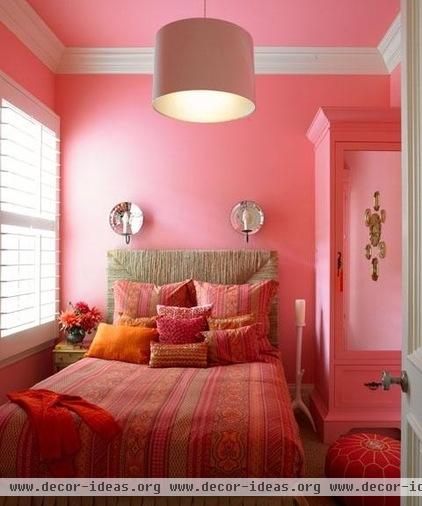
This charming bedroom merges shades of pink, orange and coral. They have more depth and visual interest together than a single shade would have, and also contribute to the room's casual feel.

Although the patterns in this girl's room don't match, they all work together because they share a common color. Liberal additions of white prevent the blue from overwhelming the space and add to the tranquil atmosphere.
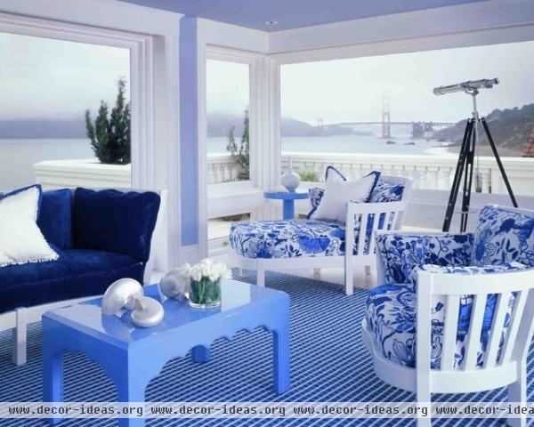
The combo of blue and white is a seaside staple. But in this San Francisco home, the variations in hue and solid planes of color banish some of the sweetness, making the scheme feel fresh and more contemporary.
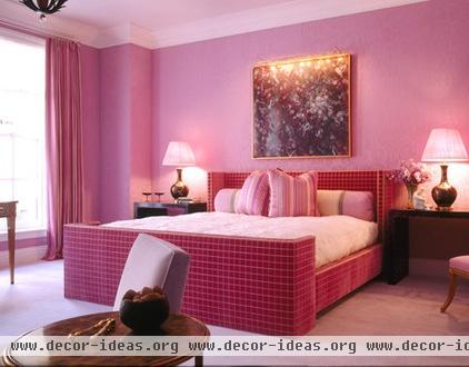
Pink has such feminine connotations, we're often afraid to use it outside a bedroom. But inside a bedroom — watch out! Pink fabric upholsters the walls and bed in this boudoir, making the softness not just visual but tactile.

A monochromatic bedroom can be a welcome escape from the optical onslaught we encounter in daily life. This sea-foam aerie hovers above the streets of San Francisco, offering a respite from the city below.
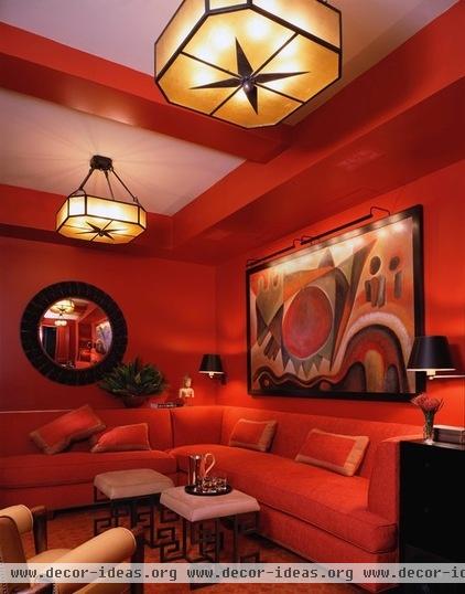
Fashion editor Diana Vreeland famously occupied an all-red interior decorated by Billy Baldwin. "I wanted this apartment to be a garden — but it had to be a garden in hell," she proclaimed.
There's nothing hellish about this New York media room (unless, perhaps, you're stuck there watching Howard the Duck). The walls are cinnabar-colored lacquer, with upholstery and carpeting to match. How could you sit here and not feel like royalty?
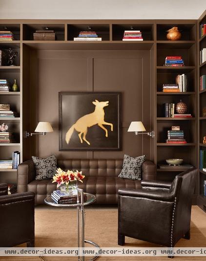
Monochromatic rooms don't have to be bright. This all-brown study is masculine and sedate, with just enough pops of contrast (the lampshades) and sheen (the side table) to keep it from feeling monotonous.
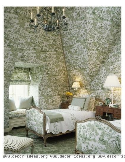
One of the most memorable bedrooms I've ever seen was covered floor to ceiling in blue and white toile. The color may be different here, but the effect is similar — like being wrapped in a grandmother's hug.

Replace the toile with a stylized floral and you get a similar effect. The comforter, bench and chair are all different patterns, but they work together to form a cohesive whole.
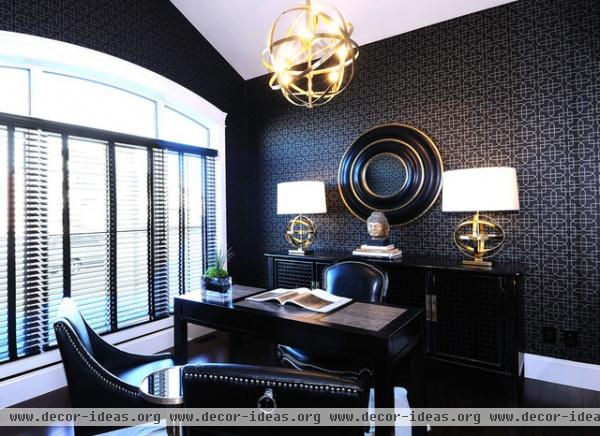
At the other end of the spectrum (so to speak) is this all-black home office. It helps that the walls are covered in a patterned paper; had they been solid black, the effect might not have been so luxurious.

This all-white Manhattan boudoir evokes the art deco allure of Fred and Ginger. Touches of texture – the padded headboard, quilted coverlet, striped satin bench and toe-tickling rug — animate the monochromatic palette and keep the eye engaged.
Get more inspiration from the Houzz color guides
Related Articles Recommended

