Houzz Tour: Respectful Updates for a Midcentury Atlanta Ranch
In Atlanta's affluent Buckhead neighborhood, modest older homes are routinely razed and replaced with upscale McMansions. Which is precisely what the owners of this 1954 ranch didn't want.
The couple, an attorney and a flooring company executive, were eager to update the home's appearance and make the interior brighter, more functional and more accessible to the backyard — while preserving as much of the old house as possible.
"We didn't want to put things in a Dumpster that didn't need to go there," says Heather Shuster, project development director for Renewal Design-Build, the Atlanta firm that supervised the home's remodel. Designers Michael Nualla and Courtney Rogers extended the back of the house 8 feet to accommodate an expanded kitchen and family room, and added a new wing for the master suite, bumping the size from 1,700 to 2,440 square feet while preserving the home's period profile.
"From the front of the house, you can barely tell there was an addition," says Nualla. "We wanted to stay with the flavor of the old ranch."
Houzz at a Glance
Who lives here: A professional couple and their 3 dachshunds
Location: Buckhead neighborhood of Atlanta
Size: 2,440 square feet; 4 bedrooms, 3 bathrooms
That's interesting: The wife asked the design team to incorporate a glowing moose head that she purchased in London. (An antler is visible above the display cabinet in the first photo.)

The old breakfast room was expanded up and out to create an airy new family room. Everything to the right of the island is new — part of the 8 feet added to the back of the house.
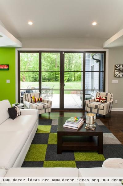
To improve the family room's indoor-outdoor flow, the designers added a Jeld-Wen sliding door; each central panel slides to the side, creating a 6-foot-wide opening. The door's understated muntins straddle the line between contemporary and traditional, and pay homage to the home's original window design.
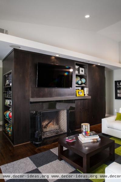
The design team removed a long corridor and installed a freestanding wood "core" in its place. The core contains a fireplace, powder room and closet, and resulted in a more circular floor plan. The soffit echoes the kitchen's ceiling plane and lends some scale to the room.
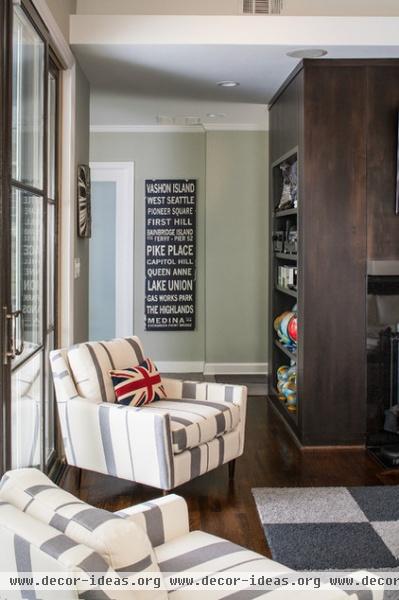
Built-in shelving displays the wife's collection of globes, while wall art commemorates the couple's travels. With three dogs in the house, the Flor carpet squares were a practical choice.
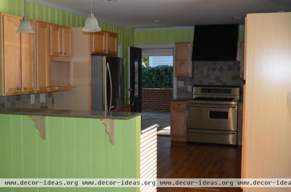
The old kitchen was small and dated — something no amount of paint could disguise.

AFTER: The homeowners kept some of the old appliances, as well as their beloved lime walls, which seem to suit the new space better. Painted cabinets are paired with an espresso-stained island topped with Carrara marble. The honed finish makes it feel less formal.
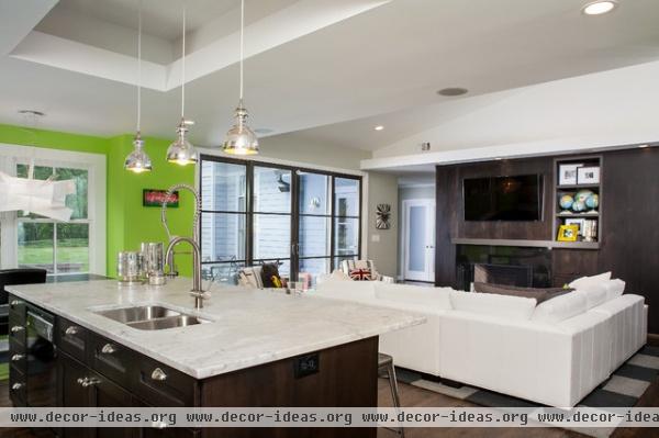
In lieu of a skylight, Nualla added an illuminated ceiling recess, which anchors the island within the open plan.
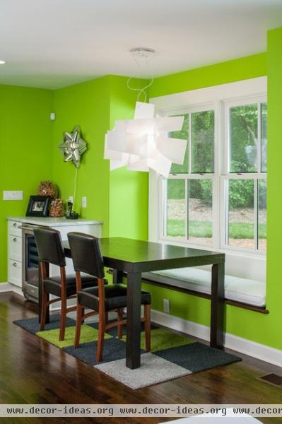
New oak floors augment existing oak floors, all of which were stained to match. The designers confined bright accent colors to walls and accessories — not built-ins — so any future owners could change the palette if they wanted.
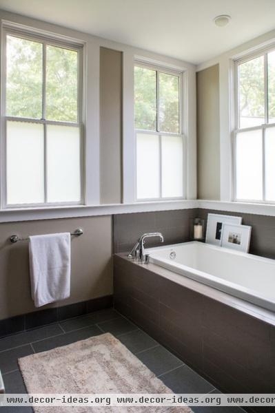
Neutral colors establish a serene atmosphere in the master bath. Windows frosted at the bottom admit light while preserving privacy.
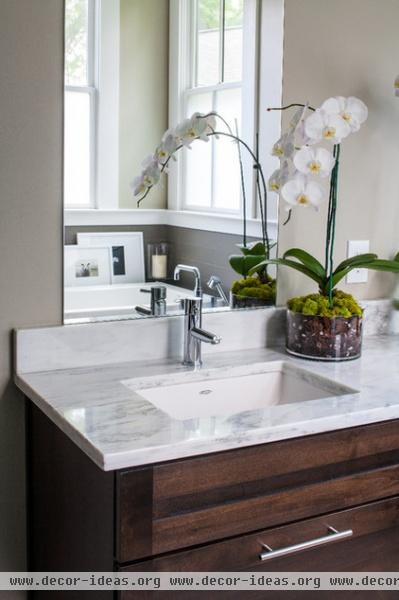
The kitchen's Carrara marble appears again on the double vanity in the master bath.
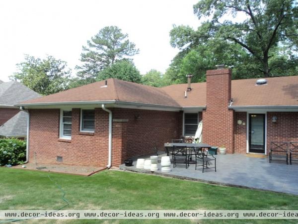
The old house offered little connection to the backyard, which was dominated by an oversize patio covered with a slippery tile.

AFTER: The master suite addition features a shed roof that slopes upward to admit light and views of the landscape. The home's leaky single-pane windows were all replaced, and the cavities around them were insulated, improving the home's efficiency.

The new patio fits the scale of the home better; a retaining wall provides overflow seating for outdoor parties.
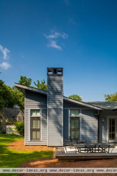
The bedroom addition is covered with fiber cement lap siding; transoms admit extra light without violating the scale of the other windows.

The designers switched to a thicker fiber cement siding around the bathroom bay, allowing them to miter the corners. The product also casts deeper shadow lines that help distinguish the volume.
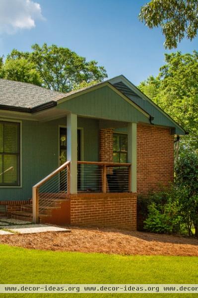
The design team updated the entry facade by removing the old shutters, replacing the porch columns and installing cable railings in place of the old balustrade.
More: 10 Advantages of the Humble Ranch House


