Kitchen of the Week: A D.C. Row House Honors Tradition
http://decor-ideas.org 09/20/2013 03:10 Decor Ideas
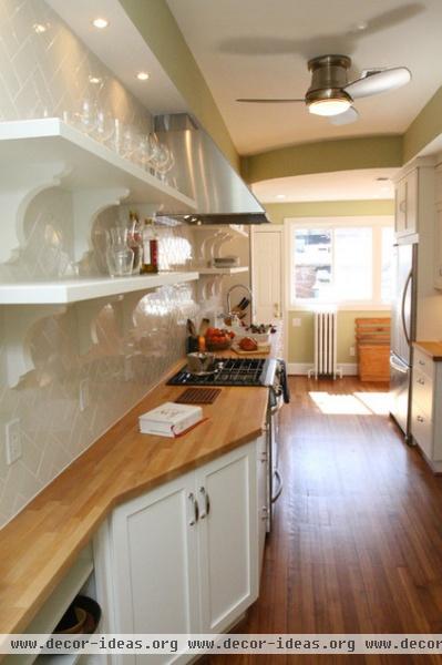
Intent on maintaining the original layout of their 20th-century row house, this Washington, D.C, couple sacrificed a more modern kitchen design for tradition's sake. Rather than open the kitchen to the adjacent dining area, they kept the galley-style kitchen and eat-in booth at the back of the house and replaced the cabinetry, appliances and finishes from a previous update. Classic white cabinetry, butcher block counters, a simple subway tile backsplash and a light-filled dining nook have given the space a fresh look that could comfortably fit any era.
Kitchen at a Glance
Who lives here: A young couple
Location: Washington, D.C.
Designer: Leroy Johnson and his team at Four Brothers
Size: About 200 square feet, including eat-in nook

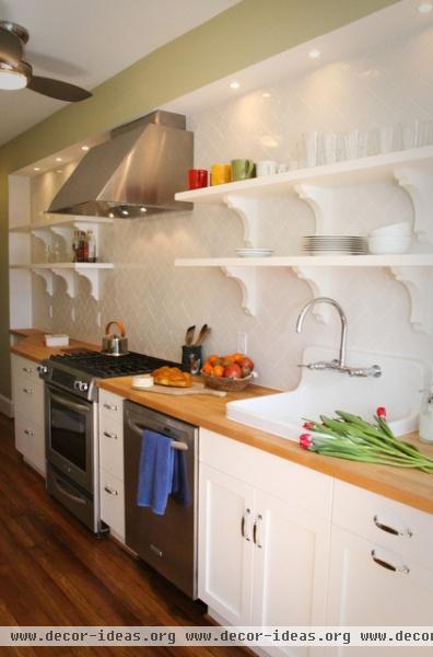
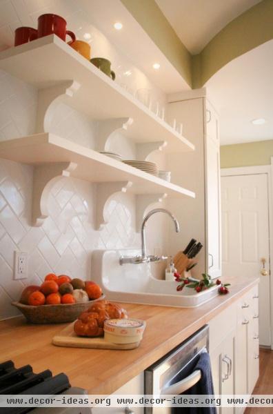
The previous owners had remodeled the kitchen and left it in pretty good condition, but the design didn't fit the new owners' style or the history of the house. Now wood countertops, traditional fixtures and a farmhouse sink give the kitchen a fresh but classic feel.
Sink: farmhouse, Kohler; fixtures: Torq, Kohler; hardware: Nouveau II, Tob Knobs

Instead of bulking up the kitchen with upper cabinets, the clients opted for open shelves to keep often-used dishes at hand.
Refrigerator, dishwasher, stove: Architect Series II, KitchenAid; hood: Pro Magnum, Faber

The clients came up with the backsplash design, rotating standard subway tiles into a more eye-catching herringbone pattern. The consistent backsplash sticks to the kitchen's limited palette and stays in line with the vintage style; plus, the affordable tile allowed for a counter-to-ceiling application.
Backsplash tile: Rittenhouse, Daltile; countertop: oak butcherblock, Ikea

Although eliminating upper cabinets sacrificed some storage space, since it's just the two of them, the couple wasn't that worried about storage. Wide and deep drawers on both sides of the kitchen provide all the storage they need.
Microwave: Spacemaker II, GE; cabinetry: Elmwood Kitchens

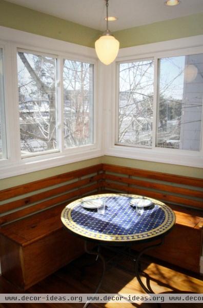
The clients kept the kitchen's original eat-in nook as a casual complement to the formal dining room. Corner windows and a simple built-in bench keep the space sunny, bright and warm.

The kitchen sits in one of the row house's rear corners and opens to the eating nook. The layout is narrow but allows for a functional kitchen work triangle.
In the previous layout (not shown), the refrigerator was in the dining nook; designer Leroy Johnson moved it around the corner for easier access and used the space in the nook for a tall pantry cabinet.
Related Articles Recommended


