Houzz Tour: Bridging Past and Present in a California Craftsman
It’s a dilemma every owner of a historic home faces: How much do you alter your life to accommodate your house? And how much do you alter your house to accommodate your life?
When a California couple purchased a turn-of-the-last-century bungalow on a tight-knit Santa Monica street, they were charmed by the home's period detailing and proximity to the beach. But the dusky woodwork cast a gloomy pall over the interior, which was at odds with their contemporary tastes and collection of fine art photography.
The pair asked Los Angeles architect Erik Evens and Woodland Hills interior designer Alana Homesley to assist them with the home's update. A specialist in historic architecture, Evens balked at the idea of painting the vintage woodwork. "My first reaction was to try to restore the public spaces to the way they originally were," Evens says. "Over time the clients and Alana brought me around to the point of view that this house needed to work for the clients' lifestyle and aesthetic."
Treated to a revivifying coat of white paint, the walls and woodwork still have their historic character but now reflect light and enhance the furniture and art. "Now that I've seen the final product, it absolutely feels like the right decision," Evens says. "The house straddles the line between traditional and modern."
Houzz at a Glance
Who lives here: A professional couple and their 3 children
Location: Santa Monica, California
Size: 2,965 square feet; 4 bedrooms, 4 bathrooms
That's interesting: The houses in this neighborhood were originally built on sand dunes, with boardwalks leading to each home.
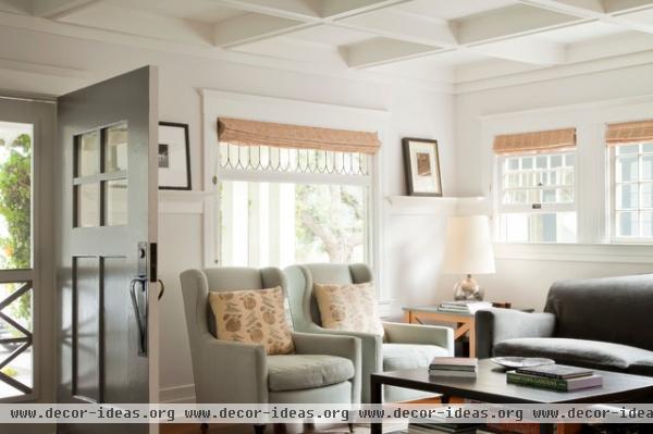
The broad front door opens directly into the living room, dividing the space into two seating areas. Here Brenda Anton wing chairs are paired with a lithe custom coffee table designed to disappear into the setting. Bleached colors underscore the shoreline setting without resorting to beach house clichés.
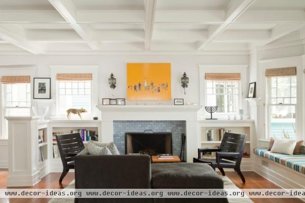
The seating group is more informal on the other side of the living room, where a custom chaise was used instead of a sofa to preserve views of the fireplace. The chairs are from Christian Liaigre.
The living room ceiling felt especially low before the painting job, due to the harsh distinction between the brown wood and white coffers. Now that both are painted the same color, one notices the craftsmanship, not just the contrast.
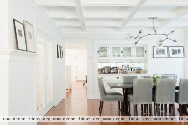
The owners' photography collection is displayed on the plate rail in the dining room, where even the original built-in buffet was treated to a coat of paint. (The walls are probably painted Pith from Martha Stewart Living, the designer says; the trim is the brand's Bright White.)
The custom chairs are covered in a watery gray-blue Hampton linen in Mallard from Rose Tarlow. "I like colors that aren't easy to understand," says Homesley. "I find it very soothing, and I think it works very well with wood tones and with white."
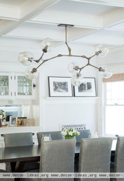
The chandelier is a contemporary creation from Lindsey Adelman. It's an unconventional choice for a Craftsman bungalow, but Homesley believed the room needed something funky and a bit sparkly to contrast with all the natural finishes.
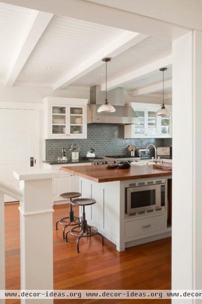
The old kitchen "was pretty dreadful and badly in need of updating," Evens says. The design team gutted the space, creating a generous new cooking area designed for food lovers who enjoy entertaining in their kitchen.
Industrial-style stools cozy up to an island covered with walnut butcher block and illuminated by a pair of vintage mercury glass pendants. New beams and tongue and groove paneling add interest overhead.
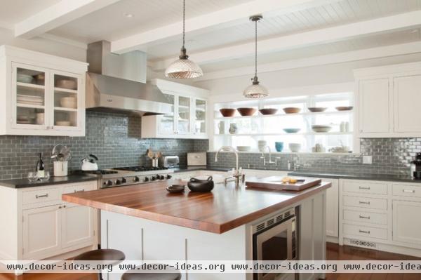
The gray-blue color introduced in the dining room continues in the kitchen, in the form of Dark Grey Whale subway tile from Heath Ceramics. The counters are covered in Pietra del Cardoso, a sandstone that looks like bluestone but is more durable and resistant to staining.
Shelves installed in front of the windows display the owners' ceramics collection and filter views of the neighboring home.
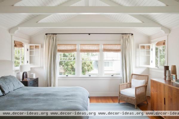
Architect Evens managed to squeeze four bedrooms and three baths into the second floor by reconfiguring the staircase and adding a dormer in back. The master bedroom, shown here, was opened to the roofline and outfitted with structural ties and a tongue and groove ceiling.
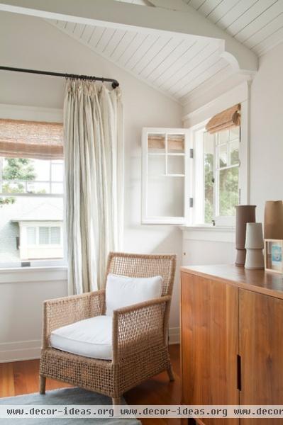
Woven grass Conrad shades were used throughout the home. "We needed privacy, because the houses are so close together," says Homesley, "but we didn't want to block out all the light."
The custom walnut credenza in the master bedroom was made taller than normal, to look less contemporary.

As you might expect from a home dating back to around 1903, the original master bath was considerably smaller. Evens borrowed space from adjoining rooms to create this new bathroom, aspiring to something that was traditional but sleek. Horizontal planks create a strong line around the room. The contractor for the remodel was de Krassel Construction.
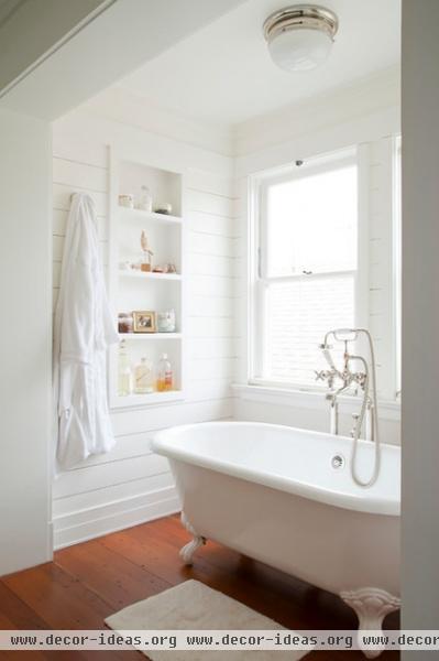
The iron tub has its own nook; recessed shelves keep toiletries close at hand.
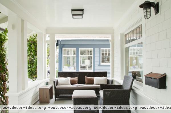
The broad front porch encourages interaction with the street.
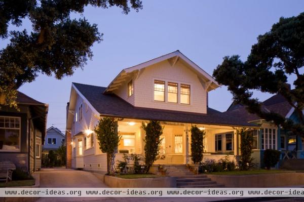
Because of the neighborhood's historical nature, the architect was not allowed to alter the home's facade, save for a fresh coat of paint.
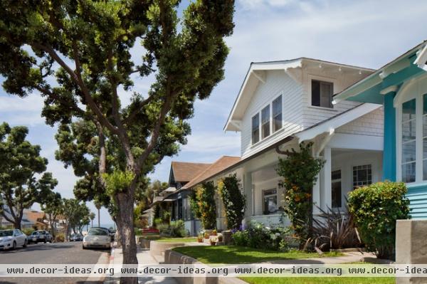
The houses on the street were originally built on sand dunes, with plank boardwalks linking the residences to the street.

The front door bisects the living room, limiting the amount and placement of furniture. New glass pocket doors divide the dining room from the study; the neighboring stair hall was reconfigured, too.
Click image to enlarge.

To fit four bedrooms and three baths in the second floor, Evens reconfigured the staircase, added a rear dormer and tucked closets under the eaves flanking the master bedroom. Bedrooms 2 and 3 share a common bath, conserving space.


