Dutch Architects Balance the Familiar and the Avant-Garde
The avant-garde Dutch architecture firm MVRDV (an initialism of the names of the founding members, Winy Maas, Jacob van Rijs and Nathalie de Vries) has tackled a wide range of projects, from a doghouse and people houses to whole sections of cities in and outside of the Netherlands.
Research is the consistency in the company's projects; regardless of building type, size or location, the architects thoroughly analyze the contributing factors to design buildings best suited to the client and how they'll be used. A number of books have documented the voluminous research MVRDV has produced since their its in 1993, but MVRDV Buildings (the most recent book and the firm's first monograph), edited by Ilka and Andreas Ruby and published by nai010, focuses on 37 realized buildings.
With the importance of social housing in the Netherlands, MVRDV has realized many multifamily housing projects, but it has also designed single-family houses. This ideabook looks at six of the projects presented in MVRDV Buildings, an excellent monograph that lets readers learn about the buildings from the points of view of the clients and users, not just the architects.
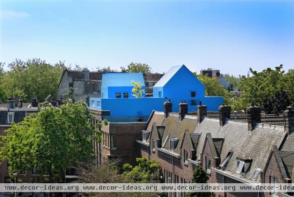
Didden Village
Rotterdam, the Netherlands, 2006
MVRDV's first project in its hometown was this small rooftop extension for the Didden family. Ghislaine van de Kamp and Sjoerd Didden wanted to add three bedrooms to the three-story building they were living and working in; the first two floors were for the latter and the top floor was for the former.
The blue addition, covered in polyurethane, seems to respond to the sky rather than the historical redbrick buildings it sits upon and next to.
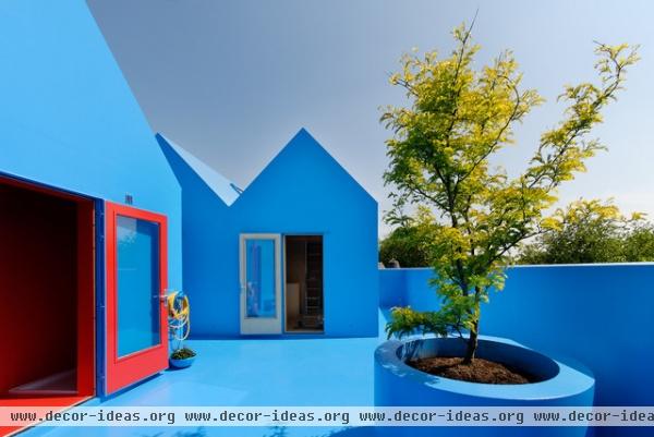
The three bedrooms sit atop the roof as two cubes topped by gables, floating within a terrace, also covered in blue. Even the planter is treated with the same material and color as the addition, reinforcing the comic-like aspect of the design.
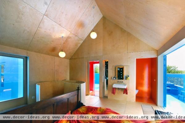
The natural wood inside is a distinct contrast with the blue exterior, but the color is visible through the various openings — at least one per side. In the largest bedroom, pictured here, we can see that each opening is also a door providing access to the large terrace.
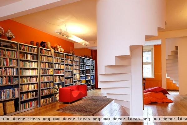
Access to the extension happens via spiral stairs, each of them prefab units lifted into place before the addition was enclosed.
Note how the stairs don't even touch the floor — they are suspended from above and stop one step from the floor. The Diddens' three-story building is a landmark, so changes to it were kept to a minimum.
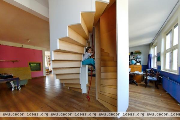
While the spiral stairs look the same in the previous photo, the one serving the two children's bedrooms and playroom has a central void large enough for a rope for them to climb up and down on. With such a playful exterior, this touch is hardly a surprise.
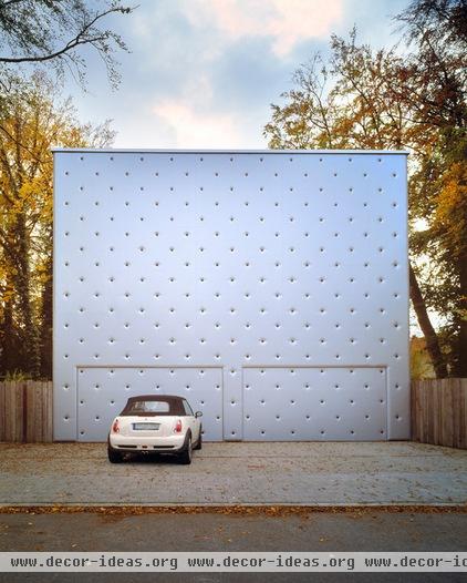
Barcode House
Munich, 2005
Another single-family residence in the book (one of the few by the firm, which "sees the single-family home as the worst-case scenario of urban development," as the book notes) is for a couple who sold their successful advertising company in 2004 to spend more time with their "patchwork family of seven," as the book describes it. Aiming for a place with a balance of urban feel and countryside, they bought a large plot of land not far from the center of Munich.
From the beginning MVRDV conceptualized their house as a parallel arrangement of barcode-like strips from front to back, hence the name of the house. The garage's dimpled facade fronts the street, providing access to the house via a gate on the side.
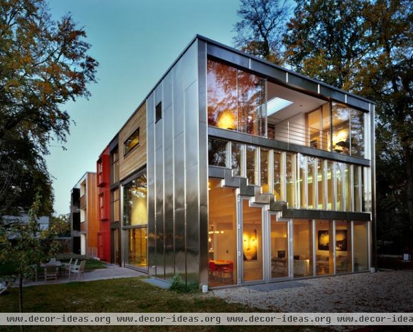
On the other end of the house the effect is quite different — solidity gives way to transparency, and the main living space looks out to the backyard.
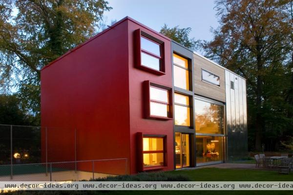
A small courtyard with a sunken pool separates the house's two main volumes, which are linked underground. The local planning regulations required a split into "front house" and "back house," which coincided with the owner's wish for separate living and working spaces. From here we can see the barcode-like strips, each one devoted to a different use. In this case they house the bedrooms, stairs, kitchen and living area.
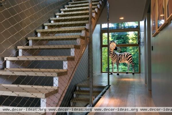
Here is one strip that houses stairs, hallways and a cool zebra lamp.
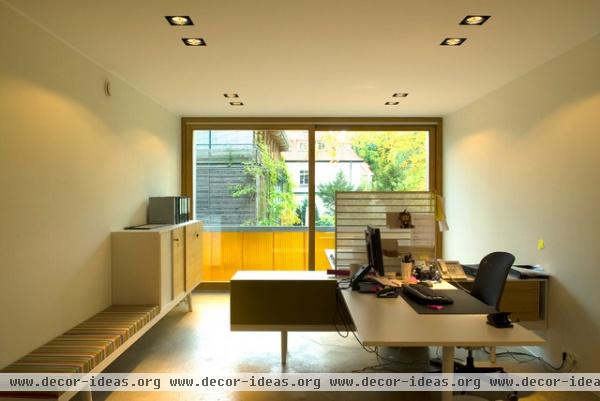
The strips mean that each space typically receives light from two sides (though the smaller spaces front only one elevation). Here we're seeing a workspace in the front volume, which receives some direct sunlight and some light filtered through orange translucent panels.
WoZoCo
Amsterdam, 1997
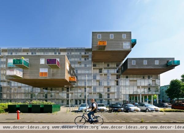
This building with 100 units for elderly residents in the city's Osdorp area was MVRDV's first housing project — it was one of its first projects, period, establishing the firm as an important young voice in contemporary architecture. Strict height and area limitations arising from a 1950s master plan meant that only 87 of 100 desired units could fit into the volume of the slab. MVRDV responded by cantilevering the remaining 13 units off one side of the building.
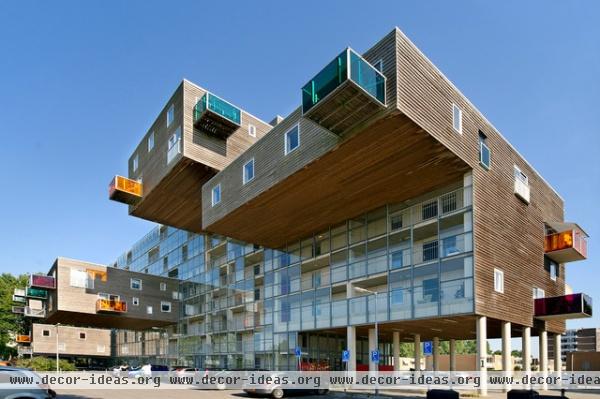
The five wood-clad boxes dramatically project from the glass facade, behind which is a single-loaded corridor serving the units.
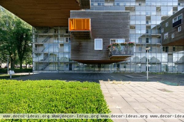
As told in the book, one couple was 13th on a waiting list for a unit, only to end up with it because each of the 12 in front of them were dissuaded by the cantilever. Sure, the unit shakes when trucks pass by, but "you get used to it," one homeowner attests.
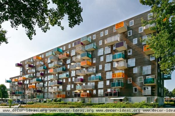
The 87 other units have cantilevered boxes as well, but they are much shallower balconies with colored glass guardrails.
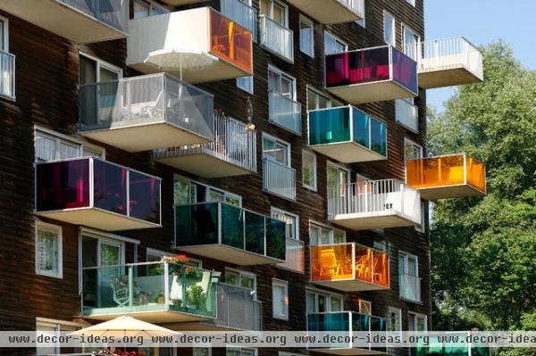
Not only do the glass guardrails create streaks of colored light on the facade, but they bring the colors into the different units. The residents get to look at the surroundings through rose- and other-colored glasses.
Silodam
Amsterdam, 2003
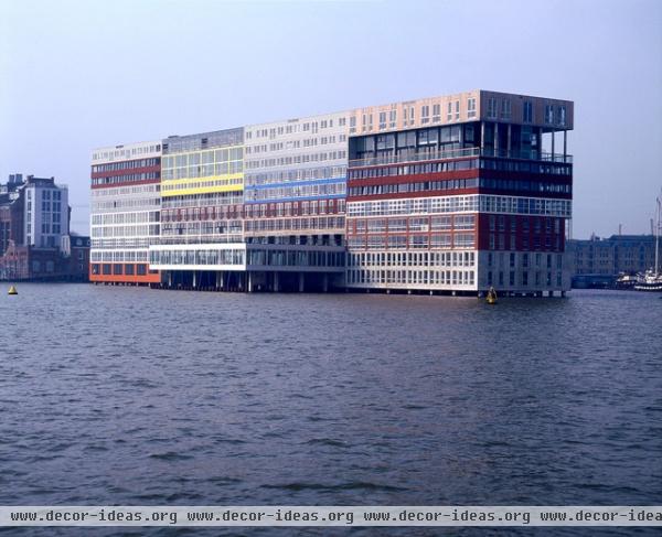
Another influential project by MVRDV (though much less photogenic than WoZoCo) is the Silodam, a mixed-use project that's a renovation of an old silo built on top of a dam in the IJ River. The building is like a patchwork quilt, reflecting the mix of different unit types — not only the office, commercial and residential spaces but the various apartment types within the latter.
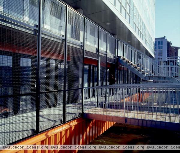
Uniquely, the building can be approached by foot, car or boat (it has both a parking garage and a boat dock), but its dead-end location means it's fairly quiet, something that many residents cherish.
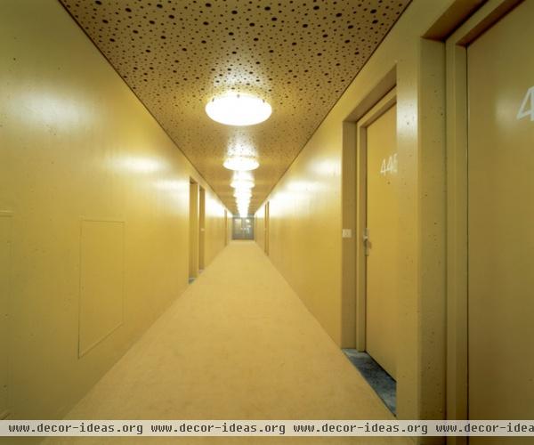
When buying a unit, residents also buy into rules that restrict changes to the architecture, such as adding personal effects to the color-coded corridors. This goes counter to the grab-bag exterior and the way empty spaces were created for residents to transform (for example, a library and a gym).
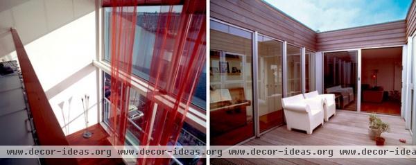
The variety of residential types means that some units have double-height living spaces or small courtyards. The random-looking exterior certainly doesn't extend inside, where the living spaces are large and well considered.
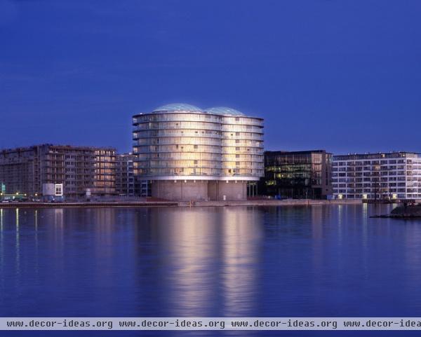
Frøsilo
Copenhagen, Denmark, 2005
Another waterfront conversion — more silos to boot — can be found in Copenhagen's old harbor area. Instead of Silodam's quilt-like expression, Frøsilo is simple and straightforward, accentuating the form of the silos.
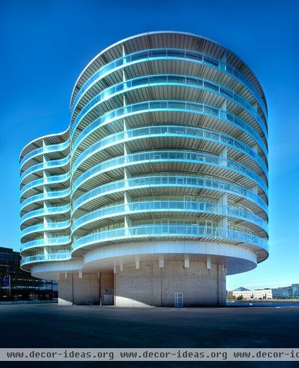
Given the size and strength of the two grain silos' concrete walls, MVRDV designed the units to be hung on the outside of them. Therefore only one opening per unit was required through the concrete, and inside is a central atrium.
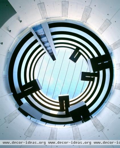
The atrium is easily the project's showstopper. Here is a view each resident receives from below.
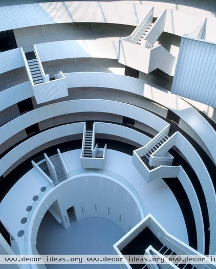
And here is the view from above. The staggering of stairs strengthens the community that has formed in the building. The elevator can be just barely glimpsed in the bottom-left corner.
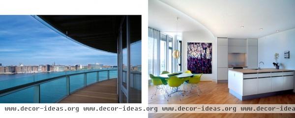
Some residents attest to the difficulty in furnishing an apartment with curved walls. Many have responded in creative ways, but all think it is a small price to pay for the generous balconies and beautiful views.
Hagen Island
The Hague, the Netherlands, 2003
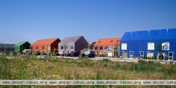
On the large end of MVRDV's spectrum is the master plan it developed for a section of Ypenburg, a new Dutch town for 30,000 residents. The plan consists of five housing projects, three of them designed by MVRDV. One of these, Hagen Island, is the only one devoted to affordable housing. The colored gable forms were a precursor to the Didden Village project we saw at the beginning of this ideabook.
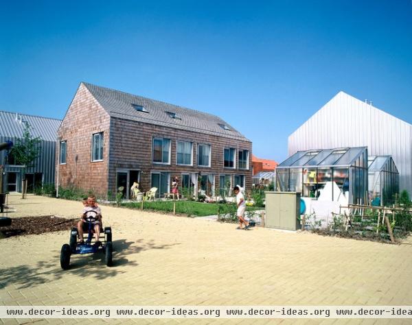
The plan consists of staggered bars of row houses between a parallel network of gravel and brick-paved walkways; parking is relegated to the perimeter, as shown in the previous photo.

The different colors and materials found on the gabled forms allow for some feelings of identity within the mix. They can also be seen as the architect's commentary on the "little boxes" that make up the suburbs, even in Europe.
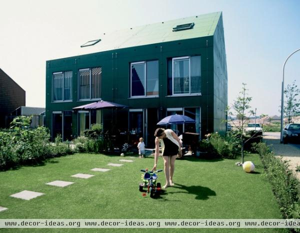
The combination of car-free walks and a yard for every row house makes Hagen Island a desirable location for families with children.
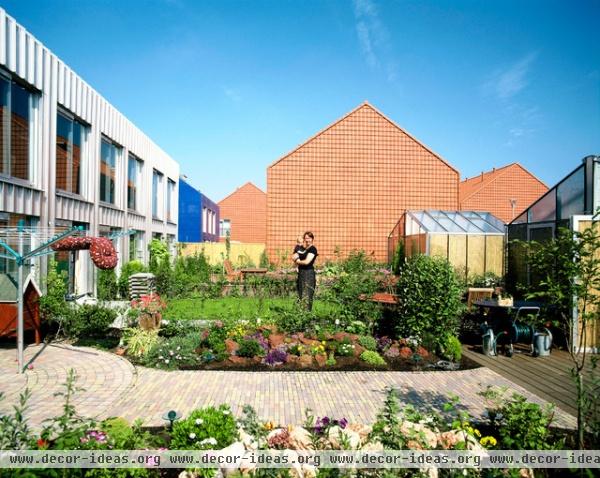
While the least expensive row houses are in continuous blocks from one end to the other, MVRDV created smaller footprints and more variety by cutting infrastructure costs (the perimeter parking and soft paving) and by simplifying details on the buildings' exteriors. The project reveals how the architects are able to balance the practical and the creative to achieve something familiar yet different.
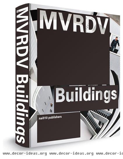
MVRDV Buildings - EUR 65 » MVRDV Buildings, edited by Ilka and Andreas Ruby (nai010, 2013). More info
More: The Classic Gable Takes a New Turn


