My Houzz: Candy Colors Add Pop to a Once-Neglected Home
http://decor-ideas.org 09/19/2013 20:50 Decor Ideas
“I like to be overstimulated by design," says interior designer and color consultant Tammy Bronfen. Together with her husband, Nir, a real estate agent, the color-obsessed Tammy reimagined a dilapidated house with awkward wall partitions and dull finishes into a space reminiscent of a candy shop. To complete the sweet look, they took down walls, gutted the bathrooms and kitchen and used bright wallpaper and colored carpentry.
Houzz at a Glance
Who lives here: Nir and Tammy Bronfen and their daughters Danielle (7 years old) and Hili (3)
Location: Kvar Tavor, Israel
Size: 130 square meters (about 1,400 square feet); 4 bedrooms, 3 bathrooms
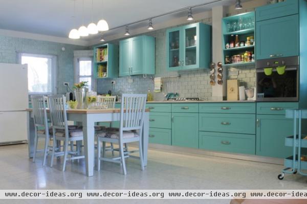
The Bronfens removed and closed up a door and took down a half-wall to open up the kitchen and main floor. Using turquoise, her all-time favorite color, Tammy commissioned a local carpenter to make the cabinets. "The color is uplifting and always makes me feel good," she says.
Tammy originally wanted a stainless steel backsplash to break up the turquoise and give the space an industrial feel. But after her fruitless search, she found gray glass tiles and had them cut to size.
She decided to forgo a kitchen island and instead combined her dining and kitchen area into one. The table can extend to comfortably seat 10.
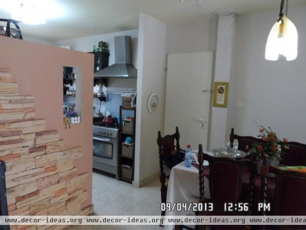
This awkward stone-clad pony wall originally divided the kitchen and dining room. The dining area could fit only a small table, and this additional door leading outside proved to be impractical and got very little use.
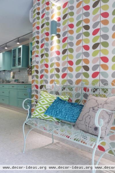
AFTER: Tammy considered changing the flooring but decided to keep the existing terrazzo tiles because they're easy to clean and maintain — perfect for a high-traffic area.
Tammy fell in love with Irish designer Orla Kiely's multi-stem wallpaper and used it to cover an otherwise dull wall. She painted the ceramic wall sconces blue to match the cabinets.
Bench: Hotam
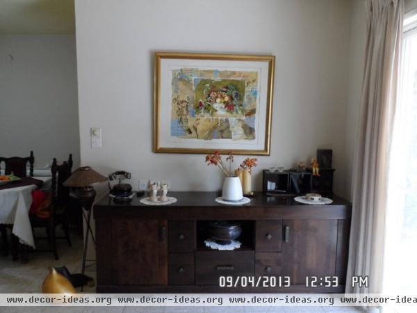
They transformed a previously empty wall into a vibrant accent wall.
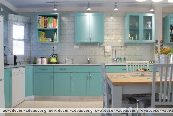
AFTER: Tammy left some of the upper cabinets open to "break up the color a bit," she says.
They kept costs low by bringing all of the appliances from their previous home. Tammy added a hanging rack and magnetic spice rack on both sides of the stove to keep their most frequently used items within easy reach. LED pendant lights hang throughout.
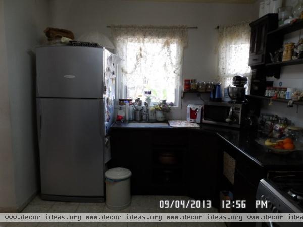
Budget constraints kept the Bronfens from replacing the windows. Instead they replaced the outdated curtains with new sheer panels.
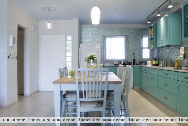
AFTER: Most homes in the area have the backsplash ending at the bottom of the upper cabinets. Tammy decided to bring the glass tile backsplash almost to the top. She left the exposed wall to eliminate cutting a new row of tiles.
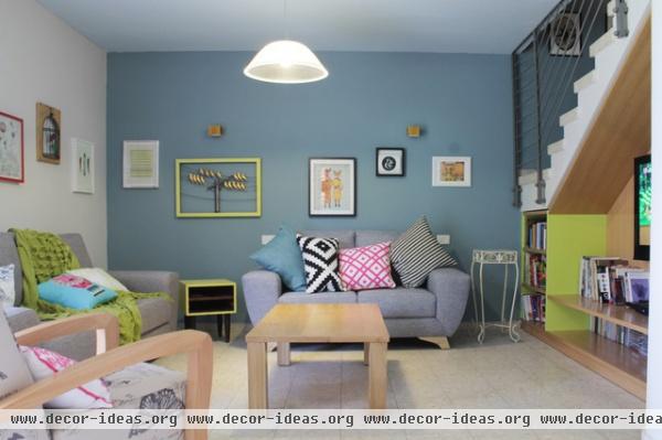
The Bronfens had their living room sofas and chair custom made at a local design center. The butterfly patterned fabric chosen for the armchair matches the seat upholstery of the dining room chairs.
Tammy created a gallery wall with some of her favorite prints from Etsy and a fox print and hot air balloon print by Society 6.
The corner yellow painted side table and painted ceramic wall sconces are both DIY projects.
Furniture and carpentry: Mercaz Harihut, Tira; pillows and throws: Rosebud; foxes and hot air balloon print: Society 6; illustrated girl print: Etsy
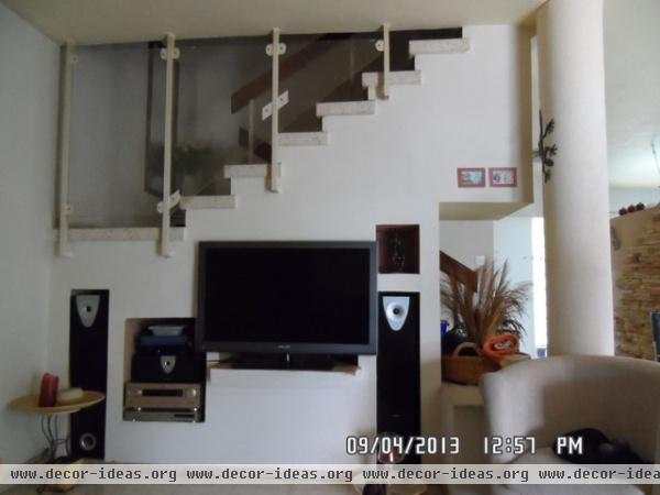
An awkwardly shaped wall under the stairs caused design and aesthetic challenges, as did the original stair railing.
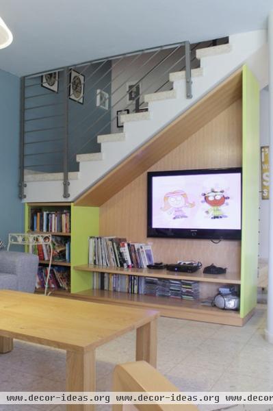
AFTER: Tammy updated the railing and designed a custom media unit to fit under the stairs. "They thought I was crazy," Tammy says when she asked the carpenter for the sides to be a bright yellow, which she chose as a complement to the primarily blue palette.
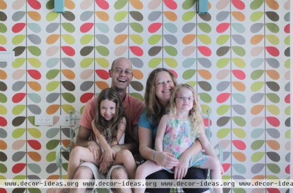
Nir and Tammy sit with their daughters Danielle (left) and Hili. The couple took all the measurements before buying their home, allowing them to complete the entire renovation process in one month.
Your turn: Show us your colorful home!
See more photos of this home
Browse more homes by style:
Small Homes | Colorful Homes | Eclectic Homes | Modern Homes | Contemporary Homes
Midcentury Homes | Ranch Homes |Traditional Homes | Barn Homes
Townhouses | Apartments | Lofts |Vacation Homes
Related Articles Recommended


