My Houzz: Clutter-Free Minimalism for a Converted Brick Storefront
Amy Tibbals and Kerri Fukui checked off the top three must-haves on their home buying list when they purchased this converted storefront in Utah: open, bright and simple. "We walked in to clean, white walls; high ceilings; unfinished concrete floors and a dynamite kitchen, and we were like, 'OK, yes. Sold,'" says Tibbals.
Developer Geoff Tice remodeled the home, which was once a mom-and-pop grocery store, meat market and bookshop. He added radiant heating and energy-efficient windows, creating an ideal clutter-free decorating canvas for Tibbals, an editor at City Home Collective and Fukui, a manager and buyer at a snowboard shop. "Our excitement right now lies in the fact that we found a structure we love, and that we get to execute all of these ideas that will make it feel like our perfect space," Fukui says.
Houzz at a Glance
Who lives here: Amy Tibbals and Kerri Fukui
Location: Fairpark neighborhood of Salt Lake City
Size: 1,300 square feet; 2 bedrooms, 1 bathroom
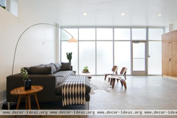
"Neither of us cares for any level of clutter, nor are we drawn to dark spaces, so it works really well," says Tibbals. The floor-to-ceiling frosted glass wall has energy-efficient, low-emissivity, argon-gas-filled windows. "The space is pretty much flooded with natural light, so we sorta lucked out there," she says. "Really, the home was designed in such a way that not only speaks to an organic, minimalist style, but sort of demands it; there aren't many corners or nooks to fill in this home, and we much prefer it that way."
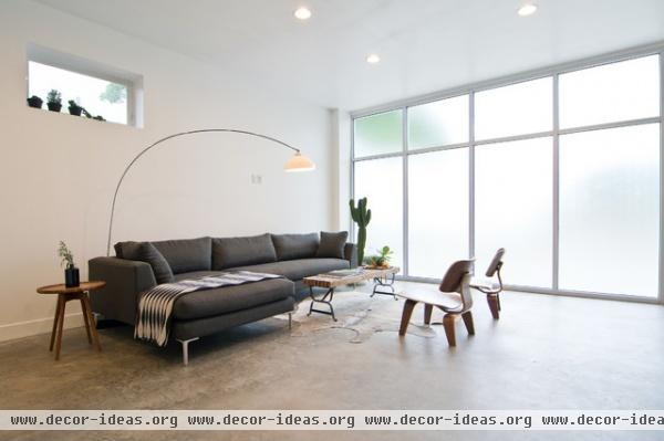
"Facing east, it's absolutely full of bright sunlight in the mornings, which gets pretty toasty but is a lovely thing to wake up to," says Tibbals. "It's a great room to read in or have a cup of coffee."
Couch: Milan 2-Piece Sectional, Lofgren's; arc lamp: Green Ant; round table: Teak Side Table, Brook Farm General Store; windows: Serious Windows, Heliocentric
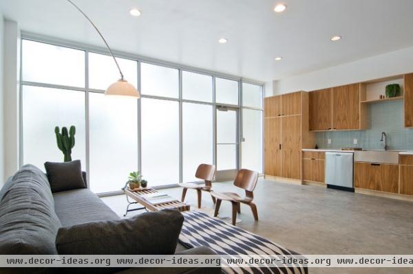
Tibbals and Fukui worked through several possibilities in the layout of the main living space. "With the kitchen lining the entire south wall, we had some questions over whether we should divide the space into kitchen and living in a more obvious way — say, with a long, narrow table that could also serve as additional counter space," says Tibbals. "Ultimately we hated that idea, as the kitchen is really an art piece of its own — with the wood and the apron-front farm sink. It's a good view to have from the couch."
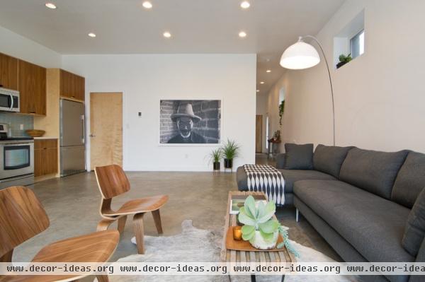
Tibbals and Fukui's friend, Laura Naylor, photographed this large black and white portrait of a man who worked at the Great Wall of China. "He was laughing at her attempt to speak Chinese, which is kind of cool to know. He definitely adds an authentic bit of happiness to the room," says Fukui.
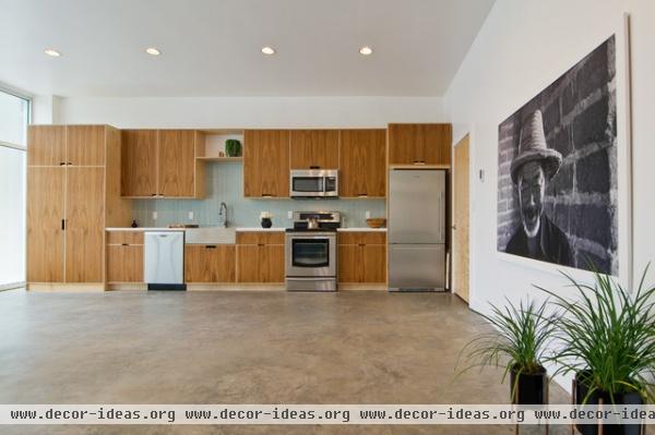
Tibbals says they are still deciding on the best spot for a dining table. "We want to avoid having too many large pieces in the one space, so it's kind of a practice in visualization," she says. For now they typically eat outside if the weather is nice or at the coffee table in the living room.
The flooring is concrete and has radiant heating.
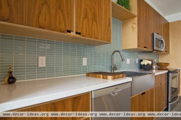
Previous owners had completely remodeled the home before Tibbals and Fukui moved in. The developer, Geoff Tice, is behind the layout and finishes.
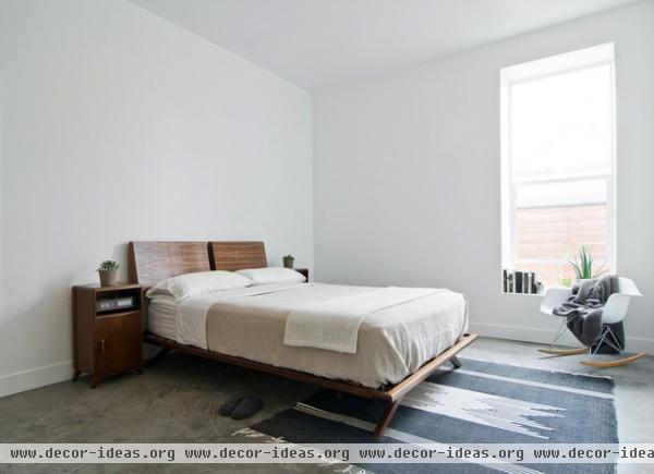
"We're newbies in the space — it hasn't even been a year since we purchased it — so we're still waist deep in ideas and eventual additions that will put a more personal stamp on it," says Tibbals. "That said, it certainly feels like ours, since the design speaks so nicely to the way we want to live and serves as a daily practice in simplicity and function." The main bedroom exemplifies that philosophy.
Bedspread: Cotton Sheet, Brook Farm General Store; bed: custom, Patrick Davis Design
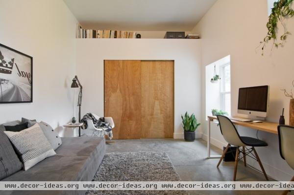
Tibbals and Fukui believe that everyone should feel a sense of calm and comfort at home, and they are excited about all they can do to their space to continually achieve that feeling. The guest bedroom is outfitted in mostly neutral colors and another black and white art piece.
Office desk: Tyler Millard Tuft, Walger and Millard Design
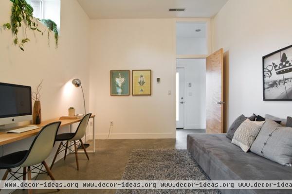
The bedroom doubles as an office. A golden pothos vine sits on the clerestory window sill. The frosted glass door leads to a patio and a detached two-car garage.
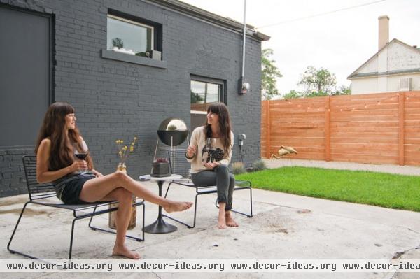
"A big want for us in finding a home was a garden and yard of our own, so we're thrilled to have it," says Fukui (at left). She and Tibbals (at right) credit their close friend Cody Derrick, Realtor, designer and founder of City Home Collective, for helping them find this home.
"A barbecue and glass of wine in the backyard with friends is a top-shelf evening for us, and growing our own food was vastly important. We'd ultimately like for our entire yard to be shrouded in green, be it plants, veggies, trees or vines," says Tibbals.
Exterior paint: Evening Hush, Behr
Browse more homes by style:
Small Homes | Colorful Homes | Eclectic Homes |Modern Homes | Contemporary Homes
Midcentury Homes | Ranch Homes | Traditional Homes| Barn Homes
Townhouses | Apartments | Lofts | Vacation Homes


