7 Ways to Play With Symmetry for a Dynamic Design
"Symmetry" — derived from the Greek word that means "to measure together" — has a few meanings. The better-known definition of "symmetry" is a balance achieved through proportion and harmony. The other definition has to do with the mathematical concept of mirror symmetry, in which items on either side of a centerline are completely identical.
We are instinctively drawn to symmetry, because nature is full of beautiful examples of symmetrical objects (such as snowflakes). Architects and designers have used the concepts of symmetry and asymmetry (nonsymmetrical designs) throughout history; traditional design tended to place emphasis on symmetry, while modernist and postmodern designers used asymmetry as a design principle.
Both symmetry and asymmetry hold a place in today's design environment. Let's take a look at how successful asymmetrical design is achieved by taking symmetry into account.
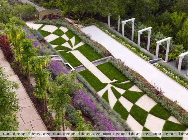
1. Create a center axis. Most of this garden’s design consists of asymmetrical elements. A linear span of grass and pavers creates a central axis, intersected by a narrow pool of water. The pavers’ pattern looks symmetrical around this centerline. While all the elements on each side are not mirror images, they work together beautifully.

2. Ground with symmetry. This modern garden design has many asymmetrical elements — the heights of the greenery on each side of the concrete bench are different, for example. However, the yellow foliage on each side of the bench creates a sense of symmetry that helps to ground the design.
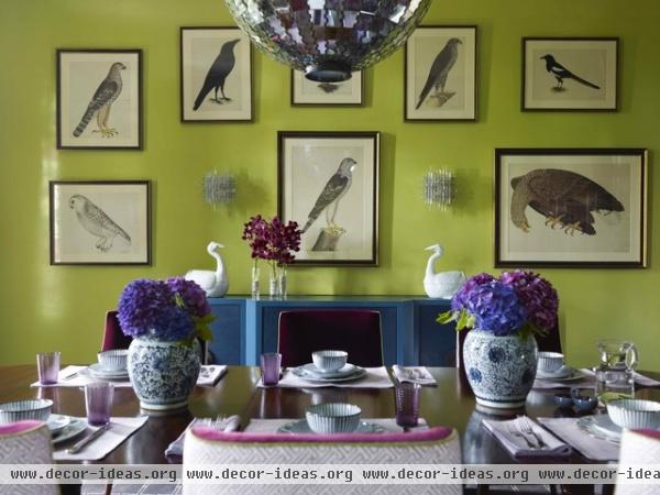
3. Interrupt symmetry to provoke. It's easy to spot the symmetry in this dining room, because the middle of the dining table serves as the centerline for the furniture layout. The chairs and china around and on the table are the same; the purple hyacinth bouquets in vases are equidistant from the table's centerline; the white birds sit symmetrically on the buffet; the wall sconces sit at equal points from the middle of the chandelier.
But the photo layout on the wall is where we see this pattern of symmetry interrupted — the frames and mats of the outermost bird artworks are different sizes, adding a fun twist.
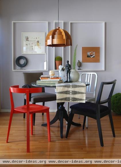
4. Add appeal through asymmetry. The asymmetry in this room works because it is balanced by the symmetry of the frames on the wall.
The pendant shares the same centerline as the round table and small vertical frame, flanked by the two larger frames. Everything else within this framework is asymmetrical. I love how these chairs, while all different in design and color, work together.
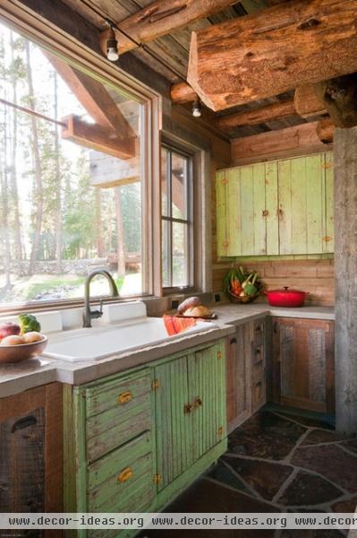
5. Find beauty in a lack of harmony. With the sink’s centerline as a reference point, we don't see much symmetry in this room; however, it's still a beautiful and calming space. This kitchen is an excellent example of how a well-designed room can be asymmetrical and still achieve harmony.
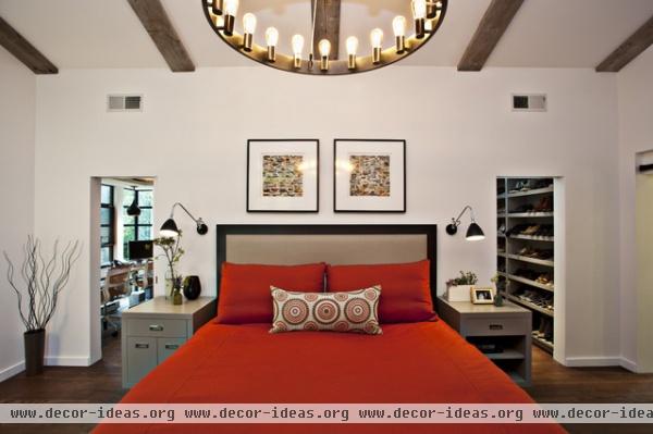
6. Tease the eye with similar yet different pieces. Good symmetry often happens in the bedroom, with the bed often serving as the room's centerline. Using furniture that's similar in overall design and structure but different in small details — like these bedside tables — allows for balance and personality.
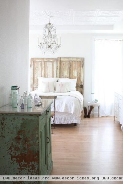
7. Design around a single statement piece. These two doors that create the headboard are fun and unique. Notice that they are centered on the chandelier in the room, and everything else revolves around these main pieces. Every item in this room is different, although they do all share a refurbished look. Keeping this room simple and uncluttered adds to the integrity of the design.
How to make a rustic-chic headboard from salvaged doors


