How to Compose Your Shot for Stunning Home Photography
http://decor-ideas.org 09/14/2013 21:40 Decor Ideas
Composition is key to creating beautiful photographs. While photography is certainly subjective, some views are usually more pleasing than others. Study other photos to see what views you like; your perspective will vary depending on your audience and interests. I often vary my compositions: diagonal, straight on and even asymmetrical to highlight certain details. Taking the time to compose a shot meaningfully will make a huge difference for the end result.
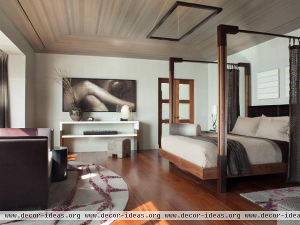
Use your frame to compose the mass of the building and show a room's layers. The best photos explore the way spaces — and their materials — interact.
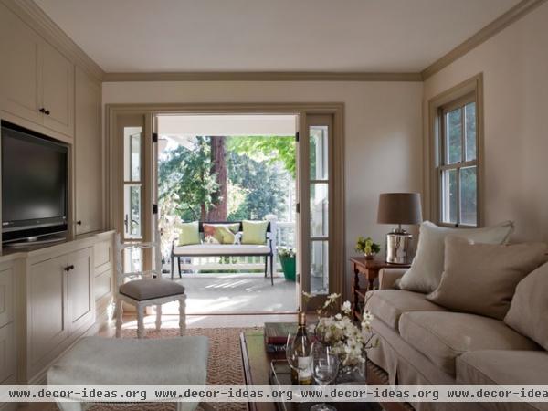
Only frame what you want the viewer to pay attention to. Good composition makes a room look spacious and inviting and leads the eye around the entire space.
Tip: A wide-angle lens will create a certain amount of distortion. To lessen the "fishbowl" effect, make sure your camera isn't too close to any furniture. It also can help to look straight onto your subject, like this photo.
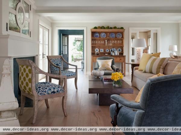
People tend to like symmetry. The space should be balanced — not too many objects on one side or the other. Sometimes good composition is about what you don't include.
Tip: Crop your photo after you shoot it to give you more options. Cropping can tighten up a composition and remove distractions.
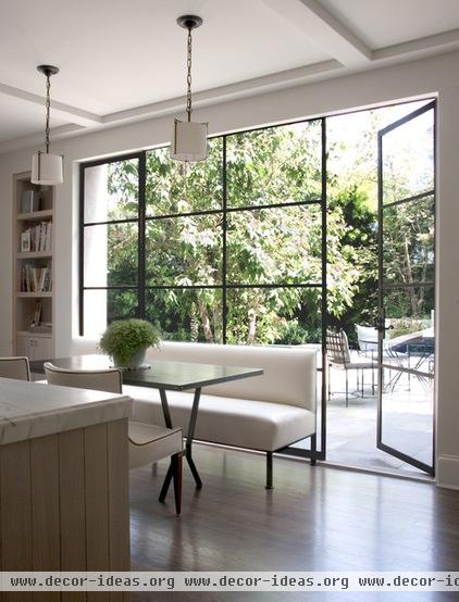
Shoot from a low angle and make a path for the viewer to walk into the room. This low camera angle makes the planes of the counter and table smaller and puts the furniture in scale to the total room and scene. The composition invites the viewer to either sit at the table or walk outside; it has a nice, subtle dynamic.
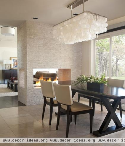
A strong, centered and weighted composition works well on small screens. In this photo, we see the detail of the table legs and the fullness of the chandelier without too much extra ceiling area. The invitation to the room beyond is a bonus that informs the viewer about how the fireplace floats within two rooms.
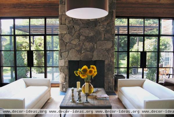
A one-point perspective photo like this shows off the room's graphic design and the elevation of the fireplace wall and demonstrates how the window grid subtly repeats outside. The photographer kept the height of the camera low.
Tip: Keep the styling simple and think about the placement of the styling elements. This shot looks clean and architectural but still inviting. An interior designer may have wanted to dress the sofas with pillows and throws.
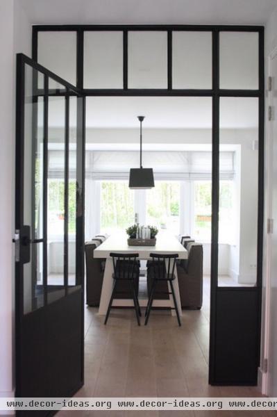
Framing a view is a great way to add interest. In this photo, there's a richer experience of the room knowing that a steel-framed doorway contrasts all of the wood.
Tips: For architectural shots, make sure the walls and doors are straight up and down; it makes the photo look more graphic and professional.
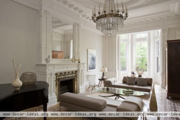
Dealing with big, dark pieces of furniture isn't easy. In this photo, the piano, firebox and tall wardrobe balance each other in scale and placement in the composition to ground the photo. The photo is almost bookended by the dark objects on the left and right.
Tip: All of the lights are off in this room, so the viewer focuses on the natural light streaming in from the bay window. This is a trend in today's interior and architectural photos.
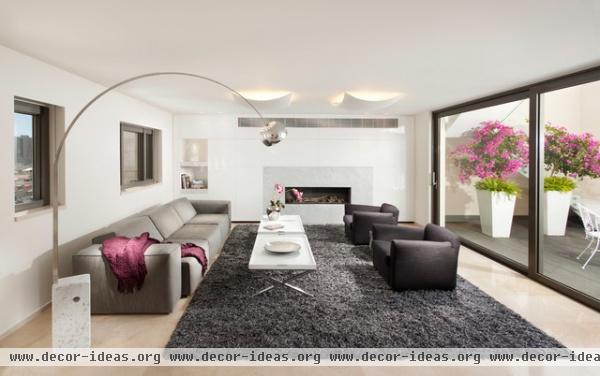
The balanced use of negative space can work well to highlight the volume and architecture of a more modern space. In this room, a wide-angle lens was used to shoot straight on to the fireplace wall. The empty areas in the foreground with the rug and ceiling plane are well balanced.
Tip: Repeating color throughout a room can have a nice effect. I like how the pink on the outside flowers continues inside with more flowers and a casual pink throw.
Related Articles Recommended


