Breaking Out of the Kitchen Work Triangle
http://decor-ideas.org 09/02/2013 08:20 Decor Ideas
You may be familiar with the kitchen work triangle and its emphasis on an efficient kitchen layout. But did you know that this concept has been in use for more than a hundred years?
Originally developed in European kitchens, the traditional kitchen work triangle was fine-tuned in the 1950s, when kitchens were reconceived as one-person spaces separate from the rest of the house. Those kitchens usually included just a range, sink and refrigerator; the arrangement of those features formed the work triangle.
Today's kitchens are very different, inspiring new layouts, but they still build on the old logic of the efficient workspace.
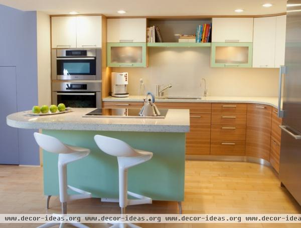
Open concept. Positioning the refrigerator at the entrance to the inner work area allows family members to access the fridge without interrupting the cook. Both the fridge and wall oven have a drop-off zone in immediate reach. Depending on the exact distance between the sink and the cooktop, there's a good chance that two people could work in this kitchen at the same time.
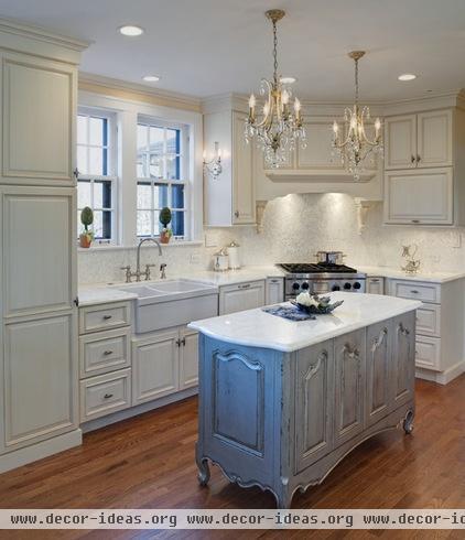
Linear layout. The tall unit on the left of this L-shaped kitchen holds the refrigerator. This linear layout requires more steps between appliances, but easy access to the sink from the island allows one person to work in the cleanup area while someone else works at the range.
Despite the loss of square footage from the unused space behind the range, the corner installation works well for this kitchen. The short side of the L-shaped layout wouldn't be as useful without this range location.
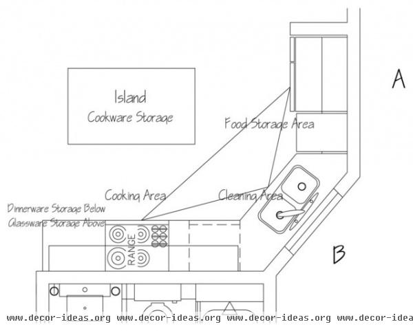
Angled layout. Here's a schematic of one version of a work triangle. This layout would work well in a smaller space; the fridge is easily accessible, there's a window above the sink, and there's plenty of workspace around the range.
Of course, there are many variations, but the general idea of the work triangle is to keep the distance between the crucial areas of the sink, range and refrigerator within two to three steps. Keep in mind that this concept relates to small spaces. In a larger kitchen you'd have to maintain a logical relationship between work zones, but their distance can be adjusted according to the room's scale.
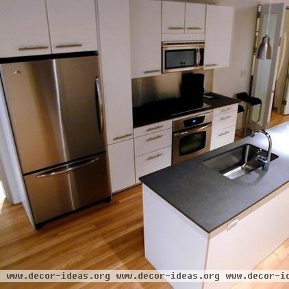
Moderate size. There's a pantry to the right of the fridge, counter space on either side of the stove and an island with a cabinet to one side of the sink. This is a great layout for a moderate-size kitchen.
Small size. The same layout can work in a smaller kitchen, too. It would work especially well in a space where the wall between the kitchen and living area has been removed.
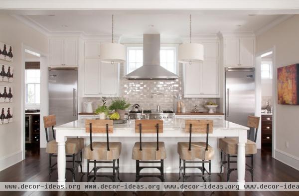
Separate refrigerator and freezer. Tried and true, the combination of a clean up island with a food prep and storage wall unit is functional and pleasing to the eye. Separate fridge and freezer towers frame the range in this kitchen to create an eye-catching focal point. Access from nearby rooms makes it easy to grab something from the fridge without interrupting the cooking process.
The island holds the cleanup area, with two pendants to illuminate the workspace or eating area.
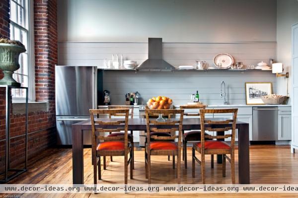
Pullman. A single-wall kitchen has all the work areas arranged along one wall, similar to the narrow, long layout of old train compartments, which is why this is often called a Pullman-style kitchen.
This layout is very common in European households and a staple for small apartments and secondary suites, although it doesn't follow the traditional work triangle rules. Such a layout requires the cook to move from one end to the other to cover various workstations.
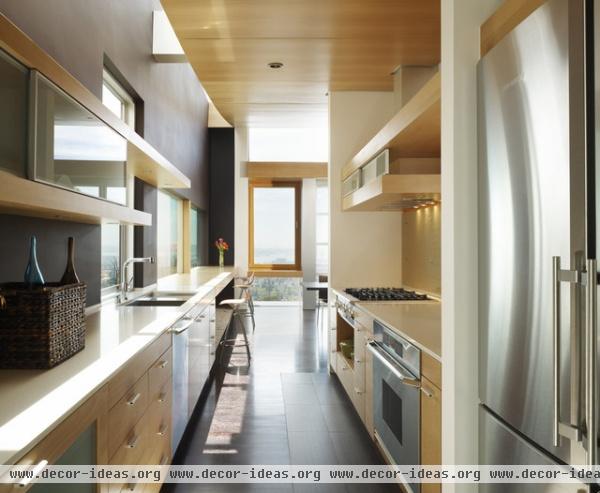
Galley. This galley-style kitchen maintains a sleek appearance with open shelves in lieu of upper cabinets. Avoid positioning such a design in a major walkway in the house. For households with more than two people, a narrow kitchen like this can get crowded fast.
Try to offset the sink and the range from each other, so more than one person can work in the kitchen at the same time.
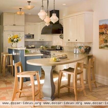
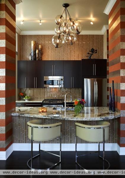
Eat-in. This little beauty is a great example of a renovated kitchen in an older home. Kitchen layouts in older homes often would include a space for a small breakfast table and chairs. Instead of a separate table, this kitchen has a countertop elongated into a swooping curve. Sometimes adding an additional eat-in space can create a tighter work triangle and extended workspace, as in this kitchen layout.
More: How to Set Up a Kitchen Work Triangle
Related Articles Recommended


