Houzz Tour: Eclectic Modern With a Vintage Splash
When Asher and Jessica Richter first set eyes on this neglected Santa Monica, California, bungalow, they were willing to overlook the home's obvious issues. The yard was overgrown, the floor plan was cramped and the entire interior needed an upgrade. Luckily, the big-ticket items — like the foundation, plumbing, electrical and roof — were all structurally sound. "We really loved the California bungalow architecture and felt confident purchasing the house with renovation projects in mind," Asher says.
The Richters own their own custom furniture and interior decorating business, Weego Home, and considered the house an ideal spot in which to put their skills to use. As their own clients, they had the freedom to create an interior full of color, texture and pattern — a look they've dubbed "eclectic modern with a vintage splash."
In shaping their colorful and modern beach bungalow, the Richters maximized every square inch along the way. Here's how they did it, along with tips on decorating small spaces.
Houzz at a Glance
Who lives here: Asher and Jessica Richter, with their 3 rescue dogs (Benny, Rosie and Coco-Bean)
Location: Santa Monica, California
Size: 950 square feet, 2 bedrooms, 2 bathrooms
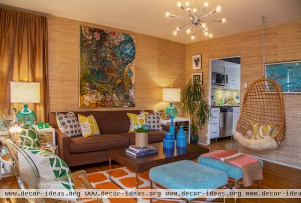
At just under 450 square feet, the living room is the largest room in the house. To make the room feel even more spacious, "We chose furniture with clean lines that either offered extra storage or had open bases," Asher says. There are clear views through Kartell's Louis Ghost chairs, and open bases on the coffee table and ottomans, which came from their store.
Beyond a new layer of plaster, the changes in the living room were mostly cosmetic. Vintage-inspired elements like sea grass wallpaper, a Sputnik chandelier and a hanging wicker chair introduce groovy retro style.
Rocky Coffee Table and Rocky Ottomans, both by Weego Home
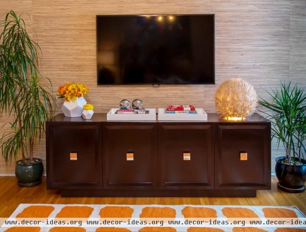
The Richters' media cabinet is customizable. "This particular piece has alternating panels of three inset drawers and/or two floating shelves, with media cutouts in the back to accommodate our TV components," Asher says. He also saved visual space by floating the TV on the wall. This left the cabinet top open for displaying accessories.
Media cabinet: Miranda Cabinet, Weego Home
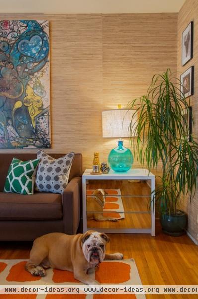
A mirror-faced side table reflects Benny, who appears to love all the playful patterns in the living room. "We used mirror elements and glass lamps with natural shades to reflect light into the snug space and help continue the open feel," Asher describes.
Eva Side Table: Weego Home
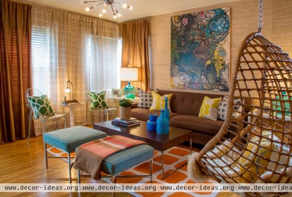
"Clients often fear mixing colors or patterns, and wind up with a lackluster outcome," Asher says. "By keeping larger items neutral, we were able to incorporate layers of color through accent items and accessories."
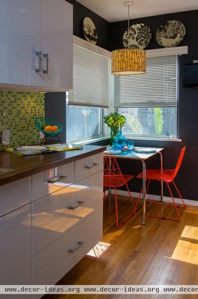
The kitchen was the first and most extensive project the owners tackled. They replaced everything, installing new hardwood floors, high-gloss white cabinets and stainless steel appliances. They added color with accents, including a vibrant green mosaic backsplash and bright orange chairs. The pendant light adds another dash of green.
They kept the kitchen's design lighthearted, adding chalkboard paint and showing off a treasured Acapulco chair fruit basket they received as a housewarming gift.
Pendant light: Covered in Galbraith and Paul's Beads fabric; chairs: Lucy Side Chair, Bend Seating
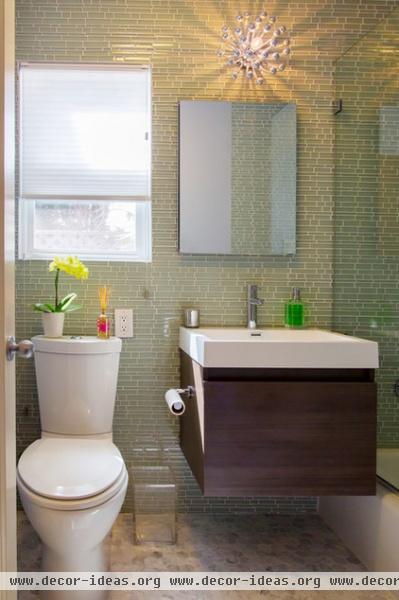
After tackling the kitchen, the couple moved on to the bathrooms, which were fully functional but felt dated and cramped. Light colors, reflective tiles and an anemone-like sconce lighten the space in the master bath, while a floating vanity and clear glass shower stall make the room feel larger.
Inspired by classic 1920s style, the owners chose 2-inch by 2-inch Carrara marble hexagonal tiles for the floor. They added a contemporary touch with rectilinear green glass tiles. "We settled on translucent tiles to not only avoid overpowering the room, but to create a fluid environment inspired by the sea," Asher says.
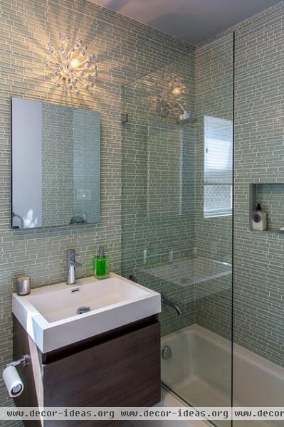
To continue the open concept, the Richters chose a floating bathroom vanity. "We selected the Fresca Nano Bathroom Vanity in gray oak, because it had a simple, compact design, and the finish complemented the soothing color palette perfectly," Asher says.
Light fixture: Spazia Pistillo (discontinued; Robert Abby makes a simliar one); marble tiles: The Builder Depot; glass tiles, Tomei Falling Water, Platinum Green, Westside Tile and Stone
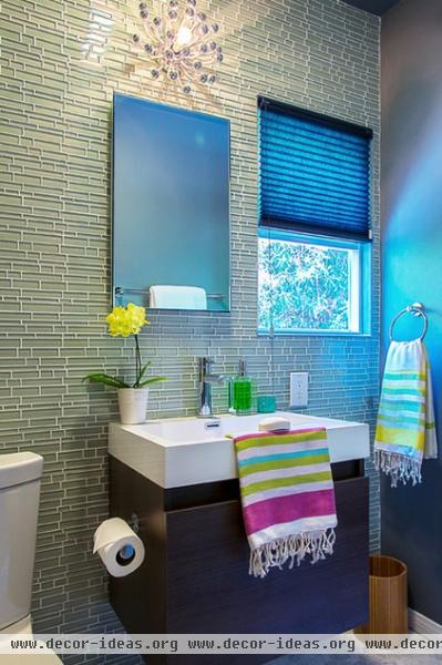
The couple used a similar design approach in their guest bathroom.
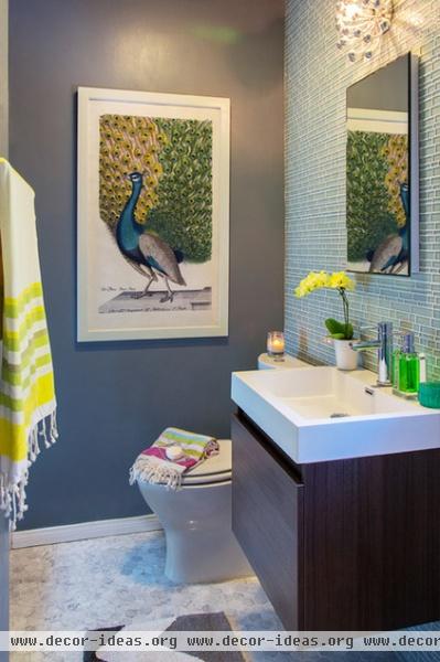
While most of the main elements are the same as in the master bath, this peacock painting inspired more colorful accent pieces in the guest bath. "By keeping the color of the bathroom floor, tile, paint and fixtures serene, we were able to incorporate pops of yellow and green with items like the towels, hand soap and orchids," Asher says. "Bringing lively elements into a tranquil space keeps the design bright and interesting."
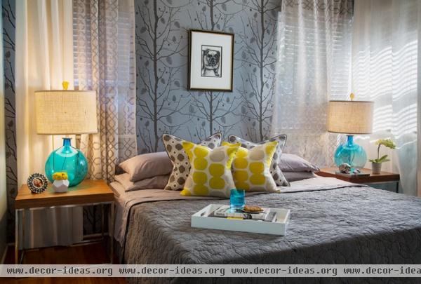
"The bedroom is the most personal part of any home; the space should feel refreshing yet suggest serenity and romance," Asher says. For the serenity part, the homeowners chose soothing gray bedding and Ferm Living's Family Tree Wallpaper in metallic silver.
On the windows they combined solid linen drapery with sheer trestle-pattern panels from West Elm, to evoke a light, airy feel. Next they layered in color, with yellow pillows, golden finials, canary floral accents and turquoise glass table lamps.
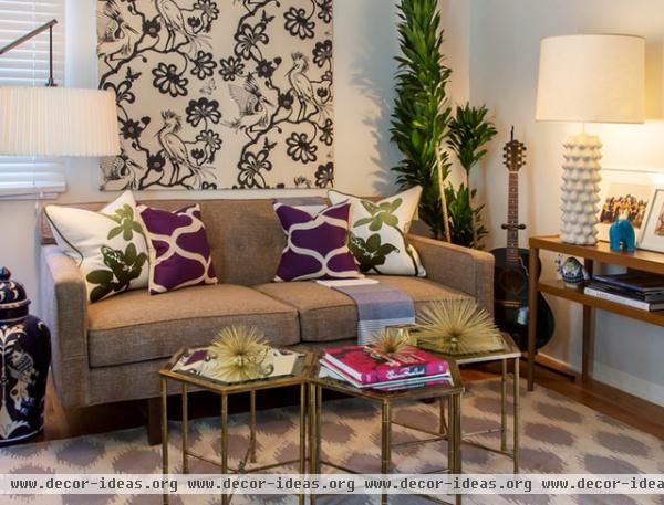
A classic Florence Broadhurst wallpaper adds a dynamic touch. "We created a custom wall panel with stretched egrets fabric to bring in pattern without overwhelming the small guest room," Asher says.
This midcentury-inspired sofa is a custom design from Weego Home and can be made into a sleeper. The couple found the mirror-topped hexagonal tables at a Palm Springs flea market. "They can be moved around for entertaining and provide added character without taking up too much space," Asher says.
Table lamp: Georgia Lamp, Jonathan Adler; sofa: Weego Home
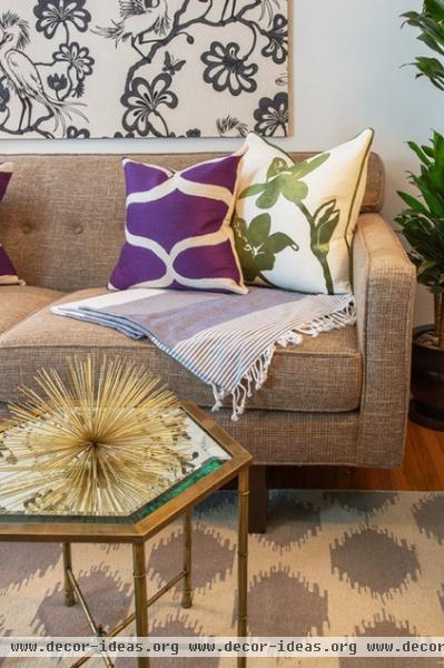
"We like to try different shapes, patterns and color combinations until we find a mix that works," Asher says. "We create symmetry among pillows and often find that our eye prefers accessories in pairs."


