Houzz Tour: An Opportunity for Invention in San Francisco
Architect David Marlatt, founder of DNM Architect, and his wife, Sarah, had loved living in their 1936 house in San Francisco's Parkside District. It was just this summer that the couple finally thought it was time to move to another nearby fixer-upper. But they couldn't leave without reminiscing about their 17 years as faithful stewards of their beloved house. They were, after all, only its second owners, and felt an obligation to preserve the integrity of its architecture.
This house served as a happy playground for their three sons and a blank canvas for the adventuresome architect and his creative wife. Together they breathed life into the house, one room at a time. All the while they proved that respectfully remodeling an entire dwelling doesn't have to cost an arm and a leg; it just takes a lot of patience, know-how and sweat equity.
Houzz at a Glance
Who lived here: Architect David Marlatt, wife Sarah and their 3 sons
Location: San Francisco
Size: 1,945 square feet; 4 bedrooms, 2 bathrooms
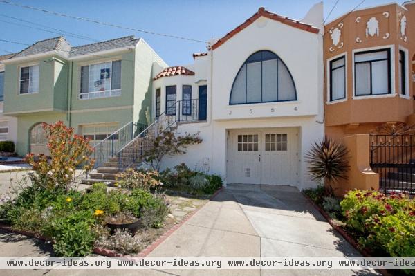
As an architect, Marlatt saw this typical San Francisco two-bedroom, one-bath house near the ocean not as a challenge to live in with his burgeoning family, but more as a series of opportunities to lend his inventiveness to a house he admired.
To stay respectful both to the house and its neighbors, Marlatt kept the facade in its original condition, save for a new color, modern address numbers and a landscape facelift.
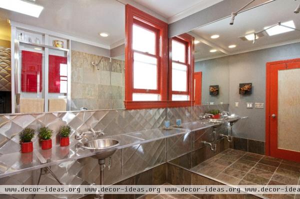
The first room they made changes to was this bathroom. "It was a 5-foot by 8-foot bathroom like all the other homes in the vicinity," Marlatt says. "It had pink tiles and a green cast iron tub. What prompted us to renovate wasn't its looks so much as the leaking shower."
They gutted the bathroom down to the studs and waterproofed the entire room to create one giant shower stall with double heads on the wall opposite the sinks. The countertop is made from ¾-inch-thick acrylic within which fit two stainless steel Kohler bar sinks (to save on space) matched with laundry room faucets. The floor is slate, while the walls are made up of a mirror and stainless steel wainscoting with a diamond pattern for an industrial-looking finish that resists mildew.
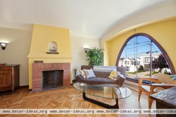
The living room was one of the few rooms to which Marlatt didn't make any architectural changes. He did refinish the floors and add yellow accents. A curved fire screen decorates the original fireplace. Marlatt hand crafted the screen out of a security window grill.
Coffee table: Noguchi
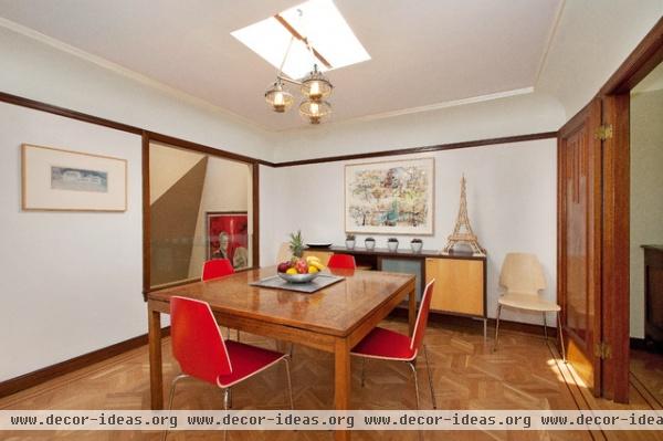
While the dining room still shows authentic style, the family needed more light, as the room had no direct exterior window. There was only a window to an interior light well that provided only shaded light.
Marlatt added more natural light with a skylight. A custom chandelier hangs from the ceiling's existing rafter, which Marlatt polished up.
The window to that interior light well was removed and expanded to overlook a stairwell that Marlatt added to give access to a new downstairs living area.
The dining table was the first piece the couple bought together when they moved from Sarah's hometown, Paris, to San Francisco. It was a black stained conference table purchased from an office warehouse store. Marlatt stripped and refinished the piece, revealing its solid mahogany beauty.
Chairs: Ikea; sideboard table: 1990s
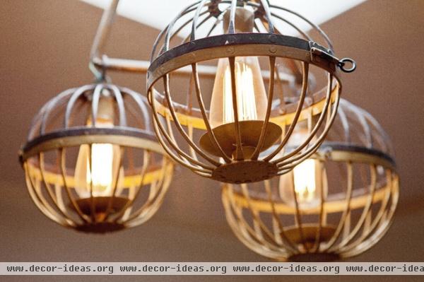
Marlatt made this chandelier that hangs over the dining table. The cages, designed to be candleholders, came from Pottery Barn. Marlatt refashioned them with bulbs that are connected to electricity by way of a simple copper pipe used by plumbers.
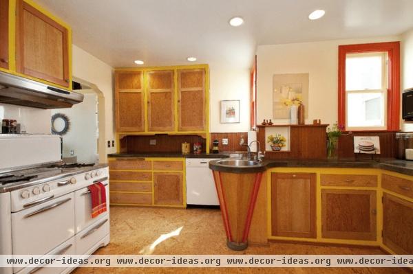
As is typical of Depression-era kitchens, this one was once divided into two areas. Marlatt removed a wall to create an open area with ideal flow. Every workstation centers on the circular sink, which is surrounded by the original, but repositioned, cabinets. "We wanted to salvage as much as we could. We stripped all the cabinets, put a natural stain on them and highlighted their frames in yellow for a fun splash of color," Marlatt says. The few new cabinets that were required to complete the room were matched closely to the old ones.
The backsplash is another work of reclamation. The vertical tongue and groove redwood boards were the backs of the original cabinets that were discovered when the space was reconfigured.
The extremely functional shape of the sink was created by way of a bowl made from a big casserole container that Marlatt bought at a restaurant supply store. "We renovated our kitchen well before round sinks were as common as they are today," he notes.
Oven: Wedgewood
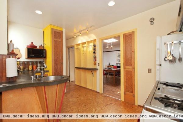
Marlatt squeezed even more space from the kitchen by crafting a storage wall that uses the hollows of exposed studs, painted another cheery yellow tone.
The couple loved the concrete counters they were seeing in magazines at the time of the renovation. However, they weren't excited by the high prices. So they cast in place their own concrete counters with pure Portland concrete; it naturally cures to this dark shade without the help of a stain.
After 30 days of curing, the countertops were topped with a food-grade sealer. Subsequent maintenance has meant only an occasional swipe of olive oil applied with a paper towel.
Flooring: vinylized cork
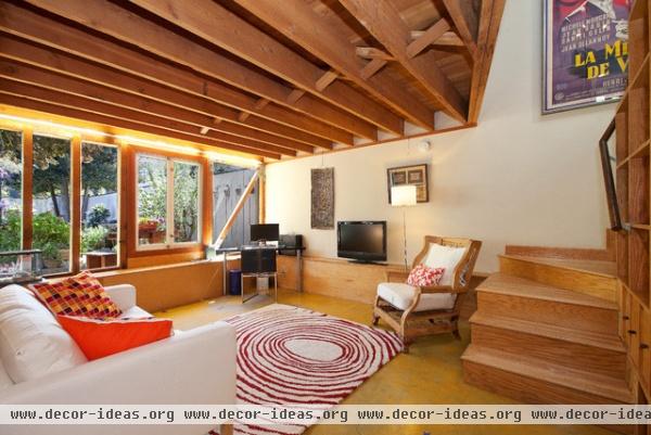
The lower level of this house was dedicated exclusively to the garage, a common feature to houses in this neighborhood. Marlatt left a reasonable amount of square footage for a working garage, then repurposed the rest of the bottom level into comfortable living space.
The stairwell (which passes by the dining room's interior window) lands in the media room. The room takes advantage of natural light with a new bank of windows. Exposed joists give the room additional character. Concrete floors were poured and stained yellow for a homey look. The kids were involved as well: They stenciled blue artwork all over the floor.
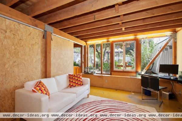
Sliding panels of oriented strand board (OSB) separate the media room from the master bedroom.
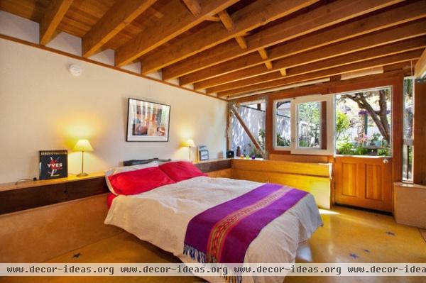
Behind the OSB panels is the master suite. Its secluded location makes for a quiet, well-lit space (the windowed wall, like the exposed ceiling joists, continues from the media room) that looks out to the backyard garden.
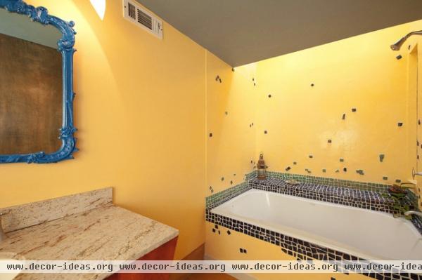
Portland concrete walls keep the master bathroom watertight. Marlatt hand made the canted vanity for a sculptural effect that saves floor space. It's topped with a piece of marble found from an old estate.
The couple found the mirror at a flea market in Paris. They painted it bright blue to play off the blue glass tiles. "We bought those tiles about 14 years ago. This was before glass tile was popular, so it was expensive and hard to come by," says Marlatt. "We bought only a few sheets. Then we let the kids peel the mosaic pieces off and place them where they wanted. It saved us money to use the tiles sparingly, plus we got a fun, unique configuration."
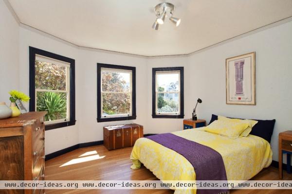
Aside from paint colors and refinished floors, nothing was altered to the structure of this upstairs bedroom, one of two.
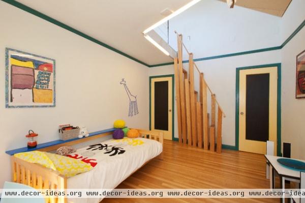
As the family grew, the couple needed another room to house their multiplying boys. Marlatt added a loft that is accessed by steep but safe stairs. The space couldn't accommodate a full staircase, and the couple didn't want their then-young boys climbing a loft ladder. This stair-ladder hybrid was built by Marlatt from 1- by 4-inch oak boards. Its treads were re-covered from the joists removed to make room for the new loft.
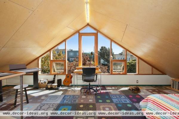
This third level was the final phase of the house's renovation, which was completed in 2009. It was also the only part that required a significant change to the house's exterior appearance. Marlatt created the new triangular pitch in a way that wouldn't be seen from the street.
The interior ceiling is paneled with birch plywood laid at an angle. "It was a complicated process for the poor guys who had to install it," says Marlatt. "But it adds whimsy to what would've otherwise been a static appearance."
The carpet tiles were a lucky find. "I just happened to call a carpet company asking if they'd give me a to-the-trade discount," says Marlatt. "I was hoping for maybe 10 percent off. Turned out I called them while they were changing out their inventory and had to dump their stock. They told us to please take as much as we wanted for free."
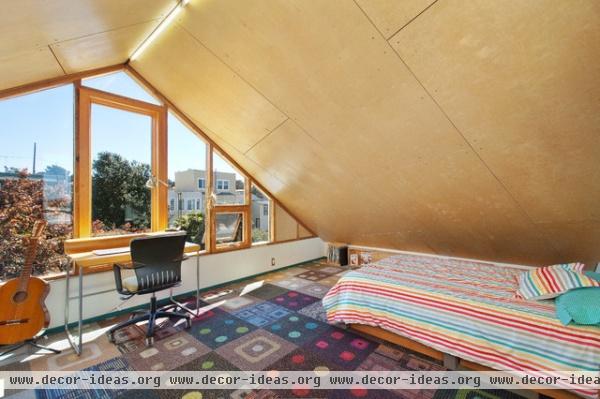
"This house became a laboratory for exploring ways to create spaces and objects from simple materials," Marlatt recounts. "In the earlier days, there was no option for us to use expensive materials, but even in the later projects when we could have spent a bit more, we came to appreciate the house as a demonstration of the many ways of using simple and oftentimes salvaged materials, and color, to maximum effect."
The family is currently enjoying a new phase of their life on a rented houseboat in nearby Sausalito. They are carefully considering their next house to purchase and improve, taking into accounts all the lessons they learned with this one. Stay tuned for more.


