Hello, Bordello — an Ohio Loft Goes From Sinning to Winning
If you’d asked self-taught designer Nikki Lloyd and her husband, Ryan Whaley, five years ago if they would ever move back to their hometown of Sandusky, Ohio, the answer would have been, “Not a chance.” But "every time we came home to visit family, we began to see a community on the rebound, and we really wanted to be a part of it,” says Lloyd.
The couple moved to the quaint lakeside town and invested in a dilapidated late-1800s building in the heart of downtown Sandusky. The building was a wreck, but Lloyd has made an art out of taking diamonds in the rough and creating shiny gems. She had previously improved a ho-hum prefab home near Breckenridge, Colorado, and a teardown-turned-charming-cottage in suburban Ohio.
But never had she tackled a project with such a history as her new home, once an early-1900s high-end bordello known as The Green Door.
Houzz at a Glance
Who lives here: Nikki Lloyd and Ryan Whaley
Location: Sandusky, Ohio
Size: 1,500-square-foot loft, plus a 750-square-foot office and a 750-square-foot cocktail bar; 2 bedrooms, 2 bathrooms
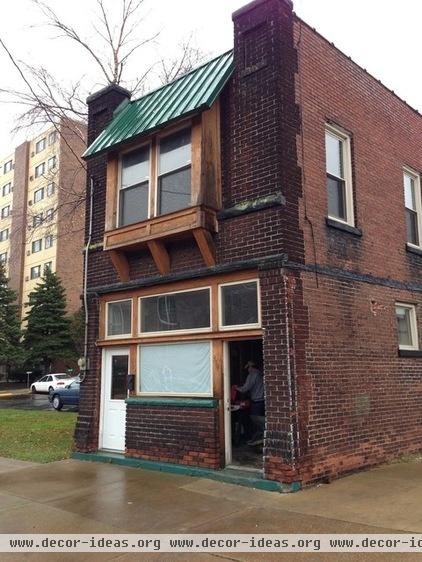
BEFORE: The couple wanted to keep the gritty exterior of the building intact. They mainly added two new doors and resealed the windows.
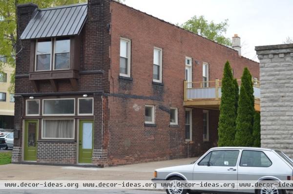
AFTER: It took a lot of vision to see any future for the relic, but Lloyd and a close team of family and local contractors spent a year gutting the 3,300-square-foot structure, restoring it to a multifunctional building. Whaley's media company occupies a 750-square-foot upstairs office space. There's a 1,500-square-foot, two-bedroom, two-bathroom loft, and along the street-facing front a small, pre-Prohibition craft cocktail bar aptly named The Volstead is set to open in late 2013.
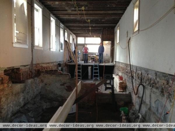
BEFORE: At first glance Lloyd and Ryan (shown here) knew they were staring down a bear of a project. Lloyd needed to get to the bones of the building to see what needed to be done.
The carpet was the first to go, revealing the need to replace the floors on the first floor. Following that, Lloyd took down the trim, doors and plaster, which entailed a few heavy hammers and crowbars, and a lot of elbow grease. Next the trim and doors came down.
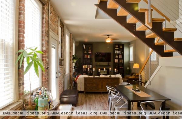
AFTER: In the living room, the high ceilings called for a dramatic bookcase display. Instead of having a custom entertainment center built, the couple added a set of four $79 bookshelves from Ikea stacked two high on either side of the wall-mounted television.
Table, bench, shelving: Ikea; chairs: Overstock.com
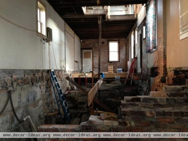
BEFORE: Upstairs they demolished seven rooms with closets and two bathrooms; downstairs, five rooms and one bathroom.
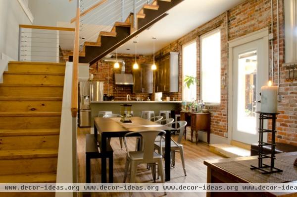
AFTER: Beneath the staircase Lloyd placed a dining table with a bench and metal chairs that can be scooted out during large parties. “It was the best way I could utilize the space and still afford us a formal dining setting for hosting dinners with friends and family,” she says.
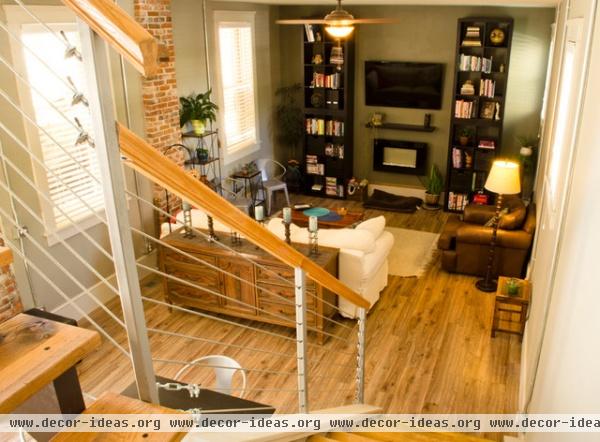
The staircase is one of the main focal points you see when entering. To achieve a sleek, dramatic look, Lloyd scrapped a former single-column staircase from the original building. She also moved the upstairs layout to allow for a larger main room, but also to provide a multilevel staircase to sit right at the entry to the loft. “Structurally and aesthetically, it had to look cool," she says. "The treads are from a 300-year-old barn that was torn down, and we added suspension wire to give it an updated, urban look."
Shelves, mantel: Ikea
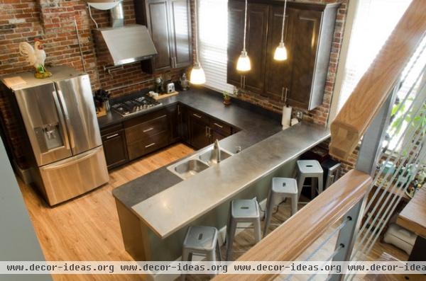
While Lloyd would have liked to invest more in different parts of the loft, she had to work within the parameters of a tight budget, which meant picking and choosing where to splurge and where to save.
In addition to the major redesign of the staircase, which was fairly costly, the kitchen was the other splurge space. “It’s where everyone spends most of their time, including myself. I love cooking,” Lloyd says. From custom cabinetry and a stainless steel bar top to a gas cooktop, a double oven, a pot filler, LG appliances and a stainless hood vented through the building’s old smoke stack, Lloyd outfitted the space with everything she could possibly want for easy entertaining.
Bar stools: Overstock.com; refrigerator, cooktop: LG; hood: Arietta, Home Depot
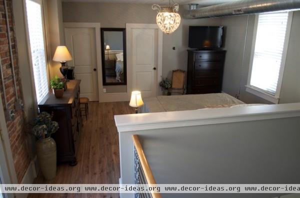
Given the urbanesque brick walls of the historic building, Lloyd’s focus immediately went to an open-space loft. The building was only 15 feet wide, with no load-bearing walls, which gave her the idea to completely open the space up.
"We wanted loft-style living to allow for more natural light to spread throughout the first floor,” says Lloyd, who admits it now forces her and her husband to be tidier. “Because our master bedroom is in a wide-open space, we have to make our bed every day and keep our dirty clothes picked up.”
Mirror: Wal-Mart
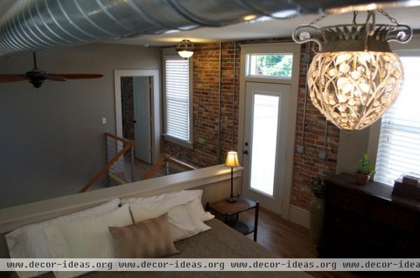
The only doors in the entire space are on bathrooms, closets and the guest bedroom. “We really wanted to allow our guests privacy when they visited," Lloyd says.
To create more space for a first-floor guest bathroom and an adjoining laundry room, she invested in an extension along the back of the building. She opted for a historic-meets-modern feel, using simplicity to breathe more spaciousness into the floor plan while at the same time blending in the amenities necessary for their lifestyle.
“I wanted to embrace the history of the building as well,” she says, which meant pounding away endless amounts of inches-thick plaster to expose the original brick walls; they lend a rich character to the overall design and feel of the home. During demolition Lloyd also saved the old 6-inch trim, painting it off-white to give the small living space a grand feel.
Chandelier: Lowe's; dressers: Ashley Furniture; fan: Home Depot
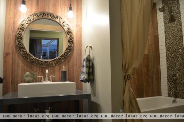
Lloyd’s philosophy on frugality is that “budget items don’t have to be boring,” she says. In fact, she looks at being resourceful as a challenge. Downstairs in the laundry room and guest bathroom addition, Lloyd opted for a gray metal workbench from Home Depot to use with a vessel sink for the main vanity.
She used a basic inexpensive white subway tile for the majority of the shower area, accenting it with a mosaic of more expensive multicolored tiles ($11.99 per square foot). To complete the look, she opted for a moderately priced faux-wood tile ($2.99 per square foot) along the far side of the wall.
She used leftover laminate wood flooring panels up behind the bathroom sink and mirror to extend the look of the faux-wood tiles from the shower.
Workbench: Home Depot; light fixtures; CB2; farmhouse sink: Overstock.com
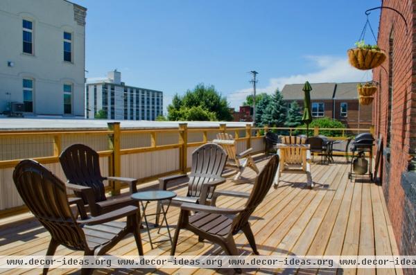
The upstairs portion of the front of the building became the main office for Whaley's media company. They built an expansive second-story deck that connects the loft and the office doors, creating a stress-free morning commute.
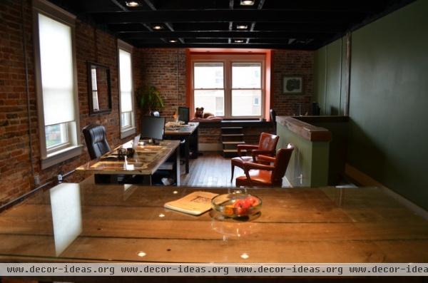
In the 750-square-foot office space, the couple wanted to have a relaxed feel where ideas could flow just like the single beer tap they installed in the kitchenette. “We wanted an office that you would feel like hanging out in at any time of the day, and everyone was welcome,” says Lloyd.
The floors are original. They were simply scrubbed and coated with polyurethane. (If you look closely, you can still see where the old walls stood from the brothel rooms.)
For furniture they relied on what the building had already given them. The conference table is made out of beams from the ceiling of the building and the old 2-by-4 wall studs from the demolition. They fitted old antique doors with glass tops for the office desks and added vintage 1950s orange chairs for guests.
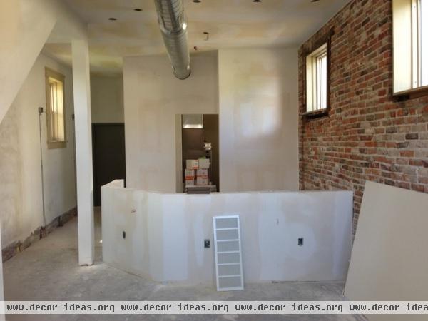
The two are now focusing on finishing their street-level bar, The Volstead, at the front of the building. Sandusky’s history includes a chapter in the 1920s, in which it was a major port for running illegal spirits across the lake from Canada during Prohibition. In honor of the city's place in American spirit history, the bar will feature a curated list of craft cocktails, fine wines and local beers.
Interior design and layout: Nikki Lloyd
General contractor: Ken Russ (Lloyd's cousin), Legends General Contracting


