The Case for In-Between Colors
Quick — what color are your walls?
If you answered with a single word — say, "blue" or "yellow" — perhaps your walls could use a little chromatic intervention.
I've always been a fan of in-between colors — those indescribable shades that fall somewhere between one hue and another on the color wheel. These colors rarely look the same from one time of day to the next. (Much of that is due to the number of pigments used. The more pigments that go into the paint, the more mutable the color.) And because these shades are harder to pin down, you're less likely to grow tired of them.
Scared of color? Or uncertain whether to go wild or mild? These in-between shades can be a great compromise, offering a tease of color without the commitment. And they're so much more interesting than ho-hum neutrals like cream or beige.
Try one of these piquant pigments on your walls. Then, when somebody asks you what the color is, you can tell them, "Well, it's sort of an indescribable mix of ..."
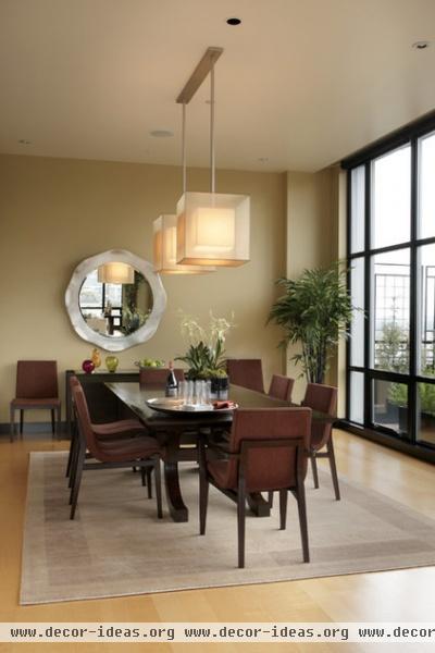
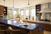
Is this color gold? Or green? It probably depends on the time of day and the weather. Think of it as getting several colors for the price of one.
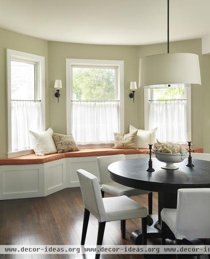
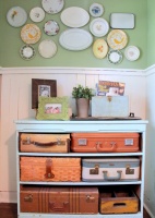
This whisper-soft hue (C2's Vex) is about as un-green as you can get and still be green. And who would have thought of combining green and orange? But here it works.
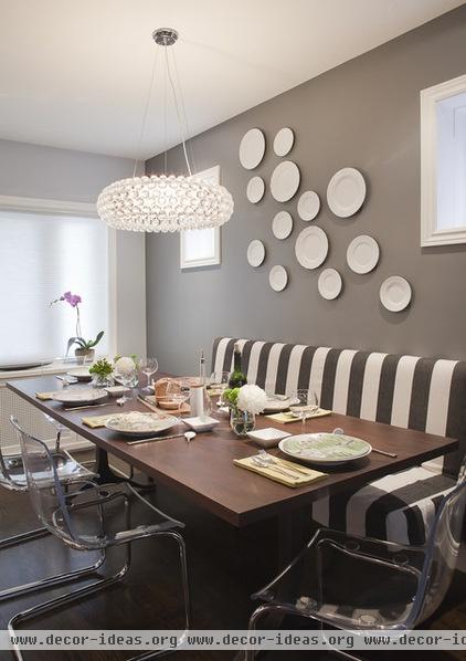
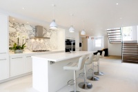
Gray for a dining area? Normally, the color is too chilly. But not here, where it's tempered with enough brown to bring some warmth to the table.

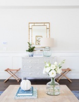
This color (Benjamin Moore's Bennington Gray) tiptoes on the line between gray and beige, offering the sense of a color while remaining firmly in the neutral camp.
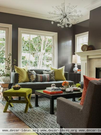
There's enough black in this brown (Benjamin Moore's Silhouette) to make it feel totally fresh. And what a great backdrop for the chartreuse accents!
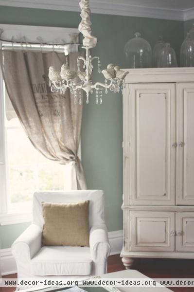
I'm not a huge fan of blue, but I find this shade (Ralph Lauren's Faded Silk) irresistible. There's enough green and gray in it to make it interesting, and as soothing as a bed of clouds.
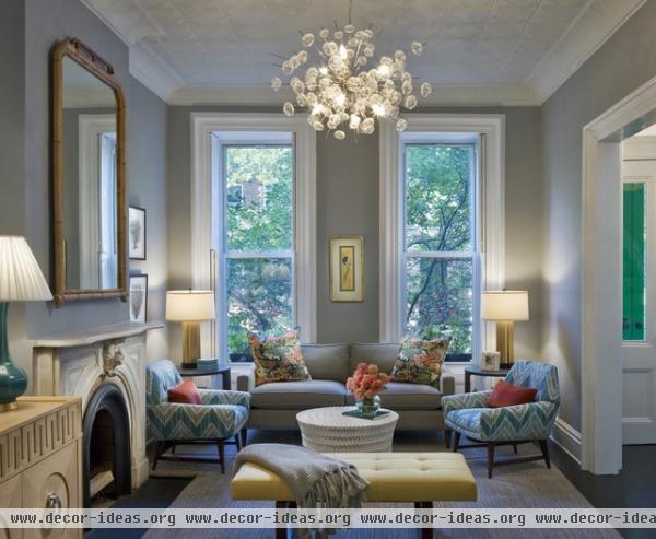
There are a warmth and softness to this gray (Benjamin Moore's Coventry Gray) that belie any associations we might have with that color.
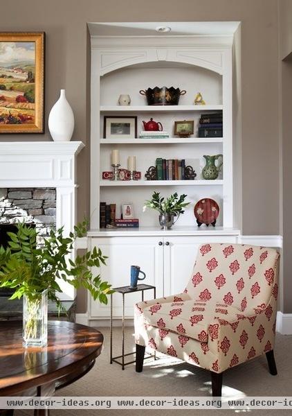
Is it gray? Is it brown? This color (Behr's Stepping Stones) is hard to pin down, and because of that, it captures your interest without drawing too much attention to itself.

Boasting just a whisper of blue, this wall color (Benjamin Moore's Glass Slipper) feels like the perfect fit for this coastal home — but avoids the blue and white beach cliché.

With vaulted ceilings, a stone floor and an open floor plan, this space could easily have looked chilly. But the color (Benjamin Moore's Grant Beige) warms and domesticates the volume and helps anchor the seating areas.
Do you have a favorite in-between color? Please share it with us in the Comments!
More: Going Greige — Tips for Choosing This All-Around Neutral

