Design Workarounds Update an English Heritage Kitchen
Although this family loved their 17th-century English heritage home's character, the kitchen left some things to be desired. Cramped quarters, poor storage organization and a burdensome layout made the dark kitchen feel much smaller than its 350 square feet.
Stuck with the original historic home's structure, designer Nick Pearce worked closely with the clients to take full advantage of the spacious layout. The existing walls needed to remain, but Pearce shuffled specific functions to each of the kitchen's various nooks and crannies to divide up the cooking and cleaning areas per the clients' request.
The layout is unconventional, but a light and bright material palette, plenty of windows and select modern luxuries updated this historic space with classic style.
Kitchen at a Glance
Who lives here: A British family of 4
Location: Buckinghamshire, England
Size: 350 square feet
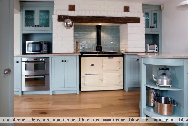
The exposed beam and brickwork around the stove are original; Pearce simply painted the brick white and added new glass tiles for a backsplash. The previous homeowners purchased the oil-fired Aga stove, which fits right in.
The brick pillars on either side of the range extend all the way down to the floor, creating very shallow cabinets on either side. These cabinets are now the perfect storage spots for spices and condiments.
Backsplash tile: Liquid Glass Ice, Fired Earth; oven: oil-fired Aga 2
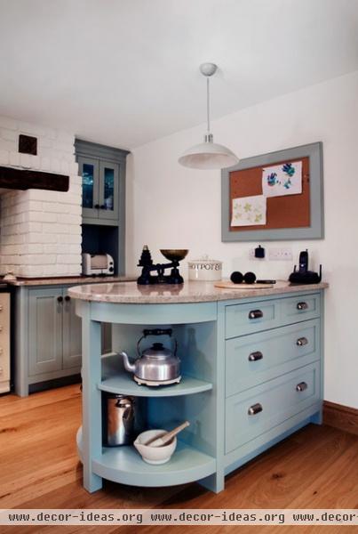
The family wanted a light, bright material palette to transform the feel of this kitchen. Kashmir Cream granite counters in the wet and heavily used areas — including the food-prep island and around the sink and stove — will stand up to wear and tear. Black walnut counters run along the storage sections of cabinetry to soften the space.
Island paint: Celestial Blue, Little Greene
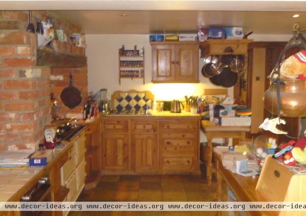
BEFORE: The old material palette made the kitchen feel dark and outdated. The layout bunched all of the cooking and cleaning zones up near the range, leaving little room for counter space and storage.
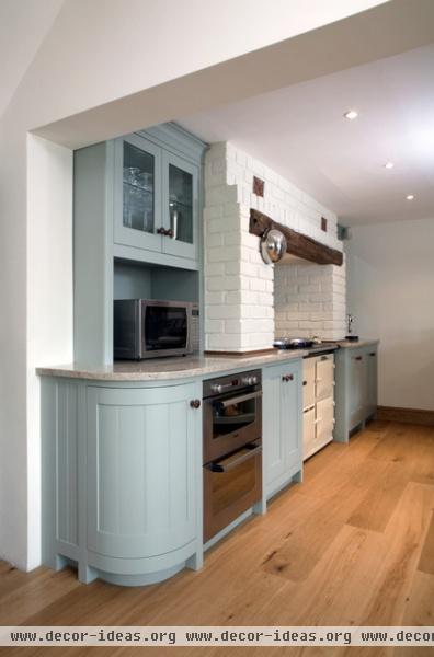
AFTER: The clients started out with an off-white hue for the cabinetry but ended up going with this soft blue, since it felt more like a heritage color. "It was a brave choice, but I'm really pleased that this is what they wanted," says Pearce. "It works so well with all of the other material choices — a cream would've looked too washed out."
Microwave: Panasonic; ovens: convection, Bosch
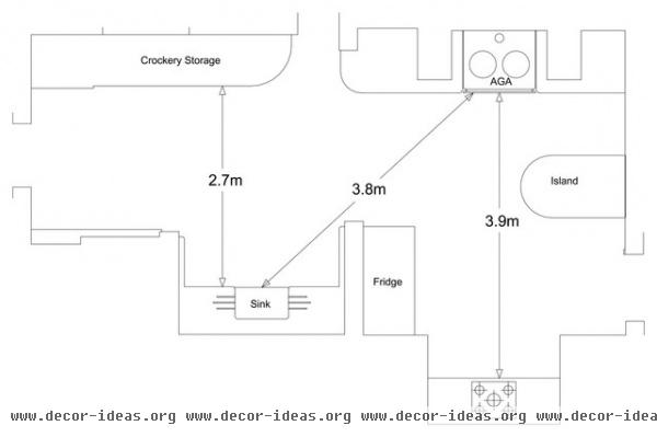
Since the homeowners didn't have the option of changing the structure's layout or exterior walls, all of the existing nooks and crannies in the original kitchen dictated this new kitchen floor plan. The clients put a lot of thought into what would work best for them and delegated cleaning to one particular space.
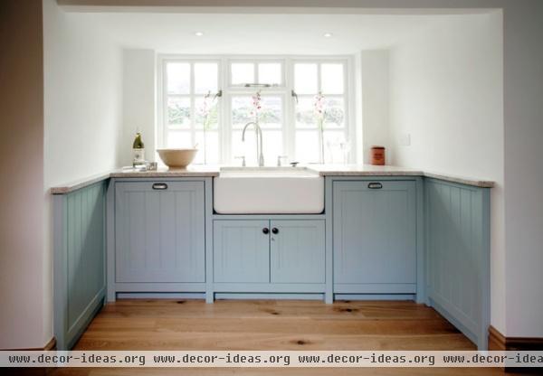
Once the clients finish eating at the island, they can take everything to this sink, dishwasher and trash nook for cleanup. Once the dishes are clean, they can put them in the storage area directly across from the sink.
The design might not be for everyone, but these clients wanted to keep the two areas separate while maintaining the original layout, so they didn't mind having to walk a few paces to the sink. The distance from the range to the sink is about 12 feet — similar to what it'd be in other, larger kitchens.
"The flow around the kitchen work triangle works really well," says Pearce. "Although it may take a few steps to get from, say, the range to the sink, its an easily unnoticeable distance."
Sink: Shaws of Darwen
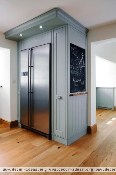
The new kitchen layout spreads out over 350 square feet, with cooking zones at one end and cleaning zones at the other end. The fridge sits conveniently between the sink and the second range, dividing the cooking and cleaning zones. The clients often fill up a pitcher of water to use for adding water to the dishes, and simply carry any pots that might need draining to the sink.
Refrigerator: Samsung
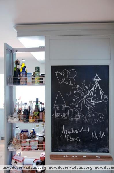
Pearce put pullout mechanisms in the custom cabinetry to keep things organized. This pantry in the custom cabinet around the refrigerator makes it easy to unload groceries in one spot.
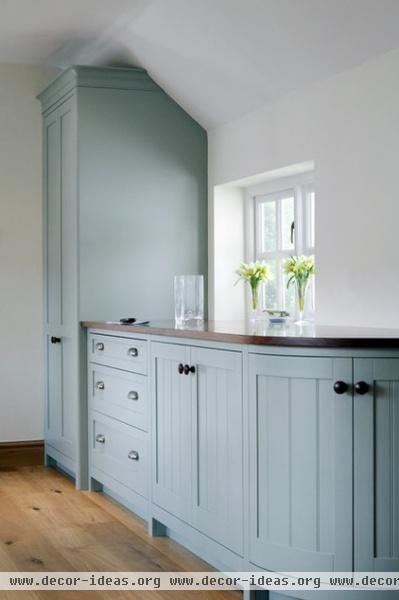
The layout of the kitchen allows for windows spaced along both longer walls. Pearce kept each window so the space gets bathed in natural light throughout the day.
Fixtures: cast-pewter shell handles, Finesse


