Houzz Tour: Old Foundation, New Marvel
The office of New York City's Rafael Viñoly Architects is known for large projects that tend to run on the order of hundreds of thousands of square feet, rather than thousands. Chan-Li Lin, a director and partner at the firm, is actually working on a 1.1 million-square-foot health-care facility for Stanford University in California; previously he had lived in Japan to oversee the design of the 1.5-million-square-foot Tokyo International Forum. But when it came time for Lin and his wife, Denise Ferris, also an architect, to design and build a weekend house for themselves north of New York City, they opted for a manageable size, reusing the foundation of a teardown on the site and suspending part of the top floor in a dramatic fashion.
Houzz at a Glance
Who lives here: This is a weekend home for Chan-Li Lin and Denise Ferris.
Location: Waccabuc, New York
Size: 2,170 square feet
Photographs: Brad Feinkopf
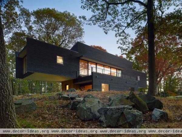
The house is basically made up of two volumes: a squarish lower floor that is built upon the existing foundation atop a hill on the 3-acre site, and a linear bar of the upper floor that cantilevers 20 feet on both the east and west ends.
Here we are looking at the south elevation of the house, which takes advantage of the sun through a large expanse of glass in the middle of the upper floor, adjacent to a roof terrace atop the first-floor volume.
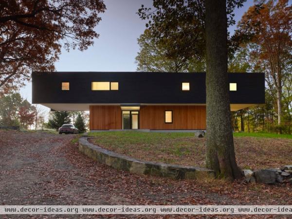
The north side, on the other hand, is primarily closed, with only a few small openings and the main entry to the dwelling. Here there is an obvious distinction between the lower floor and the upper floor — both are clad in cedar, but the latter is stained black, while the former is left in a more natural finish.
This distinction responds to different structural systems; the lower floor utilizes conventional wood framing, but the upper floor requires a special lightweight truss system sitting on six columns anchored into the rock below.
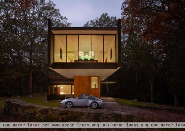
The east cantilever functions as a carport. Above it we can see the dining table through a full-height wall of glass and aluminum framing. The extensions of the walls and roof beyond the glass walls on the end aid in shading.
The room we see on the lower floor to the left is one of the two bedrooms occupying the piece below the roof terrace.
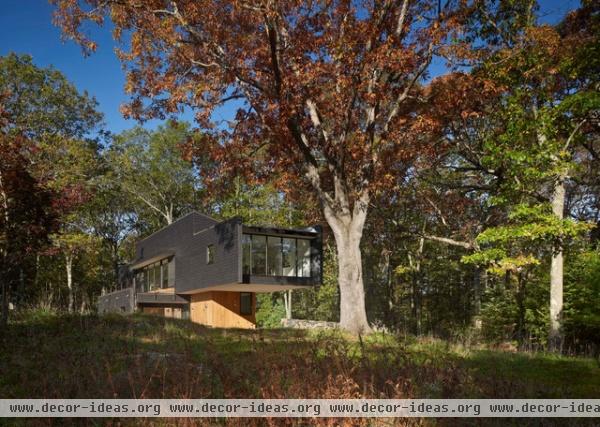
The cantilever on the west side reaches toward a large tree that aids in shading in the afternoon. Given that Lin and Ferris opted to reuse the foundation of the 1950s one-story house, no trees were lost in the construction.
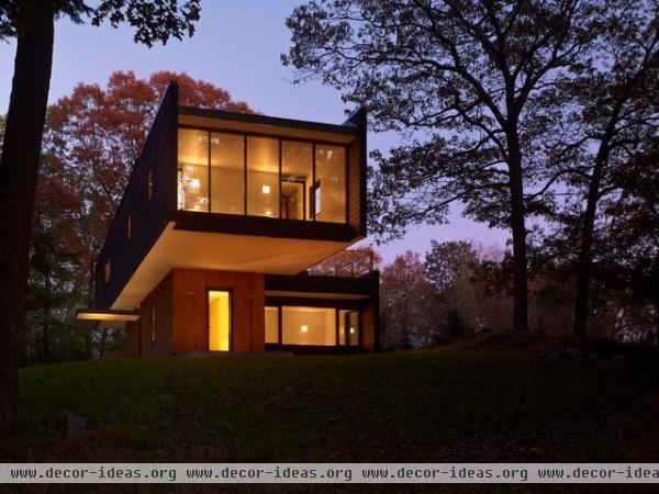
On the far west side of the upper floor is the master bedroom, done in a similar fashion to the dining room on the east (full-height glazing; wall and roof extensions). Below it and to the side we can see the other bedroom below the roof terrace.
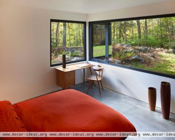
Before heading upstairs it's worth taking a quick look at one of the bedrooms downstairs. The horizontal window that wraps the corner accentuates the close horizon — the meeting of the trees and the ground. The operable window next to the desk is a nice touch that makes this corner a great place to sit at and be distracted while working.
Radiant concrete floors can be seen here; they occur throughout the house.
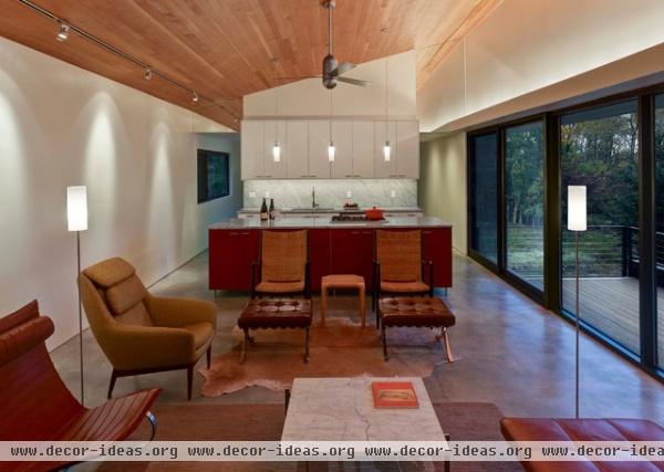
Not surprisingly, the interior of the upper floor is primarily open, taking advantage of the north-south cross ventilation of the narrow footprint. Note how the living space in the middle of the plan is raised, with a sloped ceiling overhead.
In this view we are looking east toward the open kitchen and the dining room beyond it — a pantry and stair connecting the two floors separate the two.
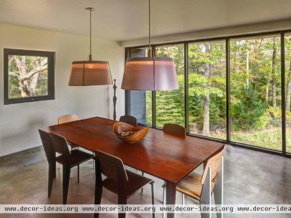
It's not hard to see the appeal of the dining room and its view of the surrounding trees. The small operable windows on the north and south allow for cross ventilation as well as more carefully framed views of the trees. I'm often amazed how much more strongly a small window framing a view can capture our attention relative to an expansive opening.
Like the midcentury furnishings elsewhere, these Jean Prouvé chairs and table work really well in the space.
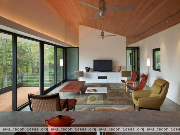
Back in the living area, this time we're looking toward the west and the master bedroom beyond the wall that serves as a backdrop for the television. Access to the bedroom is on the right, and the frosted glass on the left shields the shower of the master bath.
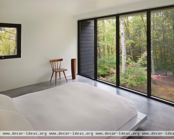
The master bedroom echoes what we saw in the dining room, with expansive glass and smaller windows. Note how the floor's stopping at the glass (rather than extending like the walls and roof) accentuates the continuation of the view below the floor.
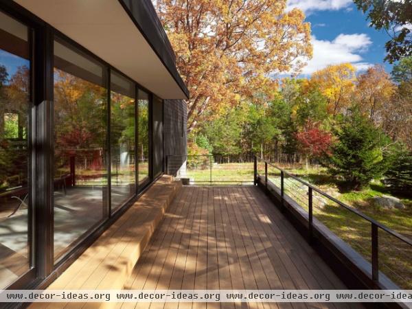
The south-facing roof terrace off the living room is the design's raison d'être. Lin and Ferris scaled the roof of the old house before its demolition, realizing the view from up high was amazing. The offset cantilever over the lower volume, as well as the location of the living space upstairs, allows this view to be ever present and easily accessible.


