7 Dramatic Bathroom Makeovers Across All Styles
http://decor-ideas.org 08/23/2013 11:10 Decor Ideas
I love dramatic before-and-after reveals, and they never seem to get more dramatic than in the bathroom. We've dug into many of these remodels on Houzz, from those that involved homeowner ingenuity, creative sourcing and DIY efforts to those with budgets that could cover an entire house. Here's a glimpse of every kind of remodel, from those that required one talented homeowner to those that took a village to complete, in no particular order. In case you want to know more about any particular remodel, I've provided links to the full stories.
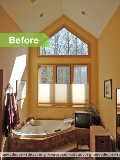
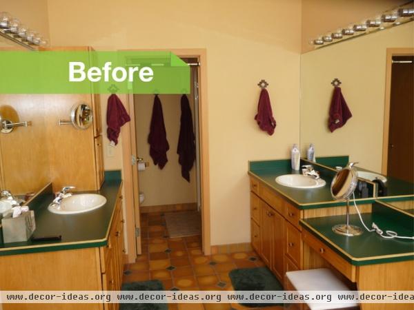
1. From dated Southwestern to harmonious contemporary in Cleveland.
Architect Ryan Duebber had his work cut out for him when it came to the odd proportions and awkward configuration of this master bathroom.
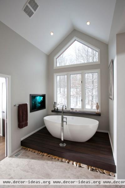
AFTER: Duebber took the room down to the studs and started with a clean slate, careful to add only pieces that enhanced the minimalist space and created serenity. Materials like Brazilian massaranduba wood, stones and natural-cut limestone tile add organic warmth.
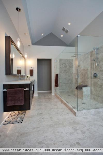
AFTER: A once-cluttered vanity area now has one dark-stained maple floating vanity with a light glowing over restful rocks underneath. A clear glass shower stall continues the streamlined effect.
See more of this renovation
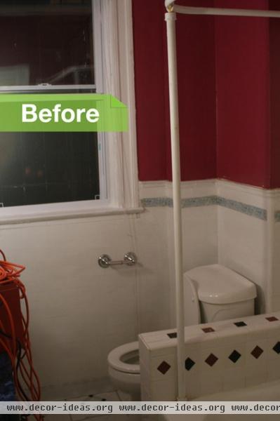
2. From plagued with problems to classic vintage style in Washington, D.C.
Underneath the ugly red walls and dated tiles of this bathroom lurked a host of plumbing and electrical problems, as well as rotting wood. Clever homeowner Megan Adams found ways to save money, completing the restoration for around $10,000.
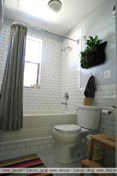
AFTER: One way she balanced the budget was finding a salvaged bathtub and sink at Second Chance in Baltimore for about $200.
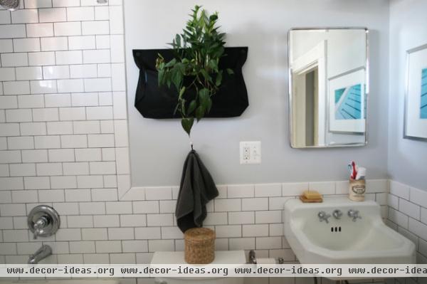
Sticking with a classic subway tile on the tub surround, backsplash and walls is a relatively inexpensive choice, and the look will never go out of style. Gray grout in between is much easier to keep looking clean.
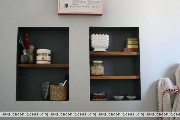
Simple wall niches give Adams a place to store and display pretty soaps and vintage finds.
Learn more about this renovation
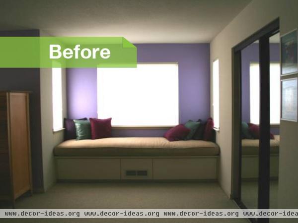
3. Totally '80s style gets a fresh layout and contemporary look in Sonoma.
This California condo's master suite was full of wasted space yet had a very cramped little bathroom.
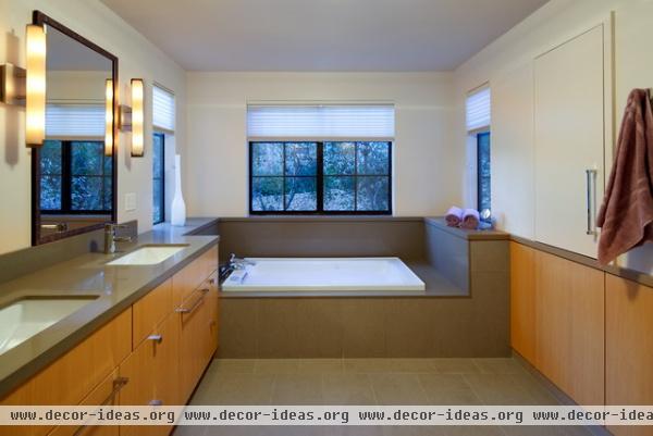
AFTER: Architect Amy Alper commandeered the wasted dressing area and window seat space and turned it into a relaxing tub and sink room. She maintained a continuous line from the counters around the room, which is easy on the eyes and provides balance from side to side.
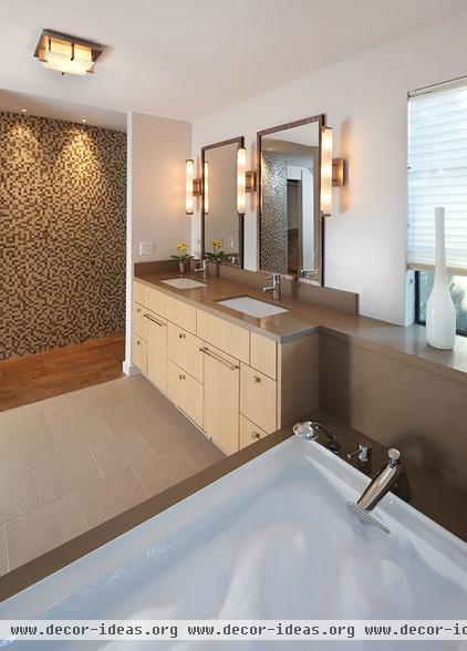
A curved wall is covered in glass mosaic tile, and a cork floor connects the tub room with the master bedroom, the toilet and shower room, and the closet.
See the rest of this renovation
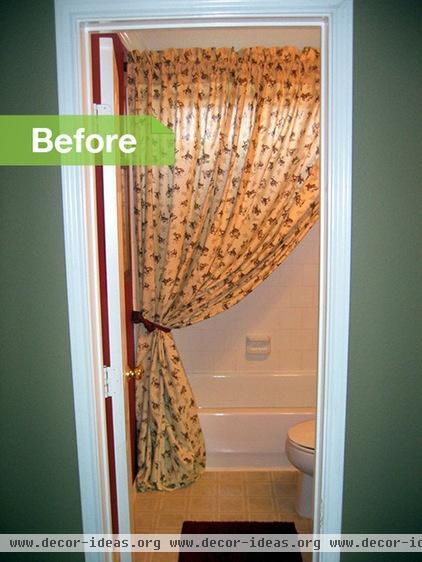
4. Clever salvage solutions add elegance in Texas.
This bathroom was not giving furniture dealer and stylist Brad Ross and his wife, Tiffany, the Parisian elegance they were yearning for.
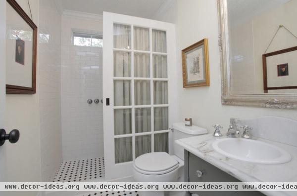
AFTER: Doing the work himself, Ross transformed a French door into a shower stall divider, which not only saved a lot of money but also inspired the style of the rest of the room. A repurposed sewing machine cabinet painted gray, topped with marble and adorned with glass knobs, adds elegance, as does a thrifted silver-framed mirror.
See the rest of this renovation
5. From drafty to dreamy in Massachusetts.
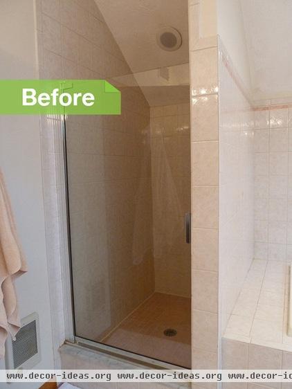
This New England bathroom was not only drab and closed in but also cold. Located over an unheated garage, it had been built before things like LEED and tight envelopes were considered in construction, and thus was drafty and inefficient.
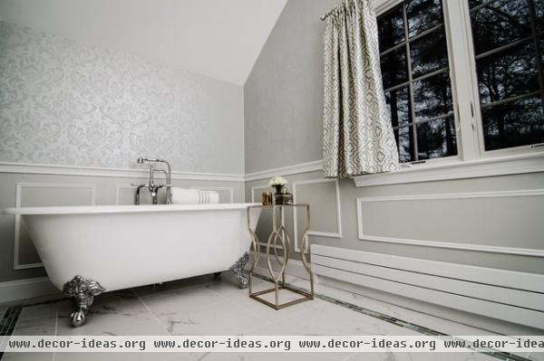
AFTER: A full gut renovation by designer Megan Meyers included adding radiant heat floors, a baseboard heating system, a heated European towel bar, a volcanic limestone bathtub and a more energy-efficient window to help hold in the heat.
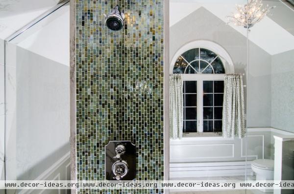
As for the decor, clear glass in the shower makes the room look larger and provides clear views. A mix of porcelain and glass tiles adds elegance and color, and the stenciled walls have an ornate yet subtle pattern.
See the rest of this renovation
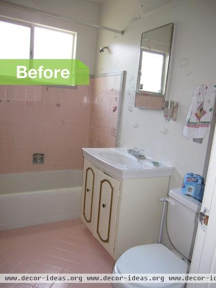
6. From '50s Pepto pink to bright and clean blue in the San Francisco Bay Area.
Scary clanking noises and bad electrical work were a recipe for disaster in this bath. In addition the layout, style and storage were not working for this mom and her 9-year-old daughter.
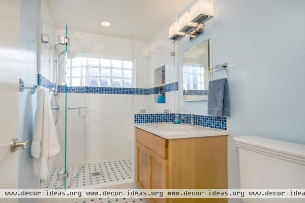
AFTER: Bill Fry Construction converted the never-used bathtub into a shower with a clear glass surround and brightened up the space with blue mosaic tiles the daughter helped choose. Along with a new window, the color and material palette infused the space with vibrance and a zestfully clean feeling.
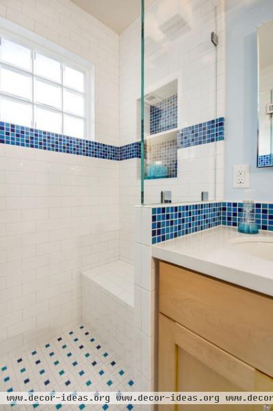
Details like shower niches and a shower bench maximize comfort and function.
Learn more about this remodel
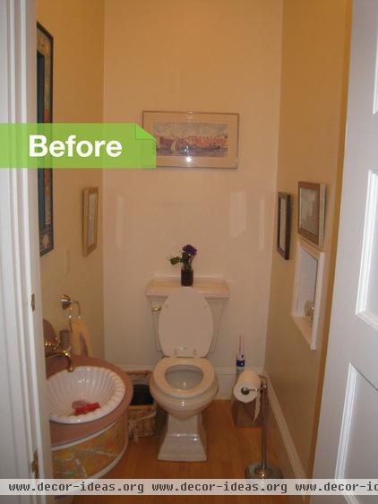
7. A narrow powder room gets a whole new perspective in Alameda, California.
I think this is the tiniest room I've ever written about on Houzz, and it may have inspired the largest response.
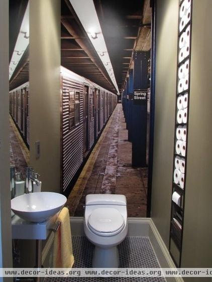
AFTER: Interior designer Lisa Konjicek-Segundo of Olive Juice Designs took the homeowners' love of all things NYC and transformed their bathroom floor into a subway platform, thanks to an oversize photograph of a subway station with just the right perspective.
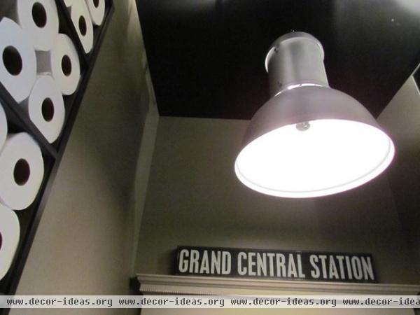
Every detail was carefully considered, from the industrial pendant to the way the round holes in toilet paper rolls could be used to make a graphic installation in a shallow wall niche.
Learn more about this remodel | More clever ways to stash toilet paper
Show us your bathroom makeover: Post your before and after shots in the Comments!
Related Articles Recommended


