Kitchen of the Week: Modern Summer Camp Style in Maine
Despite their love of clean and modern design, this East Coast family of five knew that style wasn't quite right for their lakefront vacation home. Aiming for a more relaxed style, they hired designer Kristina Crestin to give their house a summer-camp feel that wouldn't conflict with their architectural instincts. "It was a total material palette conundrum," Crestin says.
She embraced the concept of a modern summer camp with a fresh color palette and rustic barn wood accents. Sturdy concrete countertops, plenty of storage and extra-wide walkways make it comfortable and fun to cook and entertain here.
Kitchen at a Glance
Who lives here: This kitchen is in a vacation home for a family of 5.
Location: On a lake in Maine
Size: 260 square feet
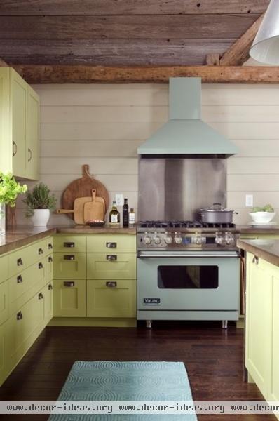
The family wanted a kitchen that could work for just them or 20 friends without having to change a thing. Crestin designed it with spacious walkways so people can work at the counter, lean against the cabinetry, chat and snack all at once. The wide space created a big work triangle, but the separate zones prevent people from running into one another.
Range, hood: Viking, Mint Julep; interior millwork: Dunn Builders; cabinetry: Dunn Builders, Dagtone Woodworks
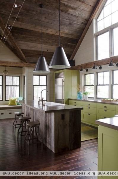
The kitchen opens to the living space, perfect for a vacation home. The window seat at the end is only 20 feet from the waterline. Thanks to the two window walls, the room gets a clear view of the sunrise and sunset on the lake.
Reclaimed materials, including locally salvaged barn boards on the ceiling, help create a camp feel.
Window lighting: Boston Functional Library wall light, Visual Comfort; bar stools: Crate & Barrel; faucet: Rohl
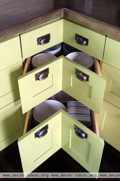
The window walls eliminated the potential for upper cabinetry, but the large footprint allowed for plenty of storage, including 36-inch-deep drawers in all the lower cabinets. A pantry behind the stove area holds big pots, serving dishes and small appliances not used every day.
Counters: concrete, Stonecraft; paint: La Fonda Olive, Valspar
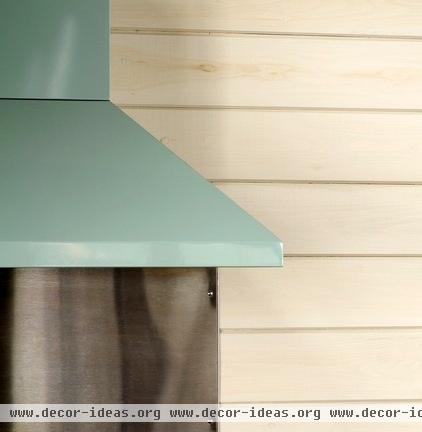
Pine wood grain is visible through the whitewashed walls. The white helps balance out the rustic barn board accents. "You can't have it all," says Crestin. "I like for one material to be the sparkly item in a room."
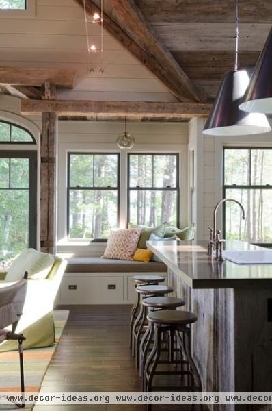
Despite the large island, the middle of the kitchen felt empty, so Crestin encouraged the client to go with a big, architectural lighting fixture. These large bronze fixtures were inspired by the client's love of the kitchen fixtures in the Nancy Meyers film It's Complicated.
Island lighting: Goodman pendants, Visual Comfort
Architect: Art Dioli, Olson Lewis
Contractor: Ron Dunn, Dunn Builders
Photographer: Jamie Salomon


