My Houzz: Midcentury Modern Style Transforms a Vineyard Bungalow
Tamara Woolgar was feeling hemmed in by Toronto's concrete skyline and missed the open prairies and mountains of her hometown of Calgary, Alberta. Craving a respite from the bustling city, Woolgar and partner Dave Suydam bought a simple 1960s bungalow nestled between vineyards and peach orchards in one of Canada's lush wine country towns. They set to work on a midcentury-inspired renovation, executing a complete overhaul of the first floor and adding a second story designed as a private getaway to capitalize on the stunning views.
Houzz at a Glance
Who lives here: Tamara Woolgar, Dave Suydam and their 3 daughters
Location: Near Niagara-on-the-Lake, Ontario, Canada
Size: 2,664 square feet plus an 8-acre vineyard
; 4 bedrooms, 2½ baths, garage
![traditional My Houzz: Niagara Vineyard Renovation [In Progress]](http://www.decor-ideas.org/upload/cases/2013-08-22/photos/middle/2114620130822104209972050432300.jpg)
The existing house was cramped for a family of five, and ill suited to take advantage of its spectacular surroundings, but its general layout informed the new design. The couple maintained the existing footprint, building up instead of out.
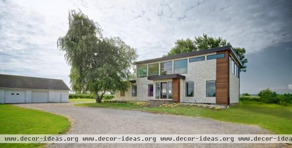
AFTER: The couple left the garage as they found it but stripped the bungalow down to the studs, completely modernizing the structure and adding an extra floor. In a nod to the original house, they kept the existing front steps intact.
They worked with a local architect to prepare permit drawings, and with a contractor for the build, but handled the design work, planning and material selection on their own.
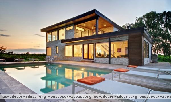
They reorganized the ground-floor layout to include bedrooms for the three children; a bathroom; an open-plan kitchen, dining and living space; and a small TV nook. The newly created second floor contains spaces intended just for the couple. Smaller in size, this level is also an open plan and contains an office, a sitting area, a semiprivate bedroom, a main en suite and a south-facing patio.
On all four sides of the house are large, full-height windows shaded by deep overhangs, designed to keep the house cool in summer and allow winter sunlight in for added warmth. A geothermal system installed under the driveway helps regulate temperature as well.
The large main-floor patio doubles the size of the living space in the summer, and a solar-heated saltwater pool helps draw cool air through the patio doors (not to mention being the kids' favorite way to combat the heat when the mercury rises).
Windows, doors: Marvin; pool: Boldt Pools & Spas; orange and aqua doormats: Maine Float Rope Company
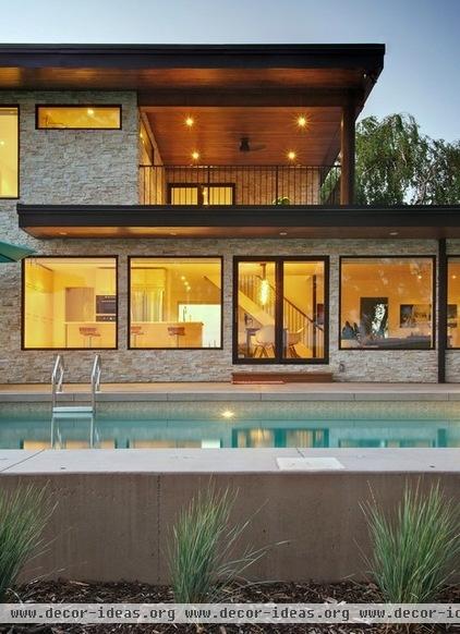
Woolgar was fascinated by midcentury modern design for many years before renovating. She read up on architects and designers like Charles and Ray Eames, Richard Neutra and George Nelson, and admired homes like the Farnsworth House and Koenig’s Case Study House #22. She developed a clear vision for the home: something open, simple and linear, with a lot of natural light for warmth and color.
With the help of Suydam, she chose a neutral palette of natural materials for the exterior cladding: quartzite ledgestone veneer and stained wood. The minimalist window frames were painted black to draw in the views, and the couple chose the same shade for the fascia, helping to emphasize the structure's linearity.
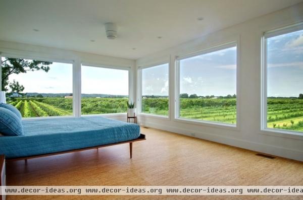
Facing south and west, the corner bedroom is perfectly situated to capture the breathtaking Niagara sunsets, rolling thunderstorms and Canada Day fireworks. Being a floor higher completely changes the views on their level plot of land, as distant vistas become framed through wraparound Marvin windows. The pair installed cork floors in the bedroom and throughout most of the house.
Bed: American Modern, Design Within Reach
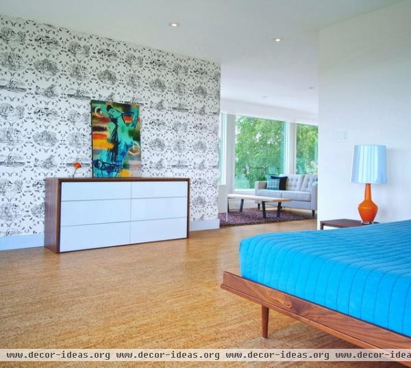
The bedroom is partially isolated from the rest of the upstairs living area, allowing it to feel like its own space while still maintaining an open layout. The owners' penchant for midcentury design is countered by their edgy and irreverent taste in decor and art. Here they matched a graphic navy and pearl wallpaper pattern from Flavor Paper with a color-splashed print by Toronto artist Denial.
Dresser: Morgan, Structube; lamp: Capri Bottle Lamp, Jonathan Adler; wallpaper: Sassy Toile, Flavor Paper
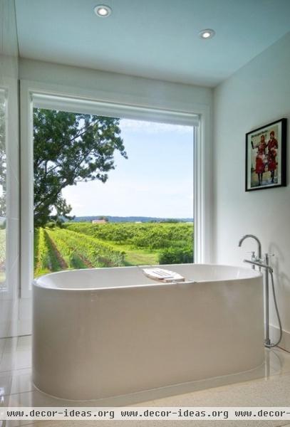
The focal point of the bathroom is a large soaker tub, centrally located near a large south-facing window. The view is perfectly framed, offering the perfect spot for sitting and watching the sun cross the sky.
The homeowners installed blinds by SelectBlinds in the bathroom and throughout the house.
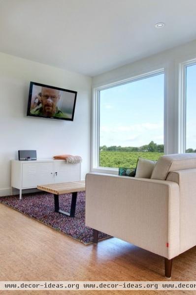
The couple rented a cottage in south-central Ontario a few summers before embarking on their renovation and loved that the house had a partial second-story adults-only area that contained the main bedroom, office, sitting area and en suite. The daughters had the run of the main floor and basement, so the second floor became a private getaway. From the get-go, they knew they wanted to replicate that feeling in their own home.
Sofa: Reverie Apartment Sofa, EQ3; cabinet: PS, Ikea; area rug: Örsted, Ikea
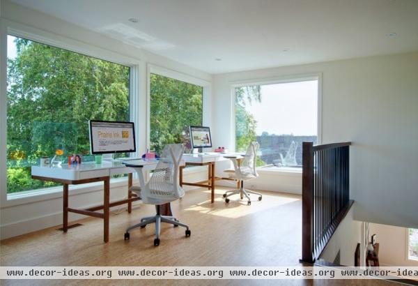
The two often work in this home office. Woolgar is the owner of Prairie Ink PR, a PR and communications firm, while Suydam is the president of Architech, a company focused on software strategy, design and development. Matching desks and Herman Miller office chairs face north and are positioned near the canopy of a large tree to help cut down on direct sunlight. Though they currently work and live in Toronto, the two visit this home whenever possible and plan to eventually move here full time.
Desks: Adel, Structube; office chairs: Sayl, Herman Miller
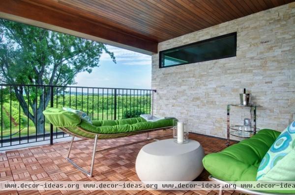
Just off the office is a south-facing patio, affording some private exterior space to take in the warm summer nights. Outdoor furniture matches the colors of the vineyard below.
Bar cart: Ernest, CB2; outdoor seating: Tropea Lounger, The Bay; coffee table: Pebble, West Elm; hurricane lamp: Tubie, CB2
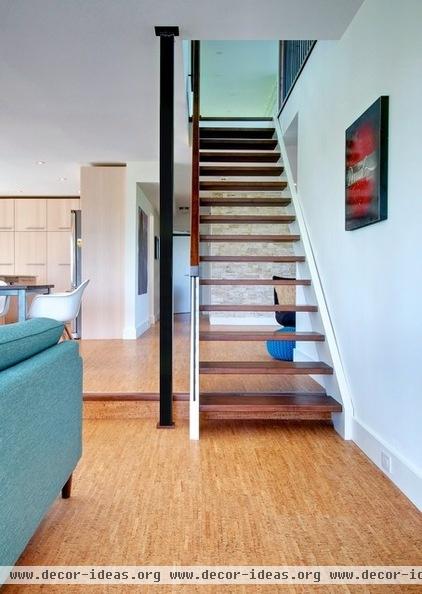
Since the stairs are so visible in the new layout, the pair opted for an open-riser design to keep the system looking as light and transparent as possible. They used maple for the treads, stained to match the vintage dining table.
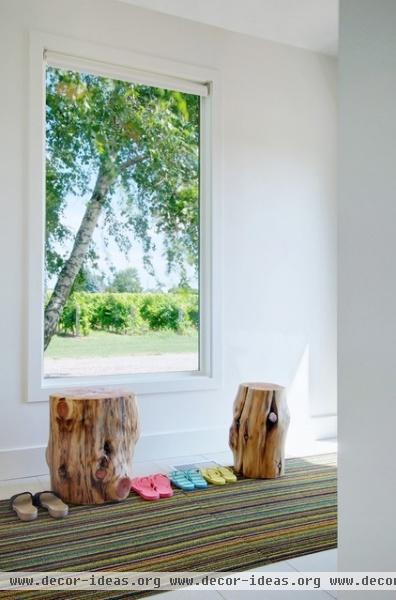
The tiled mudroom is where the family typically enters the house. Log stumps from West Elm mimic the trees through the window; the kids pull their shoes off here when they comes indoors.
Log stumps: West Elm; doormat: Skinny Stripe, Chilewach
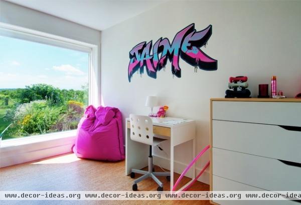
Pink accessories decorate one of the daughter’s bedrooms, offset by white and two-tone furniture from Ikea.
Dresser: Mandal; desk: Micke; office chair: Jules, all three pieces from Ikea; graffiti decal: Scribble On Everything
![traditional My Houzz: Niagara Vineyard Renovation [In Progress]](http://www.decor-ideas.org/upload/cases/2013-08-22/photos/middle/2114620130822104238244019602400.jpg)
The previous owners had a formal sitting room just off the main entrance that was underutilized. It functioned more as a pass-through to the rest of the house.
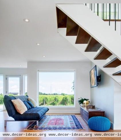
AFTER: The renovation opened up the front area to the rest of the home, allowing guests to flow more easily into the main living space. The revised furniture arrangement created a nook for the kids to read and watch TV in, while the sofa (from Structube) provides overnight accommodations in a pinch.
Sofa bed: Flow, Structube; credenza: Line Media Console, Design Within Reach; pouf: Knitted Pool Pouf, CB2
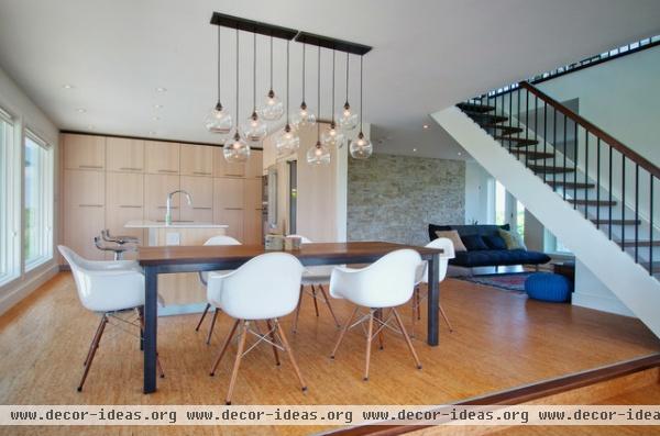
A view from the sitting area shows how the main spaces now feed into one another. Groupings of furniture and strong centerpieces, like the lighting fixture, help to delineate different areas. The fixture is actually made up of two pendants — the Firefly, from CB2.
Dining table: 2Loons, Design Republic; bowls: Loyal Loot Log Bowls, Kit Interior Objects
![My Houzz: Niagara Vineyard Renovation [In Progress]](http://www.decor-ideas.org/upload/cases/2013-08-22/photos/middle/2114620130822104250255094677000.jpg)
The dark walls and oak veneer cabinetry combined with dated linoleum floors and an inefficient layout made the former kitchen seem more cramped than it actually was.
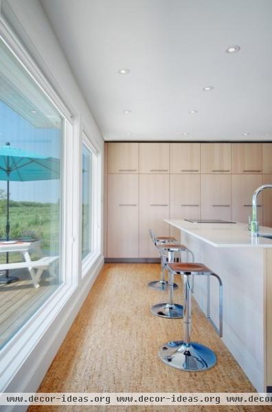
AFTER: Woolgar and Suydam pulled all cabinetry off the rear wall so they could maximize the south-facing window openings. They designed the area around off-the-shelf Ikea components, but the kitchen appears custom. The existing ceiling height ended up being taller than the full height Ikea cabinetry and while they couple anticipated closing the gap, they ended up leaving it as is. They paired the birch cabinets with minimalist Caeserstone countertops and linear door pulls to complete the look.
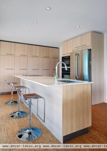
The replanned kitchen is organized around a central island, ensuring that the space doesn’t feel cut off from the rest of the house. Because the cooktop needed to be in the island, the pair installed a Broan downdraft hood that hides when not in use. This allows for uninterrupted views while cooking.
![traditional My Houzz: Niagara Vineyard Renovation [In Progress]](http://www.decor-ideas.org/upload/cases/2013-08-22/photos/middle/2114620130822104257340078929500.jpg)
The view from the sitting room into the rest of the house shows how broken up the former living space used to be.
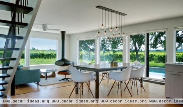
AFTER: With the main partition walls removed and the size and number of windows greatly increased, the main floor takes on an entirely different feel. It’s often hard to imagine this project is a renovation and not a new build.
Standing at the center of the space is a vintage maple table from Design Republic surrounded by replica Eames molded plastic chairs.
![traditional My Houzz: Niagara Vineyard Renovation [In Progress]](http://www.decor-ideas.org/upload/cases/2013-08-22/photos/middle/2114620130822104302421031410000.jpg)
The existing living room was crowded with furniture and blocked the only full-height views to the outside.
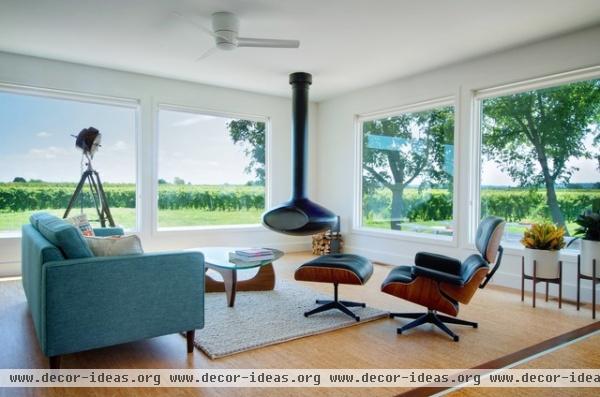
AFTER: Now anchored by a striking floating hearth from Fireorb, the main seating area mixes midcentury classics with newer pieces from CB2 and EQ3. As with the rest of the house, the decor is kept to a minimum to allow the sweeping views to take center stage.
Located in the southeast corner of the house, the space captures the morning sunrise as well as diffuses light through the trees throughout the rest of the day. “We never get tired of waking up to that view or watching the sunsets, hearing the birds and spying on local wildlife," Woolgar says. "We know how fortunate we are to be here — and there’s not a day that we take it for granted.“
Wood-burning fireplace: Fireorb; planters: Case Study, Room & Board
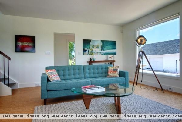
Though quirky touches can be found throughout each space, midcentury design is truly the foundation for the couple’s design aesthetic, both in architecture and interior decor. Woolgar stuck with clean lines and pared-back furnishings as much as possible.
Artwork: "Enjoy Denial" painting by Denial and samurai wall mural by Camilla D'Errico, Eyes On Walls; sofa: Reverie, EQ3; rug: Tiller, EQ3
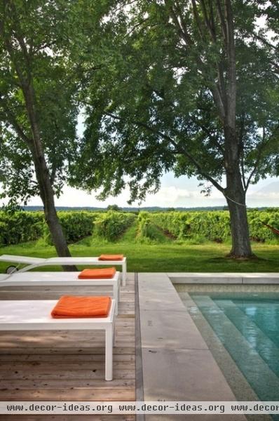
Unbeknownst to Woolgar and Suydam, the vineyard they purchased is one of the most sought after in all of Niagara County (a major wine-producing region in Canada). The local community breathed a sigh of relief when the pair called upon one of the premier viticulturists in the region to take care of the vines, ensuring that the chardonnay grapes grown on their land would continue to be made into award-winning white wines by wineries like Peller Estates, Lailey and Ravine.
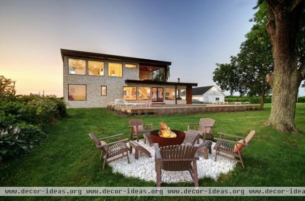
A few steps away from the patio, a sculptural Cor-Ten fire bowl by John T. Unger modernizes the ritual of sitting around the fire. The kids love to hang out here at night and play cards or make s’mores.
The couple completed the renovation in the fall of 2012, so the landscaping is still a work in progress. So far, with the help of Kiva Landscaping Design, they have planted blue fescue around the pool and russian sage, blue hostas and a variety of tall grasses on the north and east sides, and have laid river rock adjacent to the house. They opted not to overdesign the landscaping, wanting it to be fairly easy and natural, in keeping with their surroundings. Next summer they plan to replace the overgrown foliage near the fire bowl with a row of Silver Feather grass.
Fire bowl: John T. Unger; landscaping (in progress): Kiva Landscaping Design
Show us your home!
Browse more homes by style:
Small Homes | Colorful Homes| Eclectic Homes | Modern Homes | Contemporary Homes
Midcentury Homes | Ranch Homes | Traditional Homes |Barn Homes
Townhouses | Apartments |Lofts | Vacation Homes


