The Classic Gable Takes a New Turn
Swiss architects Jacques Herzog and Pierre de Meuron call the gable form the "ur-type" of house, and they have abstracted it in residential and other commissions, including the Parrish Art Museum in Long Island, New York. A project that incorporates the same form is VitraHaus, a five-story showroom for Vitra — the Swiss furniture company known for producing modern and contemporary designs by the likes of Charles and Ray Eames, Jean Prouvé and the Bouroullec brothers — on its campus in Weil am Rhein, Germany.
One way of describing the project would be "crazy gables"; it's a project that certainly would fit into my previous ideabook on gables with difference, since the forms overlap one another in an apparently random configuration. Inside the seamless spaces created by the overlapping and stacking work remarkably well, displaying Vitra's furnishings in homelike settings, with the surroundings framed by glass walls at the end of each space.
This ideabook ventures inside the VitraHaus to see what can be learned by Herzog & de Meuron's manipulation of the ur-type, one of the most lasting and malleable forms in architecture.
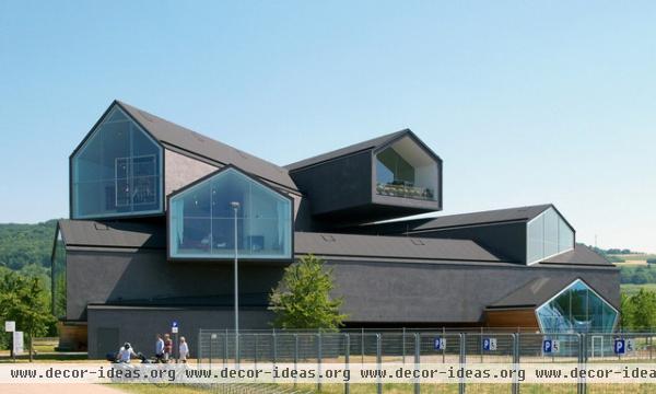
The building can be approached from multiple directions — from the parking lot, the museum or the street — and in each case it presents a similar appearance as well as a portal to an interior plaza and the building's main entrance. The glass ends hint at the views in the showrooms, each one pointing in a different direction.
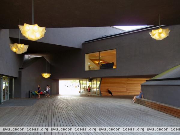
In the center of the building is an open space, a plaza that is adjacent to the main entrance. Visiting on a hot and humid day, I can say this space did a good job in cooling through shading ... but the dark surfaces have the opposite effect at night, when heat radiates from them.
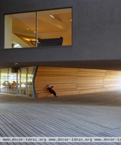
The built-in seating is also a nice touch. Made from horizontal wood slats that reach from the floor to the ceiling, the slight inflection in the wall makes for a comfortable spot in which to just hang out.
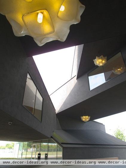
The lights occupying the central space are extremely important, given the minimal treatment of the various surfaces. Their size is appropriate to the space, and their form exhibits the same multidirectionality as the building, as if they are reaching out this way and that way. Additionally, their form is a fitting contrast to the dark and simple surfaces.
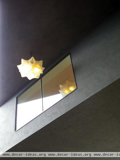
This window seems to serve solely to give a close-up view of the light fixture to those inside.
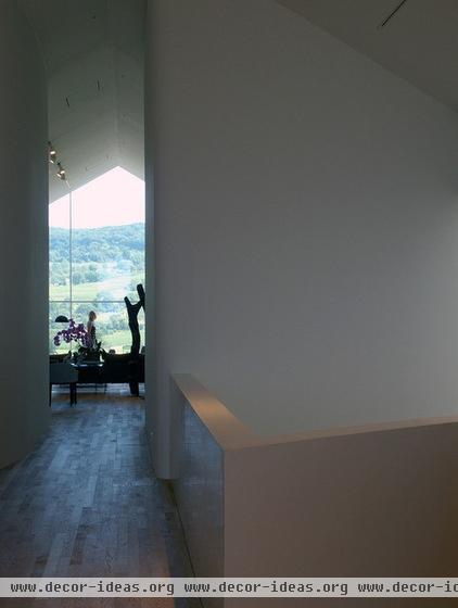
The architects should be commended for building anticipation throughout the interior. Often the windows at the end of each gable-shaped volume are visible from afar, but it's not until we're close that we grasp them in their entirety.
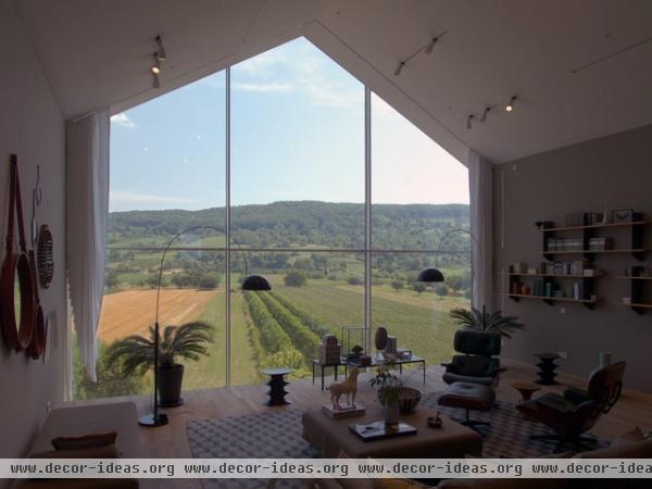
The views through some of the windows take in the beautiful Tüllinger Hills, a suitable backdrop for trying out some of the furniture. Note the way the curtains on the side are cut at an angle; when they're closed, the bottom edge is level with the floor.
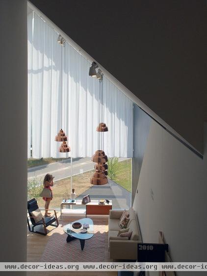
In another space, with the curtains drawn, the view has a different shape — horizontal and low, to frame the horizon.
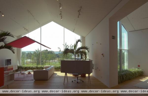
Planters at the bases of the windows act like continuations of the landscape outside, a nice touch that visually connects inside and outside.
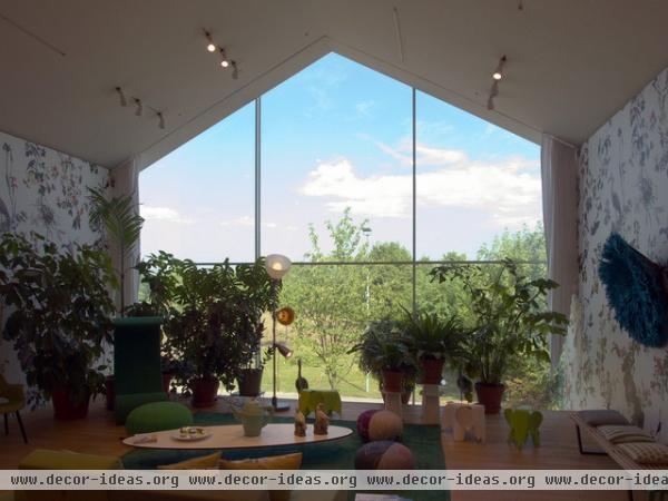
In another area plants function in a similar way, visually connecting the interior and the exterior. This effect is reinforced by floral wallpaper.
More: 8 Gable Homes Reshaped for Modern Times


