Houzz Tour: A Modern Addition Joins a Historic California Home
In 1910 this house was built in a railroad town in the East Bay area near San Francisco. Twenty years later a cellar was dug out under the entire structure to provide more space during the prewar era. The cellar, however, was accessible only from the exterior.
The house stayed in this state for decades until the current owners got their hands on it and decided to add to the property, with a keen eye on energy efficiency. The new addition celebrates the house's past and future with a cohesive connection to all of its components.
Houzz at a Glance
Who lives here: Paul Welschmeyer, founder of Paul Welschmeyer Architects & Energy Consultants; his wife, Jana Gunsul, principal and director of interior design at DES Architects + Engineers; and their 2 sons
Location: Historic Niles District of Fremont, California
Size: 2,000 square feet, including the 1,000-square-foot addition
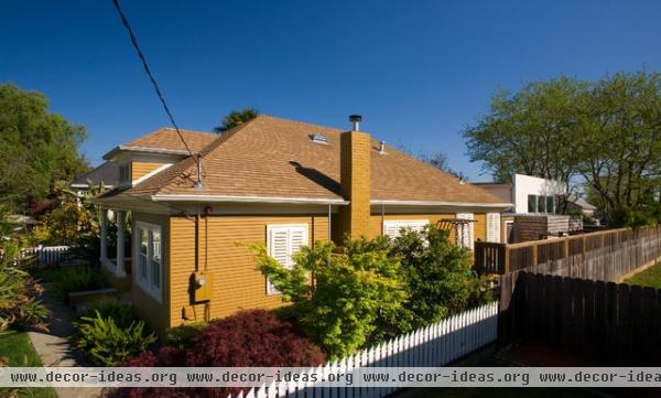
When architect Paul Welschmeyer and interior designer Jana Gunsul moved in, they teamed their extensive design skills to expand their traditional century-old house (the left portion faces the street) with a modern-style addition in the rear (right).
The couple worked in accordance with the stringent Secretary of the Interior's Standards for Rehabilitation. This resulted in the retention of the house's original form and roof, which the couple always wanted to preserve anyway. "It's like having a grandfather and grandson living on the same property," notes Welschmeyer. "They're both vital but have different outlooks on life."
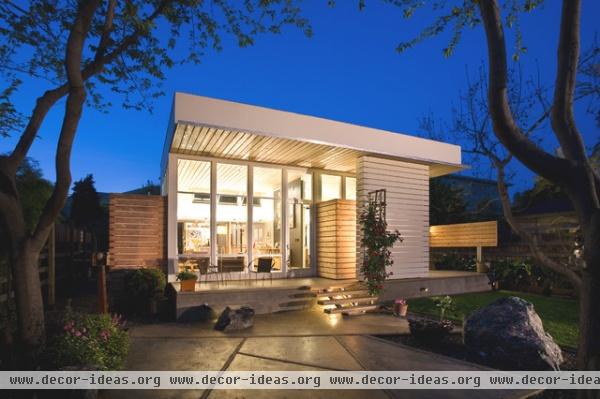
The backyard has the best vantage point of the new addition, which has a decidedly modern feel. The windowed side looks directly into the family's summer living room, described as such to distinguish it from the family's winter living room, which features a 1910 fireplace. The other half of the addition (on the right side of the photo) is the master bedroom suite, veiled by a structural sheer wall. In addition to providing strength to the house, the wall serves as a clever privacy screen.
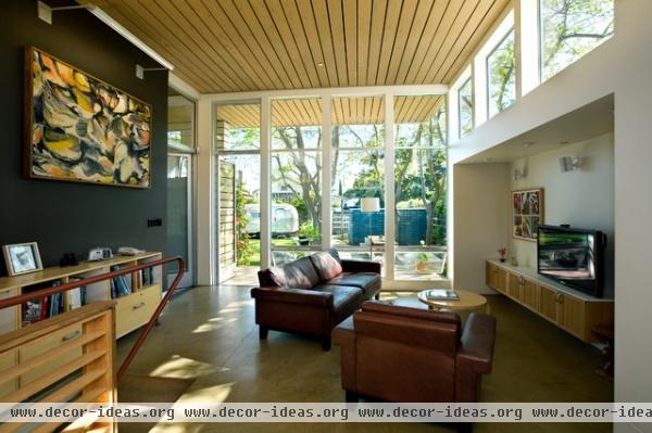
The summer living room benefits from abundant windows that flood the room with light from the south. Radiant slab concrete floors keep it warm in winter. The "floating" media center is made of Ikea upper kitchen cabinets topped with a ¼-inch-thick slab of Corian. The ceiling's Sheetrock is covered with cedar decking boards to absorb sound that bounces off the room's hard materials.
The addition gives convenient interior accessibility to the cellar. While not counted as part of the house's square footage, the cellar accommodates the family's storage needs. This is important, as the property does not have a garage.
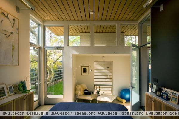
The bright, airy master bedroom suite doesn't need window treatments, because of Welschmeyer's placement of a cedar-sided wall that keeps its occupants from being seen by neighbors while still allowing light and airflow in.
A white leather chair sits in a restful reading niche, also a space for practicing yoga. The two tones of the room give the space a yin-yang feel.
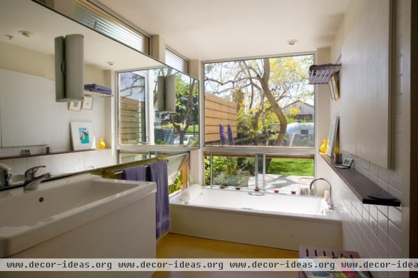
Despite the master bathroom's large windows behind the tub, the bathroom is shrouded in privacy. The visual barrier that allows the owners to bathe without neighbors peeping in comes from the house (not the fence) by way of horizontal planks. "This design is the closest thing to an outdoor hot tub without the expenses of having a hot tub," Welschmeyer says.
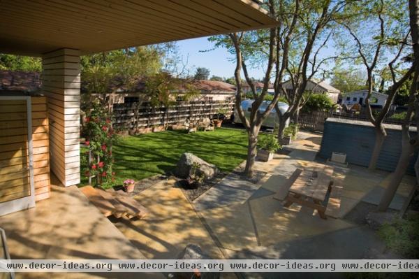
The concrete flooring continues onto the patio and leads to a grove of fruitless mulberry trees and basalt rocks from the old Dumbarton Quarry nearby to provide a park-like setting. "One hundred percent of this property is useful," Welschmeyer says. "There's no garage, so the blue shed gives us just the right amount of space for our tools. No area is wasted."
This summer the couple's backyard played host to a show in the Niles Home Concert Series. The band played on the landing while 100 guests sat comfortably on the grass and patio to enjoy the performance.
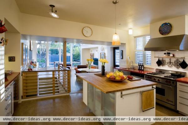
The kitchen is part of the 1910 structure. At the time of the addition, it too was given an upgrade to reflect the contemporary tastes of the family. The kitchen, like the rest of the original house, was refloored with sheet linoleum by Forbo Linoleum.
Ikea cabinetry gives the space a clean, updated feel.
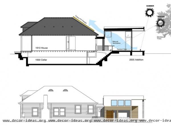
Despite the house's doubling in size, the couple's energy bill never went up. "I applied building science," says Welschmeyer. "This addition carefully takes advantage of the summer and winter sun positions and the way warm and cool air moves to provide natural ventilation. We even planted mature trees accordingly so as to keep the home cool during summer by about 5 degrees, so we don't need A/C. All these seemingly small details add up to a lot of energy efficiency."


