Houzz Tour: New Life for a Historic Georgia Fixer-Upper
http://decor-ideas.org 08/23/2013 01:20 Decor Ideas
Finding a new home was all about location for this couple. The house didn't matter; they were prepared for an extensive renovation if needed. When they found this historic fixer-upper within walking distance of the downtown square in Decatur, Georgia, they opened up its small rooms, grabbed more space under the roof and adapted the interior for modern life.
Houzz at a Glance
Who lives here: A couple and a baby girl born a month after they moved in
Location: Decatur, Georgia
Size: 2,470 square feet before the renovation, 2,955 square feet after; 4 bedrooms, 3 bathrooms

BEFORE: The home was the Boo Radley house on the block, divided into separate apartments on each side. The historic district's guidelines limited what the couple could alter on the exterior; the team at Renewal Design-Build was not allowed to alter the footprint and had to maintain the exterior, including the siding, windows that could be seen from the street, the roof-ridge height and setbacks.

AFTER: They aggressively stripped the siding, removed the loose paint and repainted. Having to keep the original siding had positive results. "The texture of the original boards adds a nice layer of patina and age," says architect Michael Nualla.

Many of these bungalows lack an entryway; front doors open right into the living rooms. "We visualize the furniture placement during the conceptual stage," Nualla says. The sofa's placement defines the line between the entry and the living room.
You can catch a glimpse into the office at the back in this image.
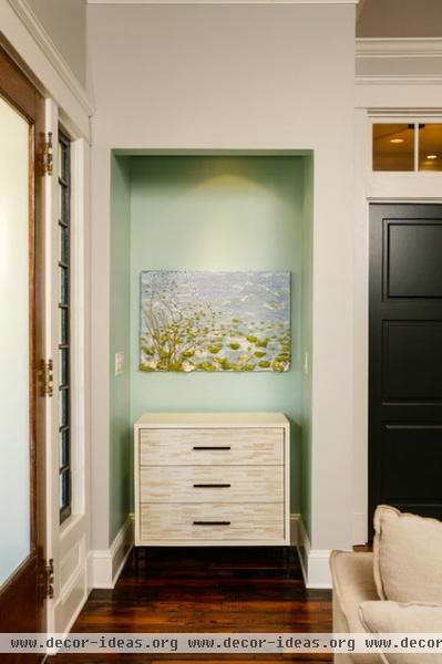
The space had two coat closets; the team converted this one into a drop-zone nook for keys and mail.

"Our clients' former home was a loft, and they wanted that open feeling on the interior," Nualla explains. There is a clear view from the front of the house to the back; sliding doors at the end in this photo lead to a new screened-in porch.

BEFORE: While the designers had to keep the exterior chimney unaltered, this fireplace did not draft well or fit the clients' more modern tastes, so they rebuilt it. Now there is a raised hearth, wiring for the television that extends to a component closet across the room, and a simpler wood mantel and shelves.
"We sourced the new bricks from Iowa, where there is more metal in the clay and you can get this great grayish-purple tone," Nualla says. The bricks are also longer than typical bricks, and lend a rustic industrial feeling.

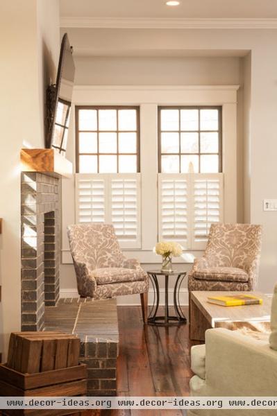
AFTER: The team tracked down reclaimed wide planks for the rustic look the owners wanted. "They were full of all these nailholes we plugged that also show age," Nualla says. "The process was arduous and took a while, as they had to be kiln dried, but it was well worth the wait." The stain is called Old Dirty Goat, which is probably the best floor stain name ever.

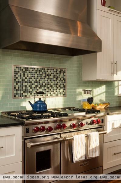
Located at the back of the house, the kitchen is open and has a large island for gathering. A black limba wood island countertop adds the rustic in the rustic industrial mix.
Backsplash mosaic: Vitro Mosaico Gris Brillo; backsplash tile accent liner (behind range): ¾- by 6-inch Medici Mosaics Brushed Silver Liner; green tile: Metro Crisp Collection, 2 by 4 inches, Dew, Ann Sacks; gas range: 48 inches with six burners, Wolf; windows: Jeld Wen; island countertop: black limba, edge-grain; counters: Black Beauty granite; pendant lights: Benson pendant, Restoration Hardware
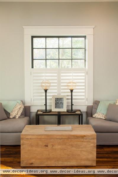
The entertainment hub extends to this cozy keeping room right off the kitchen.

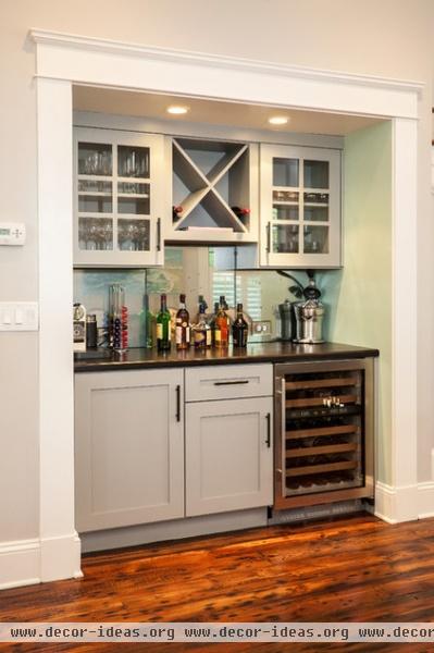
The living room opens into the dining room, which continues the transitional mix. Upholstered French chairs mix with a more industrial dining table and chandelier. A bar is tucked neatly beneath the staircase.
Chandelier: Solano Chandelier, Zia Priven; dining table: Restoration Hardware; dining chairs: Vintage French Round Upholstered Side Chair, Restoration Hardware; wine refrigerator: Sub-Zero

The first floor has this full bathroom and a bedroom, which is convenient for visiting grandparents. The reconfigured bath also blends old and new. The homeowners scooped up the unique industrial cart–turned–vanity at Scott Antique Market. By the way, whenever I see a unique piece like this in any Atlanta room, more often than not it was plucked from this wonderful monthly market.
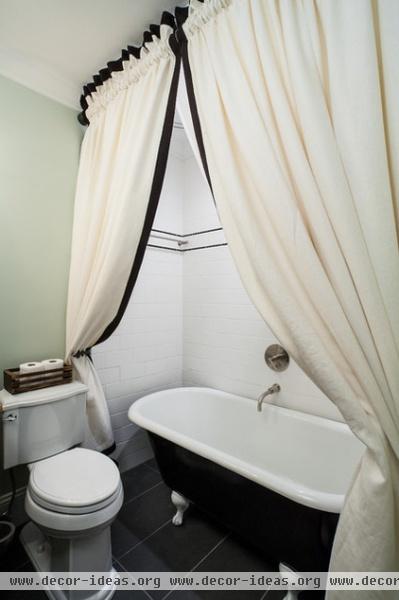
This claw-foot tub was already in the house in another bathroom. Refurbished, it now adds another big vintage touch atop the contemporary tile floor.
Tile: Modern Dimensions, Arctic White, Daltile; black tile detail: ½- by 6-inch Black Flat Liner (K111), Daltile; wall paint: Filmy Green, Sherwin-Williams; floor tile: Stratos Orion Antracita Polished, 12 by 24 inches, Roca Tile

BEFORE: This second kitchen on the back of the house became a screened-in porch.

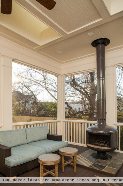
AFTER: The new screened-in porch can be used most of the year, thanks to Georgia's mild winters and this new Malm fire drum.
Sofa: Del Mar Sofa, Restoration Hardware

BEFORE: The couple wanted room for a pool and again, clearly the condition of the house didn't matter.

AFTER: The screened-in porch is also a great transitional space between the backyard pool and the rest of the house. Here you can see the changes to the roofline and the conversion from the former second duplex kitchen into the porch.
Upstairs was a challenge, as the homeowners wanted a full master suite but had to balance those needs with the historic restrictions. They were able to extend the roofline but had to keep the original ridge's height.


Part of the challenge was creating a master bath that felt spacious underneath the existing roof. Sliding doors lend an open feeling, and new skylights make the ceilings feel higher. Shades let light filter through the original windows while maintaining privacy.
Doors: The Sliding Door Company; bathtub: MTI Tubs; wall paint: Porpoise, Sherwin-Williams
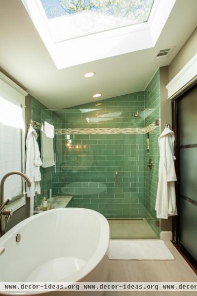
The clear glass shower stall maintains the open feeling, while glass tiles bounce the light around.
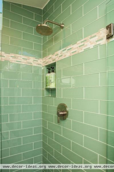
A small niche keeps the shower from looking cluttered with products.
Main tile: Glass Reflections (GRO2), Whisper Green, 4¼ by 12¾, Daltile; shower fixtures: Berwick FloWise Shower Trim Kit
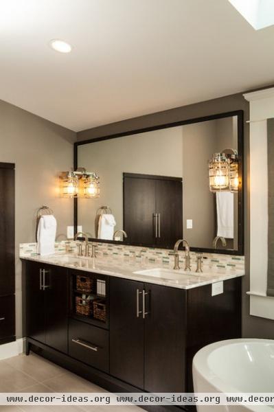
The tile on the backsplash matches the accent tile in the shower.
Cabinetry: custom, Timberland Cabinets; tile: Random Mosaic Blend, Whisper Green, Daltile; sconces: Circa Lighting

A new walk-in closet provides a lot of room and a bench for trying on all of those beautiful shoes.
Ceiling light: Circa Lighting

The process from development to finished construction took a little over a year, partially due to the calendar for getting approvals from the historic commission. The home was finished just in time, as the couples' daughter was born about a month after they moved in.

BEFORE: This dormer is the one on the front facade of the house. Formerly unfinished, this portion of the second floor is now an exercise room.
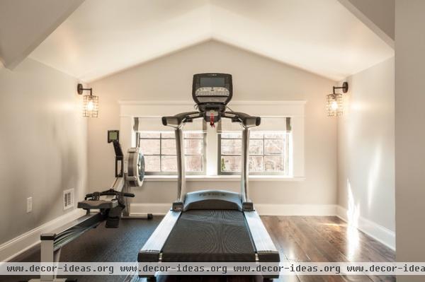
AFTER: The work in transforming the home to the historic guidelines paid off; the homeowners have a beautiful light and open home blocks from the center of the very happening Decatur universe. It also won a 2013 Decatur Design Award for a historic renovation, which promotes excellence in preservation, design, sustainability and advocacy.
Wall paint: Passive Eggshell 7064; trim paint: Pure White 7005, both by Sherwin-Williams
Architect: Michael Nualla
Project development director: Heather Shuster
Project manager: John Carpentier
Interior designer: Courtney Rogers

MAIN FLOOR BEFORE: This plan will help you see how the interior was reconfigured from the duplex layout to the new, more open layout.
Related Articles Recommended


