Finding the 'Wabi-Sabi' in Midcentury Modern Design
In this series I’m examining the parallels between modern Western design and wabi-sabi, the ancient Japanese philosophy of finding beauty in things that are imperfect, impermanent and aged. Purists may see this as disloyal to the philosophy’s core, but I am following the advice of Shiho Kanzaki, an esteemed potter and tea master who generously shared his wisdom with me when I was in Japan in 2003.
Kanzaki-san’s exquisite vases, pots and tea bowls, fired in traditional wood-fired anagama kilns, embody wabi-sabi’s very essence. But Westerners in search of wabi-sabi, he told me, should not imitate the Japanese vernacular, because that would not be authentic. They should seek out their own indigenous design constructs that embody simplicity and imperfect beauty, he said. When Kanzaki-san visited the United States in the 1980s, he found wabi-sabi in Pennsylvania Dutch barns. My own musings have led me to find parallels in clean, crisp, unadulterated midcentury modern design.
See Part 1 in this series
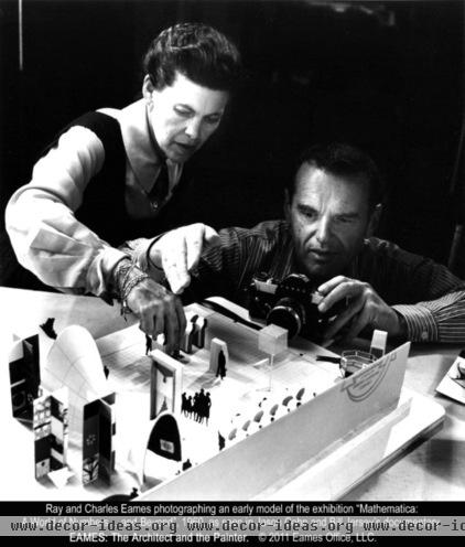
Ray and Charles Eames emerged in the 1940s with wildly popular furniture that combined Shaker simplicity and innovation with modern industry. Herman Miller has been reproducing the Eames’ molded plywood and leather lounge chair, which Charles described as "a special refuge from the strains of modern living," since 1956. The Eames’ enduring furniture designs were fresh air for many Americans who wanted a contemporary look but found extreme modernism cold and sterile.
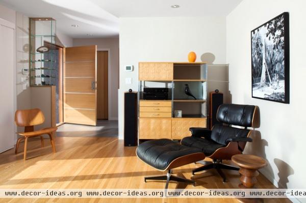
Charles and Ray Eames gave the wabi-sabi aesthetic a modern, industrial twist by using newly emerging materials, such as molded plywood and plastic, to produce items for everyday use that were both beautiful and affordable. Terence Conran calls their furniture “intensely human, charming and kind.”
In a 1996 tribute, designer Tibor Kalman said the Eames’ ubiquitous, unpretentious molded plywood chair was like a lover. “It can be lived with, seen every day, change and evolve, and slowly reveal its beauty,” he wrote. Craig Hodgetts, who designed a Los Angeles exhibition on Charles and Ray Eames, says what the designers left out of their designs — “the pomposity, hierarchy and stodginess associated with ‘important’ stuff”— is just as crucial as what they put into them.
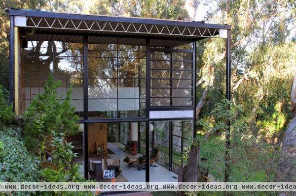
The Eames’ Pacific Palisades home (shown here), one of the Art & Architecture magazine–sponsored Case Study houses built in the late 1940s, demonstrates the freedom that can be found in straightforward, unpretentious design — a modern take on the wabi-sabi idea.
Built with the same simple, clean lines as their furniture, the Eames’ open-plan home is modern yet human, with a Japanese influence that includes vertical-louvered blinds, tatami mats and Isamu Noguchi paper lanterns. It has a humble, fleeting quality, with a large, unbroken area where items the couple collected — driftwood, sculptures, mobiles, plants — could be brought in or taken away.
The living room was home to a continually changing collage of wabi-sabi items: Indian embroideries, Mexican clay dolls, ceramic bowls, antique toys (which they collected as fine examples of design principles) and dried desert weeds — all treated with equal regard.
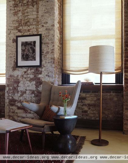
In the 1960s the crisp, understated (Shaker-like) Danish furniture made by Hans Wegner (whose chair is shown here), Børge Mogensen and Arne Jacobsen delighted the design world. Danish modern furniture, finished only with a sandpaper rubdown or linseed oil and embellished sparingly with natural materials such as leather, cotton and linen, was a wabi-sabi counterpoint in an environment cluttered with all the new plastics and vinyls. A softer, more human minimalism had been born.
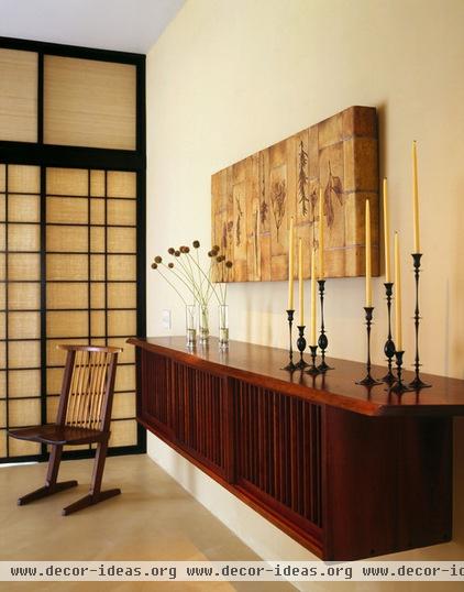
In the 1940s Knoll furniture company began distributing Pennsylvania craftsman George Nakashima’s polished cherrywood tables and softly geometric chairs.
Nakashima’s furniture (like the side table and chair shown here) was museum quality, but he refused to treat it as precious. “A certain amount of scratching and denting adds character to a piece," Nakashima wrote in The Soul of a Tree. "In the trade, surface marring is called distressing; in our family it’s ‘Kevinizing,’ after our son who could, when young, ‘antique’ furniture in record time. To me, there is nothing quite so uninteresting as a shining, perfectly smooth surface that looks as though it has never been used.”
Nakashima's daughter, Mira, explained how wabi-sabi influenced him (and continues to guide the work of his studio following his death) in a recent interview. "We depend entirely on the natural shapes and colors of the wood to inspire and determine the course of our work, and never apply artificial colors or shiny finishes," she said.
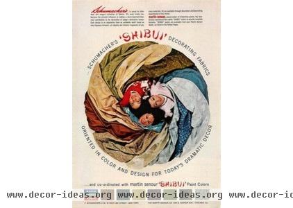
In 1960 House Beautiful magazine published two of its most popular issues of all time, focusing on wabi-sabi’s close cousin, a spare, restrained style known as shibui. Shibui is the ancient Japanese art of not too much, of quiet grace through economy of means.
The ancient Japanese written character for shibui referred to water blockage, a symbol of restraint. Shibui colors are subdued (black, slate, dark brown and moss green), and shibuimono (“shibui things”) have a nonmechanistic, timeless beauty, hinting by their very presence that they’re more than just pretty.
Meshing perfectly with the era’s spare, modern style, shibui had its moment in the post–World War II United States. Baker developed a furniture line, Shumacher promoted shibui fabrics and Martin Seymour called its line of muted, tasteful paints shibui. Erwin Lambeth Company built the Shibui House, with burlap-covered walls, a fireplace textured with sandpaper and Danish modern furniture. “Shibui has no bounds,” said Erwin Lambeth president Kay Lambeth. “It’s the unrestrained, the unobvious, the elegant in any culture — and we’ve borrowed ideas from the whole world.”
To help Americans understand shibui, House Beautiful developed this list of shibui things in 1960:
• 18th-century captain’s chests
• Early American cupboards, blanket chests and trestle tables
• Oaxacan black clay jars
• Shaker furniture
• Danish furniture
• 18th-century pewter
• Salt-glazed pottery
Next up: How the Slow Design movement embraces wabi-sabi ideals.
More: Why We Love Midcentury Modern Design


