Case Study: Turn Your Wall Colors Into Art
http://decor-ideas.org 08/19/2013 21:10 Decor Ideas
When lead designer Chelsie Lee started working on this Brooklyn brownstone, she needed color — lots of it. The homeowners loved traveling, pop art and vibrant color palettes, so Lee combined those themes into a bold technique: color-blocked walls.
Using a custom Peruvian blanket sofa and bright Moroccan rug as inspiration, Lee brought in contrasting colors and varying shades of red to make each space unique yet still part of a cohesive whole.
By walking through her own project, Lee, of Jessica Helgerson Interior Design, shows you how to incorporate interesting decorative elements on a smaller, subtler scale.
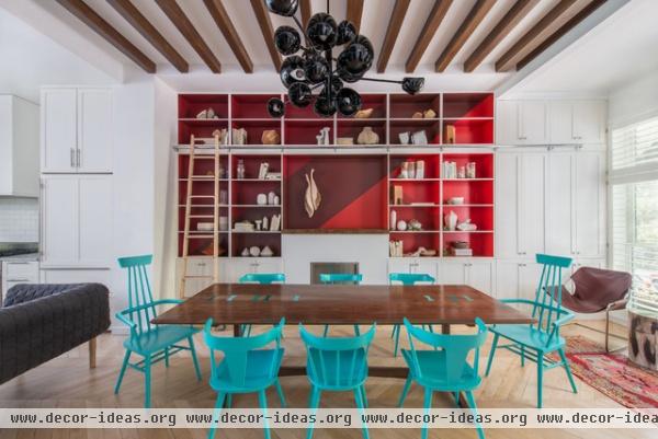
Use varying shades of the same color. This tone-on-tone technique uses the same color in different shades to create a dramatic look. Here, Lee revamped the back of bookshelves with varying shades of red. The teal serves as a dramatic accent.
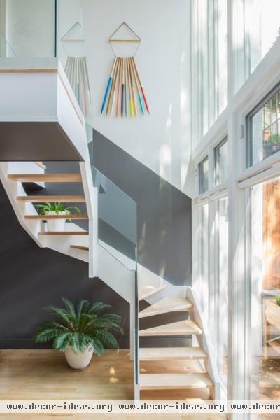
Design lines to reflect architectural elements. When setting out your look, use wall patterns that complement lines already in the space. The parallel paint line follows the angle of the staircase and reinforces the interior's geometric theme.
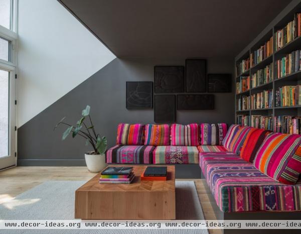
Pare it down with neutral colors. Even though this space uses dark gray and white, the contrast keeps it striking. This lower level room is partially open to the space above, so Lee used a nice diagonal line to break up the floors.
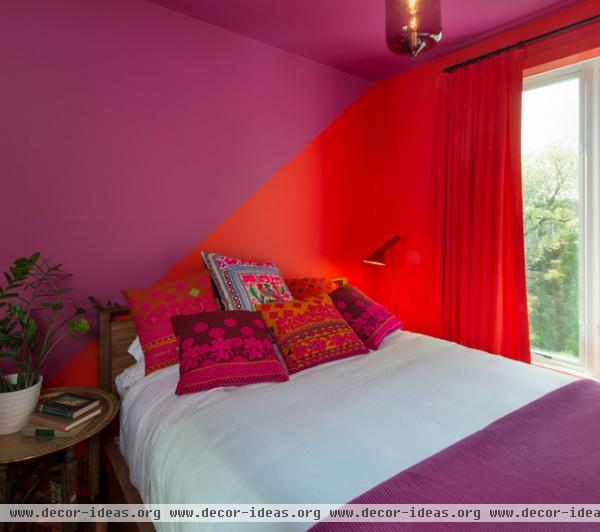
Don't be afraid to try unexpected color combos. This bedroom shows how well magenta and red can look together. For a truly daring space, experiment with different palettes — but be sure to test your combinations with oversize paint samples before going all in.
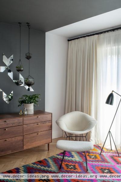
Pick an inspirational item. Determining your color scheme is often the hardest part because it's such a personal preference. If you're at a loss, find an item you love and base your palette around that. This colorful rug in the master bedroom, along with the bright sectional, inspired the reds, purples and blacks seen throughout the home.
How to paint a perfect stripe
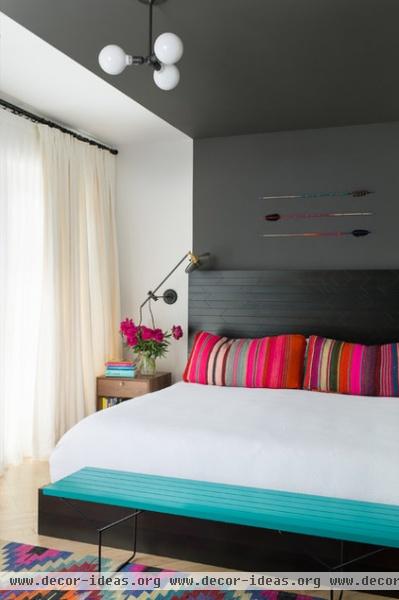
Let your furniture dictate your lines. In rooms without prominent architectural elements, use your furniture as paint color cues. Here, Lee used the edge of a custom headboard to create a sleek line between charcoal gray and white.
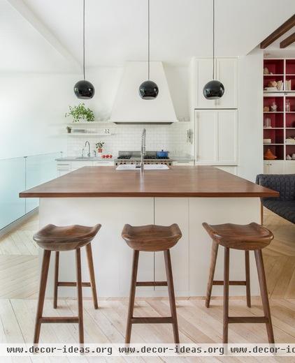
Leave a little white. With so much color, give yourself a visual break by having a few color-free, neutral spaces. Lee always likes blank slate kitchens because they allow your food to pop. Next to such a bright dining room, this room feels clean and fresh.
Paint picks and guides: More help choosing and using color at home
Related Articles Recommended


