Houzz Tour: Deceptively Detailed Minimalism in Miami
http://decor-ideas.org 08/19/2013 19:50 Decor Ideas
This home's straight lines, expanses of white, subtle architectural detail and sparingly dolloped pops of color are a far cry from what the designers saw on their first visit. When the team at DKOR Interiors first encountered the pseudo-Tuscan house, it needed a lot of vision and a lot of construction to adapt to their clients' minimalist tastes.
The main challenge was to meet six family members' needs within the minimalist design. This included personal spaces for each family member, offices, shared spaces for gathering and play. Here's how they did it.
Houzz at a Glance
Who lives here: A Brazilian couple and their two daughters and two sons
Location: A suburb of Miami, Florida
Size: 6 bedrooms
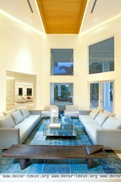
"These are the kind of people who like open spaces and modern design," says Ivonne Ronderos, principal at DKOR. Knowing that the clients liked floating design elements, the team developed a concept of suspension, emphasized by dropped ceilings, LED-lit cutouts and ethereal light fixtures.
The living room ceiling soars to 25 feet high with two drywall dropped ceilings on the sides and floating slats of wood in the middle. LED lights in reveals accentuate the suspended pieces overhead.
Rug: Amir Rugs, Miami; sofas: Baltus; bench: West Elm
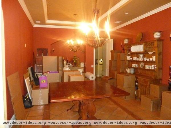
The family and designers were working with a dark home full of dated fixtures and finishes with a pseudo-Tuscan theme: A lot of trompe l'oeil, superfluous moldings, earthen colors, dark wood and limited natural light — in other words, the opposite of what one thinks of as fresh Miami style. But the clients "are very design savvy and saw the potential," Ronderos says. Also, the neighborhood is one where children play safely in the street, a rare find. Here, the dining room before.
See more "before" photos
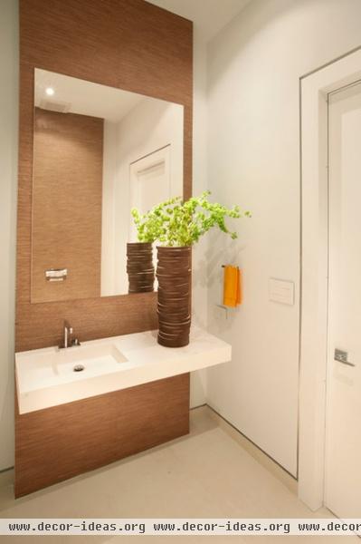
In a minimalist home, continuity enhances the soothing feeling; there are no jarring transitions and details repeat from room to room. You'll see the metal-backed recessed lines around the doorways that transition down to the baseboards throughout the home. This reflective recess makes the walls seem subtly suspended.
A careful balance of contrasting materials is also key. Contrasting wood warms up the white. In the powder room, the sink wall is tiled in a wood-colored porcelain tile with a linen texture.
Tile: Porcelanosa
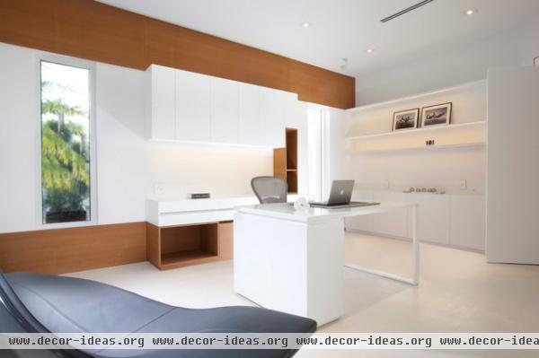
While the home was staged to be extra neat and spare for the photo shoot, Ronderos had just visited the home the same day I spoke with her and says the family embraces the minimalism. They have added books and a few accessories, "but it's still very minimal," she says. "Everything has its place."
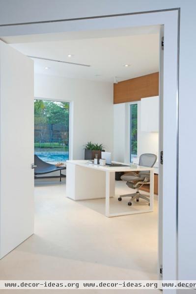
The dad telecommutes, and he needed a home office away from distractions. Like most minimalists, he's a paperless kind of guy, so storage was not a priority. Instead, he wanted an area where he could display his family's LEGO creations.
The desk box and other closed spaces hide office equipment. The white box of satin wood walls is broken up by two wide lines of bamboo wood behind the desk. The team used bamboo throughout the home for contrast and texture.
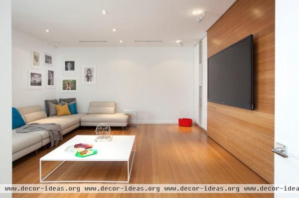
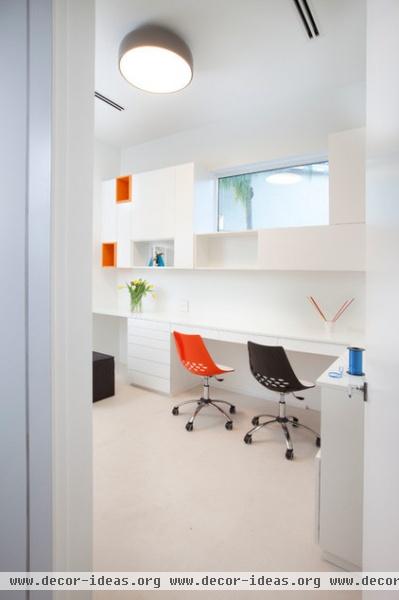
Lots of concealed storage is the key to making minimalism work for a family with four kids, Ronderos says. The TV wall is packed with hidden storage including media cabinets and lots of room for toys and games.
In a downstairs craft room, every drawer is customized to fulfill a specific storage function.
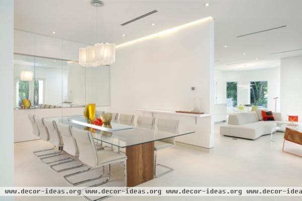
TIp: "Make sure mirrors reflect something pretty," Ronderos advises. "We used them to make this space look bigger."
At first glance, you'd never know how much storage is hidden in here; behind the first three doors on the left is concealed storage; one door conceals a sink for washing hands before dinner. The mirror panel on the right is a door that leads to the pantry and kitchen.
"We dropped the ceiling with a reveal on the sides and put LED lights around it," Ronderos says. A cloud-like Logico Lamp floats in the space between the ceiling and the table.
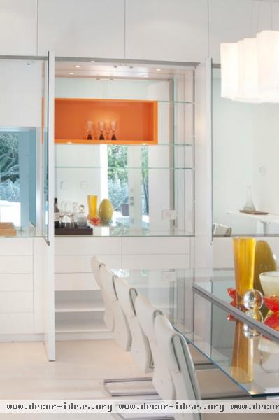
"Part of the concept was to have a very off-white and white color palette with one pop of color," Ronderos explains. "It was important not to overdo color in order to be minimalist." The floating orange shelf in one of the dining room's storage spaces also contributes to the home's suspension concept.
Dining table: Custom; cantilevered chairs: Arravanti.
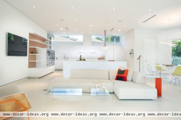
In the open family room and kitchen area, new clerestory windows let in the bright Miami light, which bounces off the white surfaces.
The family gathers in this central space for TV and games. The parents can also watch the kids play in the pool from here.
Sofa: Luminaire Miami; coffee table: Arravanti
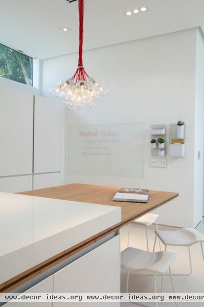
Even the kitchen message center has a minimalist design, with a recessed magnetic glass panel where the family can pin up invitations, school reminders and articles. The team chose a new switch and outlet line from Adorne that doesn't break up all of the white expanses and incorporated USB charging stations throughout the house. (These blend in so well that they are very difficult to spy in the photos).
The DAB Ilde Max Chandelier provided a way to introduce the pop of color in the kitchen in a minimal way.
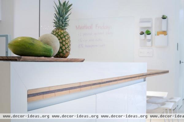
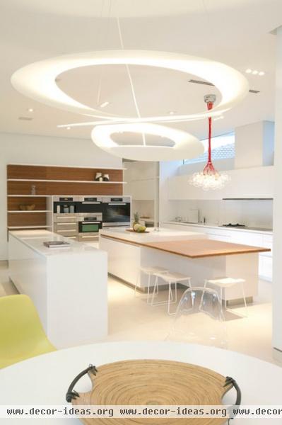
A table-height extension off the island creates a gathering spot. This detail is made up of bamboo and compaq quartz.
A ringed fixture from Artemide hovers like a mobile over the kitchen table.
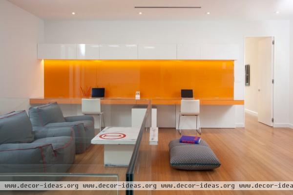
Upstairs, a glossy pop of orange marks the kids' office space. Each child has a station along the back wall. The backsplash, shown temporarily cleared of notes and personal photos, is orange back-painted magnetic glass. The custom desk is covered in matching orange and the custom cabinets are finished in high-gloss white.
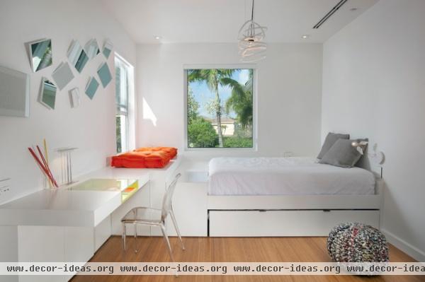
The eldest daughter shares her mother's penchant for minimalism. All of the kids' rooms have trundle beds for sleepovers.
Light fixture: Lepere
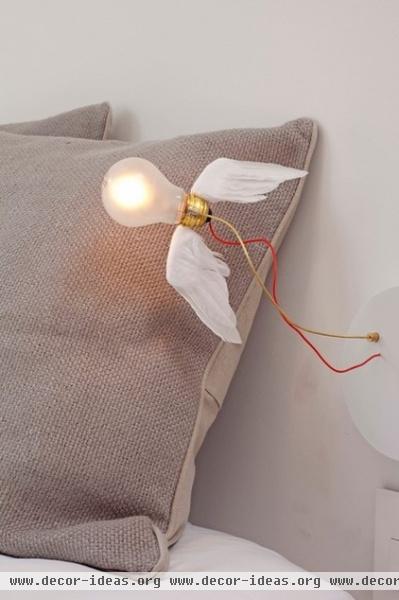
A new modern icon, the Lucellino wall sconce by Ingo Maurer, adds a bedside touch of whimsy.

Her closet and dressing area is tucked behind a curtain of beads.
Panton New Chair: Vitra
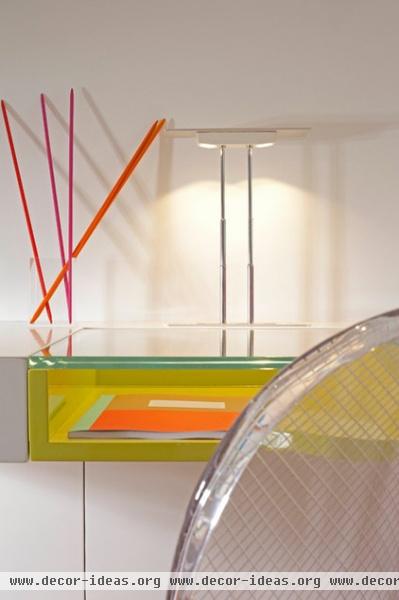
More high gloss and glass accentuates the pop of green on her desk. Each child's room has its own signature color.
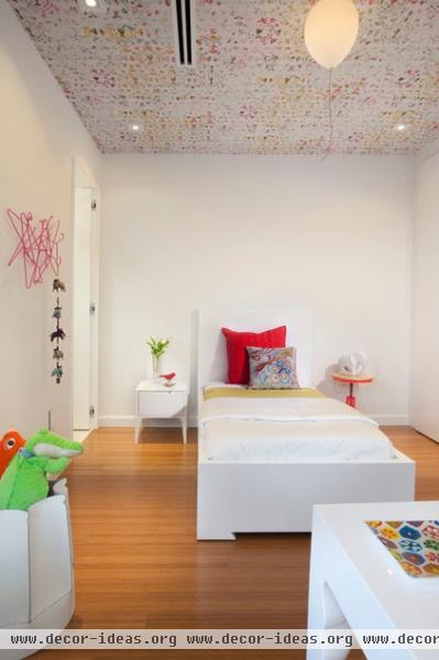
In the youngest daughter's room, a floating balloon light fixture hangs beneath a ceiling covered in wallpaper by Elitis.
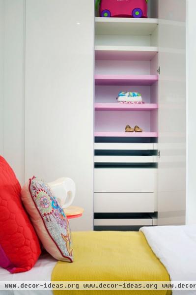
The team worked with closet company Mia Cucina to customize storage for each family member.
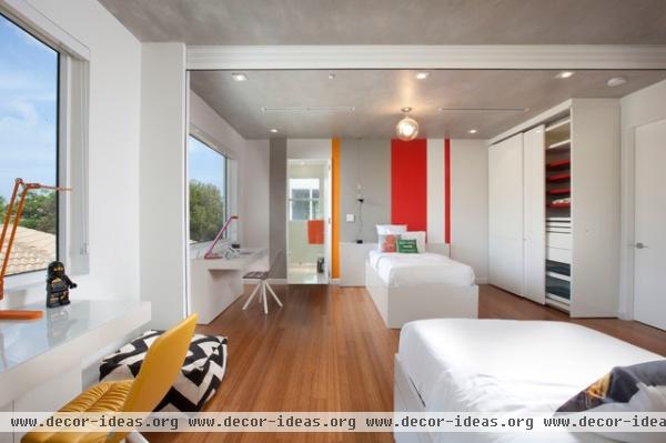
The two sons have the option of sharing a room or having singles — an operable garage door separating the two tucks into the ceiling.
The ceiling is a faux-concrete painted design by a local artist. It breaks up the white and adds a more industrial look.
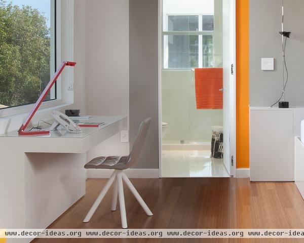
Another bane of minimalist existence: wires. Custom carpentry hides wires and power strips.
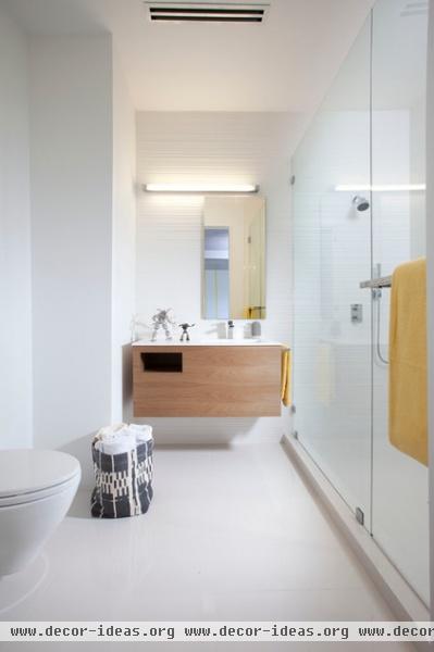
The team used floating sinks and/or vanities in every bathroom.
Countertops: Krion; floors: porcelain tile.
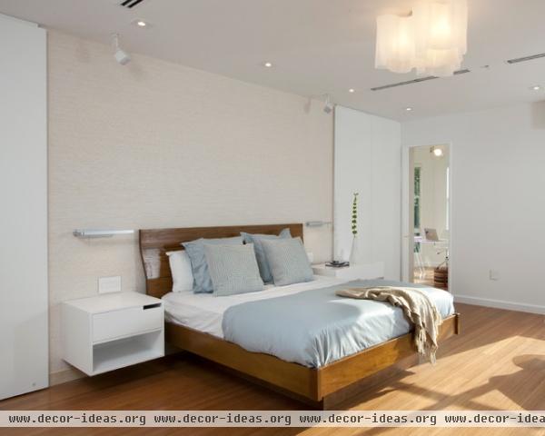
The team made the owners' existing bed minimalist by cutting off the legs and replacing them with a hidden platform that makes the bed appears to hover. Likewise, wall-mounted nightstands leave the floor space open underneath. A subtle wallpaper behind the headboard anchors the bed and nightstand area; a ceiling Logico lamp glows overhead.
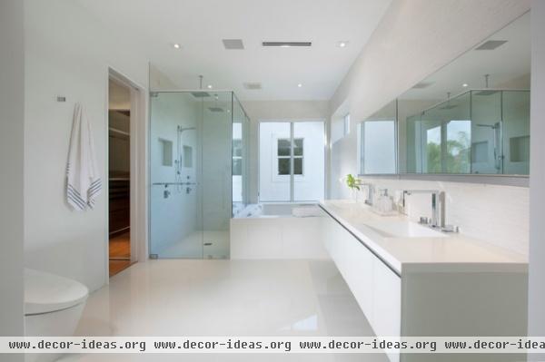
In the master bath, the mirrors lift up to reveal outlets for charging toothbrushes and plugging in other grooming appliances.
Vanities: Robern; toilet: Toto
Team: DKOR Interiors: Ivonne Ronderos, Marcy Garcia, Margaret Smith, Kishia de la Espriella, Lindsay Biondo. Builder: Newman Brothers Construction
Related Articles Recommended


