Kitchen of the Week: A Separate Peace for a Manhattan Studio
http://decor-ideas.org 08/19/2013 17:30 Decor Ideas
Like many studio dwellers, this New Yorker wanted to separate her kitchen from her living and sleeping space as much as possible. Rather than spend time on structural work, interior designer Damon Liss and contractor Chip Brian, co-founder of Best & Company lined the pass-through with a contrasting bleached oak for a stronger distinction between the two areas.
A clean palette of white marble, shiny lacquered cabinets and stainless steel appliances makes the kitchen look larger than its 50 square feet. Smart storage solutions and quality appliances accommodate the client's passion for cooking without taking up too much space.
Kitchen at a Glance
Location: West Village neighborhood of Manhattan
Size: 50 square feet
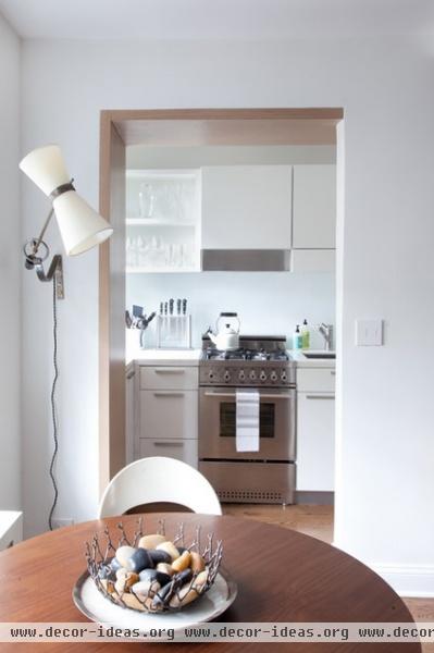
The stove is still visible from the bed, but the new kitchen palette makes it a much more pleasing sight. The bleached oak in the pass-through works well with the studio's tongue and groove oak flooring.
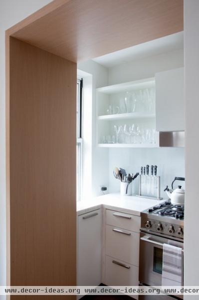
The client wanted a light and bright palette, and as an avid cook, she needed durable materials, too. Brian chose the lacquered cabinetry for its easy-clean sateen surface, which also reflects light around the kitchen.
Counters: Spa White solid surfacing; backsplash: glass; hardware: Doug Mockett
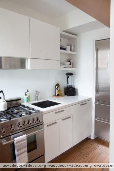
Smaller appliances concealed behind closed cabinet doors balance out the larger stainless steel appliances. "You almost see too much stainless steel in kitchens today," says Brian. "We didn't want the appliances to overpower the space."
Cabinetry: custom lacquer; refrigerator: Liebherr
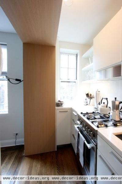
Southern light from the tiny window warms the kitchen. There's a clear view from the tree-level apartment into a nearby park; the oak on the architrave also brings in an organic element from the outdoors.
The client really likes everything in its place, Brian says. Open shelves, rods for hanging pots and utensils, deep cabinets and drawers, a pullout garbage tray and plenty of concealed custom inserts line the upper and lower portions of the kitchen. Brian even used the narrow spot under the window for serving-utensil drawers.
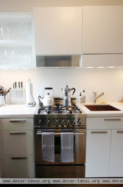
Brian and the client selected small but high-end appliances that will last a lifetime. A 24-inch Bertazzoni stove has the starring role.
Sink: Blanco
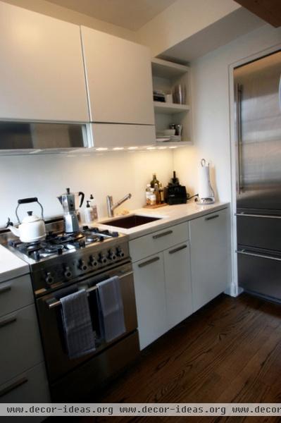
Undercabinet lighting connects to a dimmer switch. At night, the light in the kitchen softens and mimics the living room lighting for a less obtrusive feel.
See more of this studio
More: Get ideas from other great small kitchens
Related Articles Recommended


