Houzz Tour: A Wine Country Home, Reinvented Once Again
When remodeling a house, architects are tasked with fixing or altering a previous architect’s design. For Bill Willers that previous architect turned out to be himself. In 2002 he completely renovated and added on to a 1966 Sea Ranch–style home in Sonoma, California, for a set of clients whose traditional style included granite countertops, distressed stone tile and Arts and Crafts–style light fixtures. Almost a decade later, those clients moved out and the home's new owners approached Willers to remodel the space to their needs.
This time Willers and his clients picked finishes that he hopes will last through design trends. “That way the interiors have longevity and timelessness,” he says. “Light, openness, sense of space — those things define really good architecture no matter what finishes are. If finishes help that, then it helps the whole thing endure."
Houzz at a Glance
Who lives here: An investment banker and a potter
Location: Sonoma, California
Size: About 3,200 square feet; 4 bedrooms, 3 bathrooms
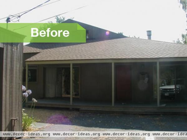
BEFORE: The home was built in 1966. During that time architecture firm Moore, Lyndon, Turnbull and Whitaker (MLTW) was developing an enclave along the Sonoma coast that would reflect the San Francisco Bay Area's traditional architecture as well as create a new modern vocabulary of style.
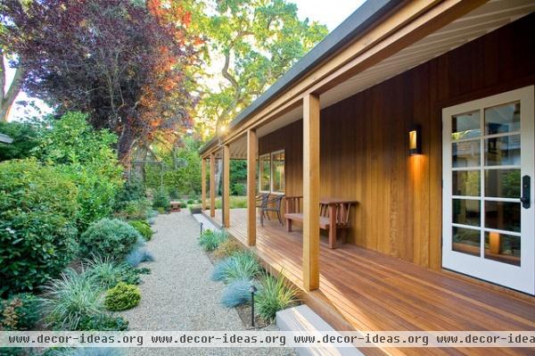
The firm basically used this project as a prototype for other Sea Ranch homes near the coast. This inland design, however, had modified features — such as multiple porches — not found near the foggy, windy sea.
In the late 1960s, the vertical-grain, old-growth redwood exterior had been painted gray to cover up the weathered wood, much to the dismay of Willers. “It was kind of the worst situation,” he says. “They had a naturally aged building, and they painted it the color that it basically was, only they removed the character to the house and destroyed the opportunity to refurbish the wood.”
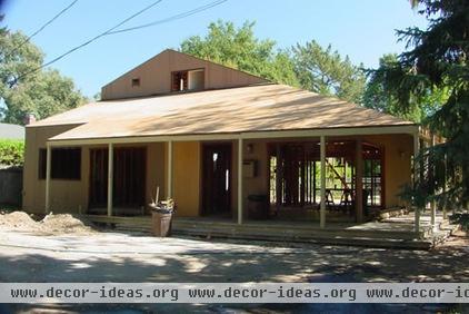
In 2002 Willers basically had the structure taken down to its studs, then modified the space to open up the main volume of the interior, to bring in more light.
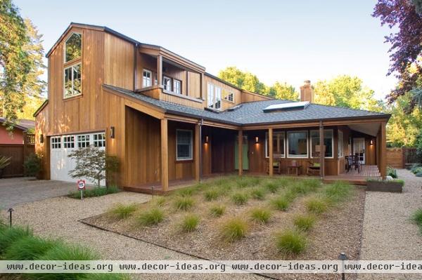
Old-growth, vertical-grain redwood siding was added back in 2002, as was a main bedroom and two-car garage addition. In 2011 new owners — he's in finance; she's a potter — kept the redwood siding and the layout of the home intact, but reached out to Willers to help them update the interiors and completely redo all the landscaping to create something low maintenance and water sensitive.
Landscaping: Installed by Rozanski Design
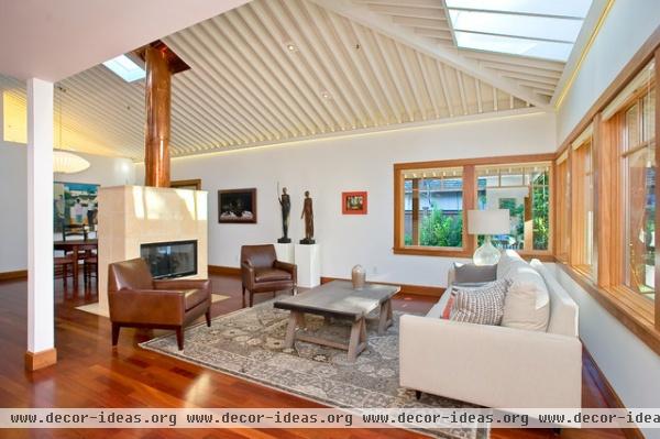
AFTER: Inside Willers removed materials that had been added in 2002, changed the interior colors and reworked the bathroom to make it more modern. Corner windows in the living room replaced sliding glass doors that were original to the home and had made defining the sitting area difficult. By adding corner windows, he didn’t lose the light or views of the mature oak trees. He then added a skylight to bring in the canopy of those oak trees.
Willers also removed the ceiling to open the space to the full spatial height and expose the rafters.
Sofa, chairs, rug: Room & Board; table: J. Grigg
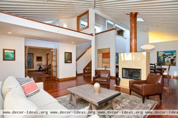
There are numerous loft-like spaces in the house that the previous homeowners had attached ladders to so their kids could climb and play. The current homeowners removed the ladders and are looking for artwork to occupy the spaces.
The fireplace is original to the home. The two-sided design separates the living and dining rooms. The original redwood box remains, but the terra-cotta tile was replaced. It used to be bigger, extending up to the ceiling. Willers took down the box around the chimney and had a copper surround made for color and reflection, but also to visually open up the space.
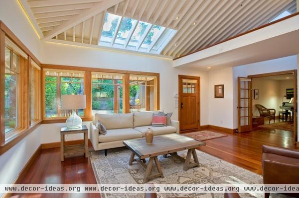
The current homeowners painted the walls and ceiling Benjamin Moore's Cloud White. “It’s one of those whites that’s like a chameleon,” Willers says. “It changes its color based on ambient light being given. It’s always changing the mood of the room. It’s a nice white because of that.”
The ceiling is standard 2-by-8 Douglas fir framing, but instead of the standard 16 inches apart, the beams are 8 inches apart. “The change in that frequency takes it outside the normal guts of a house into a pattern that’s more rhythmic and delicate,” Willers says.
The floors are Brazilian cherry, and the trim is American cherry.
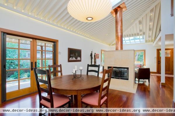
With such high ceilings, figuring out a lighting scheme was difficult. Willers had to bring light to the seating areas without having a bunch of lights hanging down. "If you hang a bunch of fixtures, you begin to clutter the visual space," he says. The space gets plenty of light during the day, but at night it becomes dark and cavernous. So he added custom dimmable LED tape cove lighting to cast a nice wash on the walls and ceiling.
He then created framing boxes for LED can lights as a form of recessed lighting placed into the exposed rafters.
The table and chairs were made by Amish craftsmen in Indiana and purchased at Fenton MacLaren in Berkeley, California.
Light: Room & Board
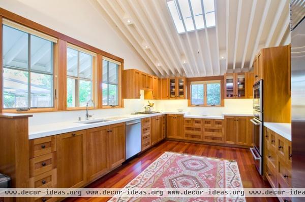
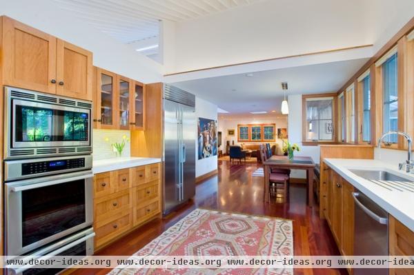
In the kitchen more modern updates include white precast concrete countertops. “You walk up to it and you really don’t know what it is, but it has a sense of permanence, a quality that’s innate,” Willers says.
His first set of clients "had an Arts and Crafts–style ceiling fixture hanging from everywhere you see a light box," Willers says. “That gives you a sense of difference between the first and second clients. Granite countertops and distressed stone tile were trends in the late '90s, early 2000s, but they are also markers in time of particular design trends. They age quickly, because you can pick them out.”
Counters: Sonoma Stone; rug: Pottery Barn
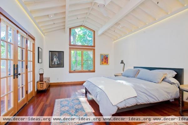
The main bedroom sits over the garage. A high window frames the oak trees that line the edge of the property. French doors open to a balcony that overlooks the front yard.
Bed: Room & Board; chest: The Zentner Collection; bedding: custom
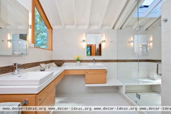
Willers completely renovated the main bathroom. Blizzard-white Caesarstone countertops with a hint of sparkle set a neutral background that brightens the space without challenging current trends.
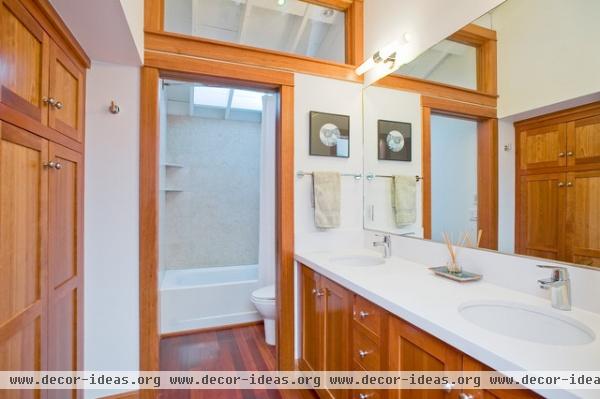
He changed the countertops and fixtures in the guest bathroom, too, but kept the custom-made American cherry cabinets from his first clients.
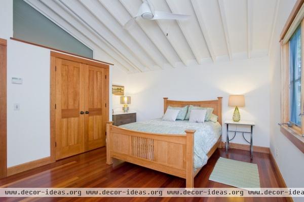
Another loft-like space remains above a guest room closet.
Bed: Fenton MacLaren; lamps, side table: HD Buttercup
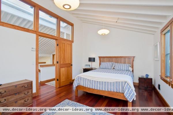
Because this guest room faces to the north, it originally received very little sunshine. Clerestory windows pull in sunshine from a hallway skylight.
Bed: Fenton MacLaren; chest: The Zentner Collection
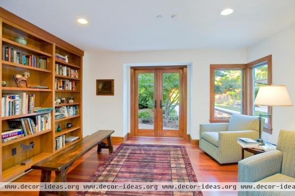
Willers replaced a bench window with French doors, removed one wall's bookshelves and added a corner window to connect the space with the outdoors.
Chairs: Crate & Barrel; bench: Pottery Barn
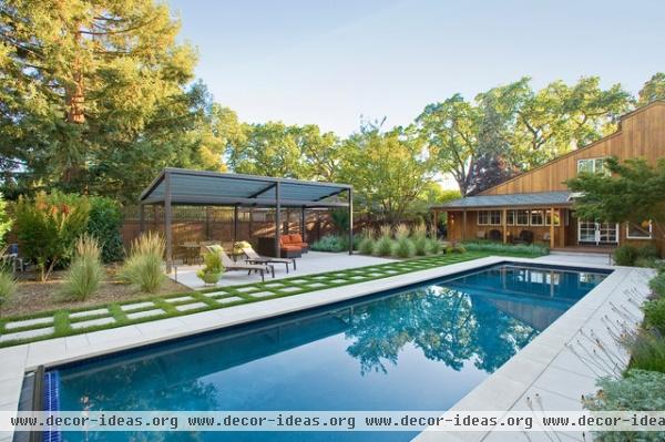
The original homeowners had added a huge pool in the 1960s that took up half the backyard. Willers' first set of clients had him bury it in 2002. His most recent clients, though, wanted a lap pool for exercise, so he added one in 2011.
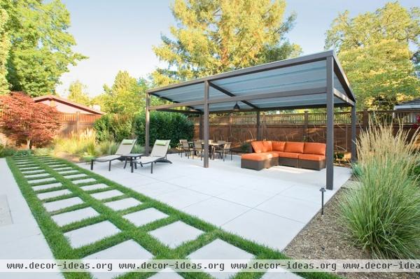
Canopy: Steel Geisha Designs; sectional: Wicker Central
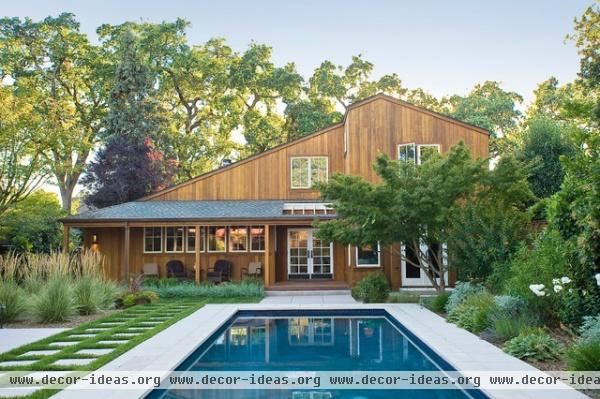
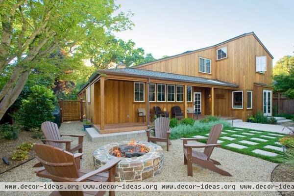
Willers designed the landscaping, while Rozanski Design built the final look.
Chairs: Sonoma Backyard
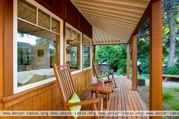
Corner windows frame the new lush green landscaping.
Chairs: Villa Terrazza
So just how does it feel to remodel the same house nearly a decade later? “It’s the nature of what we do,” Willers says. “At least we’re not using brand-new ground to make another house and another pool. On one hand you’re remaking something for a client’s particular set of needs, which is always what we do. Sometimes it’s from the ground up on bare land. Much of the time we take existing buildings and hang on to redeeming features," he says. "It’s difficult to see an entire house being pulled apart and thrown away, so to speak. In this home’s current version it will be around for a while.”
General contractor: Gracie Construction
Landscaping: Installed by Rozanski Design


