6 Lessons in Scale From Well-Designed Bathrooms
http://decor-ideas.org 08/19/2013 16:25 Decor Ideas
How we mix objects of different sizes, masses, proportions and patterns — in other words, how we work with scale — is a big part of good design. Architects and designers use scale to create interest and balance, and taking it into account leads to good design in even the smallest rooms of a house. To see what I mean, take a look at the lessons in scale from these six bathrooms.
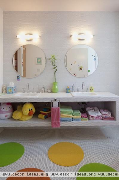
1. Use similar shapes in different sizes. Using similar shapes — rectangles and squares or circles and hexagons, for example — in different sizes can add interest and subtly draw the eye around the space.
Unlike most bathrooms, where rectangular and square tiles have a significant presence, this bathroom has round elements — hexagonal tiles, round mirrors and round floor mats — that create an environment that is both fun and minimalist.
The white hexagonal tiles on the walls, floors and bathroom vanity make the space feel large and bright.
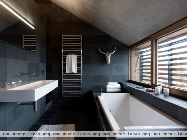
2. Play with one main material. Choosing one main material for your bathroom's palette will help harmonize the elements, creating a visual flow that's easy on the eyes.
Here's an obvious example of how using one main material produces a calm feeling. The large 12-by-24 tile reduces the amount of grout lines, adding to this bathroom's expansive feel. And the simplicity of one material allows the art in the room — the silver steer head — to have a real presence.
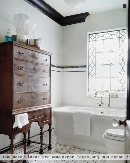
3. Vary the sizes and shapes of materials and furnishings. Transitioning between sizes of furniture and materials connects various parts of the space in a different way.
There are many good examples of scale in this classic bathroom. There is a nice transition in scale from floor to ceiling, with the small basket weave tiles on the floor, the medium subway tiles for the wainscoting and the large drywall that leads to the ceiling.
The leaded window design relates in pattern and proportion to the basket weave floor tile. And because the ceilings are quite high, I love this tall wooden chest next to the cast iron tub. It helps connect the space from floor to ceiling.
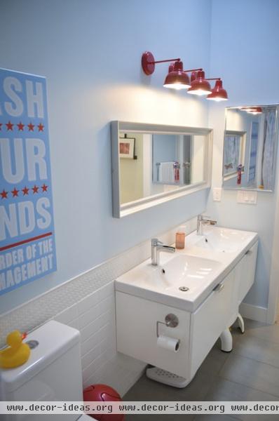
4. Create collections. Using grouped items in the same scale adds rhythm and variety to designs. Don't overlook the relationship between wall sconces and the vanity in the bathroom.
Because this vanity's mirror is as wide as the vanity, the lighting above the mirror needed to span the same width. Instead of adding one large horizontal light fixture, this designer used a collection of three sconces above the mirror, creating a nice rhythm and tapping into the power of three.
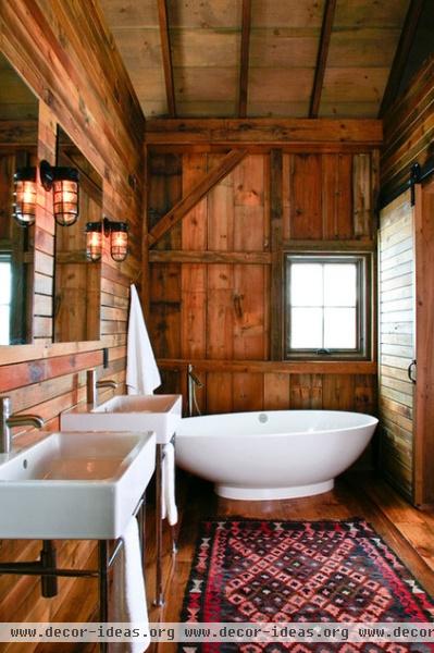
5. When working with one material, use it in different sizes. The floor and window-wall planks in this wonderful barn bathroom are one size, the vanity-wall planks are narrower, and the ceiling planks between the rafters are yet another size.
Using the same material in various sizes — one way of working with scale — made this bathroom simply beautiful.
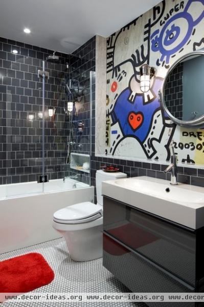
6. Use contrasting shapes. Sometimes the use of the same shape can create harmony in a space, and sometimes the use of different shapes can create a contrast that works.
In this creative bathroom, small white floor tiles contrast nicely with 4-by-4 glossy black ceramic wall tiles. The black and white palette allows the wall mural to make its statement.
Have you been playing with scale lately? We'd love to see what you've done.
Related Articles Recommended


