My Houzz: Quality Shows in a Contemporary Dutch Home
http://decor-ideas.org 08/19/2013 15:40 Decor Ideas
Karianne Peeters and Erikjan De Wit had just months to get their unfinished house in the Netherlands into shape before the arrival of their first child, but they didn't let the time crunch get in the way of quality and comfort. Here's how they turned what was once an empty concrete former office space into an inviting family home boasting a custom kitchen and a smart layout.
Houzz at a Glance
Who lives here: Erikjan de Wit, Karianne Peeters and their children, Jan-Jan and Jikke
Location: Utrecht, the Netherlands
Size: 120 square meters (1,292 square feet); 2 bedrooms, 2 bathrooms
Year built: 2002
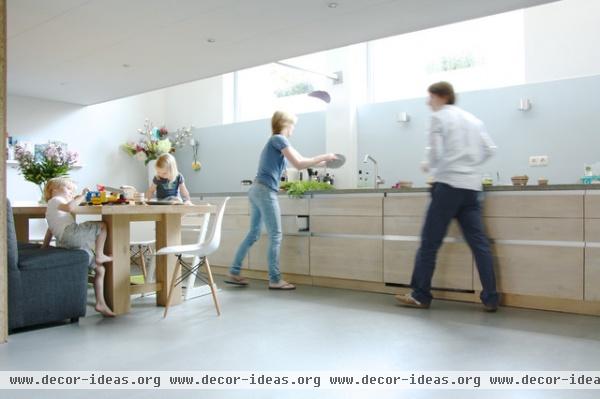
De Wit, shown here with the rest of the family, originally planned to buy an Ikea kitchen, but his friend had just started a custom furniture company, so he took advantage of a friendly discount. "In the end the kitchen cost around 30,000 euros [about U.S.$40,000], which is admittedly still a lot, but it is all custom built and beautifully made,” he says.
He wanted a seamless look for the Eastern European oak drawer fronts and commissioned a carpenter to replicate the same cabinets for the dishwasher. Instead of cabinets above, the couple opted only for drawers below to store toys, clothes, laptops and artwork in.
The kitchen features a custom concrete countertop that measures 6.4 meters (21 feet) in length and was made in two parts. This custom work set the couple back about 4,000 euros (U.S.$5,286) — a splurge they feel was worth every penny. “Concrete doesn't keep its new look for long, but I like the way that it wears,” says De Wit.
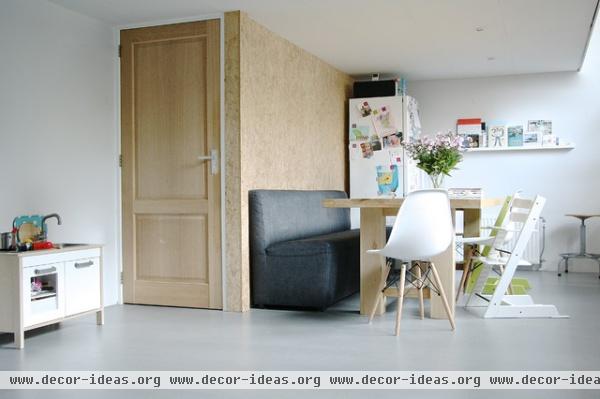
A wall initially divided what is now a spacious eat-in kitchen; the area had accommodated a bedroom with an unnecessarily high ceiling on one side and a small kitchen on the other. One of the first things De Wit did was open the room by removing the wall, which he did himself with the help of friends. This lengthened the kitchen and created extra space upstairs in what would otherwise have been wasted space. That extra space is now a home office behind the main bedroom. Behind the plywood wall is the family bathroom.
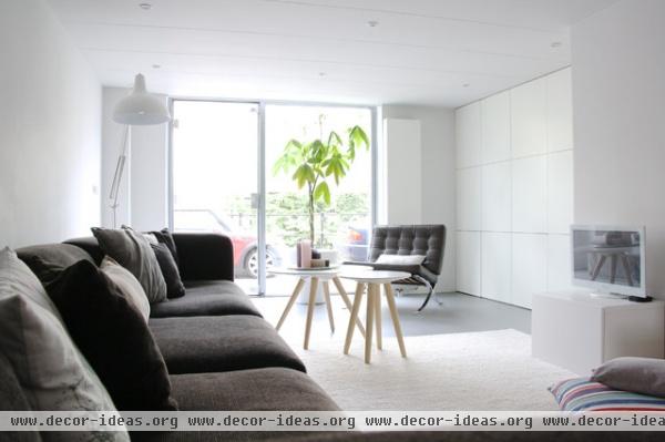
The family room has a large charcoal-hued sofa and a contemporary coffee table. “Our philosophy is to buy things that we really love, but it’s not our goal to fill our home with any old thing just because it's in style,” says Peeters.
“I’m an economist," says De Wit. "I’m not really into design, but I do like chairs.” He finds inspiration in the Bauhaus style of modern architecture and design, and one of his favorite pieces is his Barcelona chair.
Peeters gathers decorating inspiration from the Dutch publication Eigen Huis & Interieur.
The couple added the glossy white floor-to-ceiling built-in unit and use it to primarily store their clothes, due to a lack of storage space upstairs.
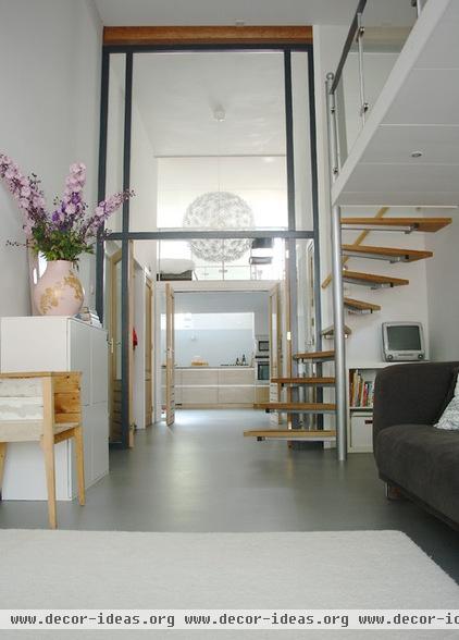
This view from the entryway shows a streamlined combination of oak, glass and concrete against a clean, white backdrop, maximizing light and space. “We appreciate modern design but also like using certain materials,” Peeters says. The oversize Ikea pendant is large enough to make a statement but delicate enough to not overwhelm the space and detract from the architectural features.
The floor-to-ceiling steel-framed glass wall is one of the home's most striking features.
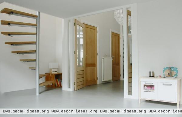
From the kitchen a floating spiral staircase leads to the couple's loft bedroom and home office. Down the hallway is the entryway, followed by an identical staircase, which leads up to the kids' bedroom.
The oak doors were in the house when De Wit purchased it back in 2006, and they played a pivotal role in the way he went about designing the rest of the space. When it came to the look and feel of the house, he went for genuine and hard-wearing materials that had a somewhat raw quality, such as concrete, wood, aluminum and steel. “I wanted quality," he says. "I was going for a look that was simple but authentic.”
Pendant: Maskros, Ikea
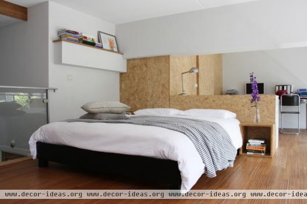
The main bedroom is an understated, modern affair, divided by a midheight wall of plywood, which extends into built-in storage space made from the same material. The plywood continues into the kitchen below.
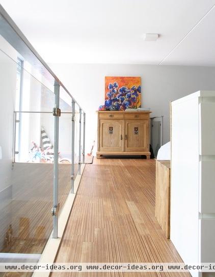
De Wit began with a renovation budget of around 40,000 euros (U.S.$52,856) to paint, complete the kitchen, install the wooden floors upstairs, install the glass panels and reveal the steel balustrades. When he purchased the house, the balustrades were heavy wooden structures that reminded him of a Swedish sauna. “They were heavy and blocked the light, so I removed the wood with a grinding tool to expose the steel frames inside,” he says.
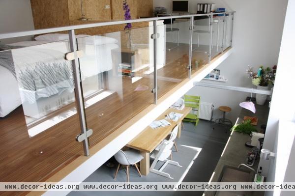
When the glass panels were installed, the contractor hired to do the job realized the angles of the balustrades were off, making it virtually impossible to install the glass. The steel beams were intended only as the frame for the wooden balustrades, and were never meant to be visible.
So the glass panels had to be cut on an angle, a job that set De Wit back another 2,000 euros (U.S.$2.642) and an extra two weeks. “It was a setback,” he admits. “But the contractor who came up with this solution was inventive and did a great job.”
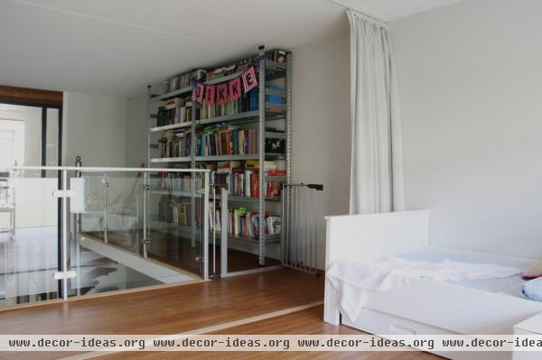
The space above the living room was initially the main bedroom until De Wit and Peeters needed to make room for their first child. Now siblings Jan-Jan and Jikke share it.
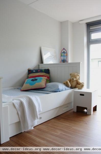
Simple furnishings atop wooden floors (another splurge during the remodel) give the kids' room a spacious look and feel.
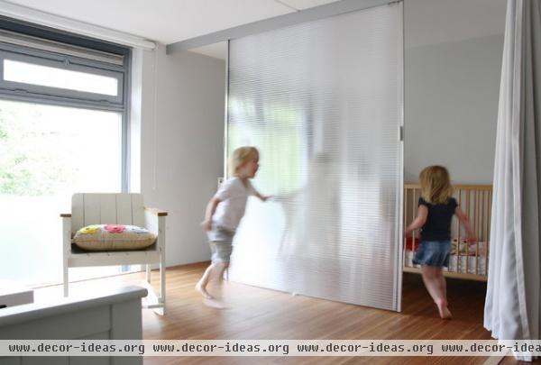
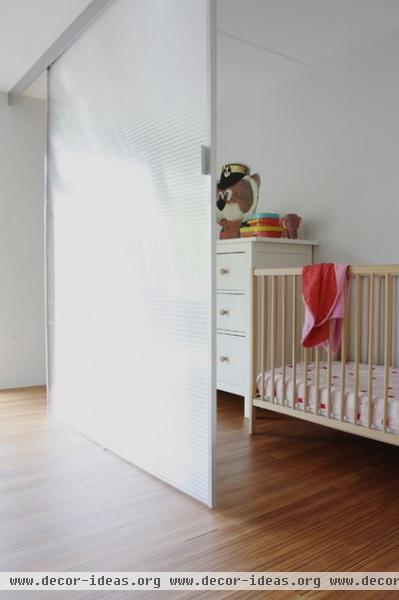
Daughter Jikke's crib and changing table are nestled in what used to be a closet — a smart solution for this family of four.
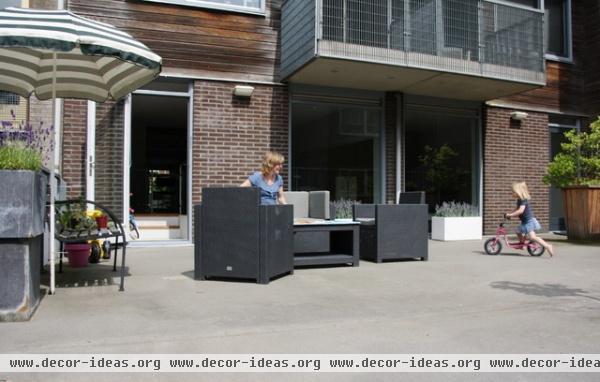
A small staircase leads from the couple's bedroom to a shared patio, where the children have ample space for playing and riding their bikes.
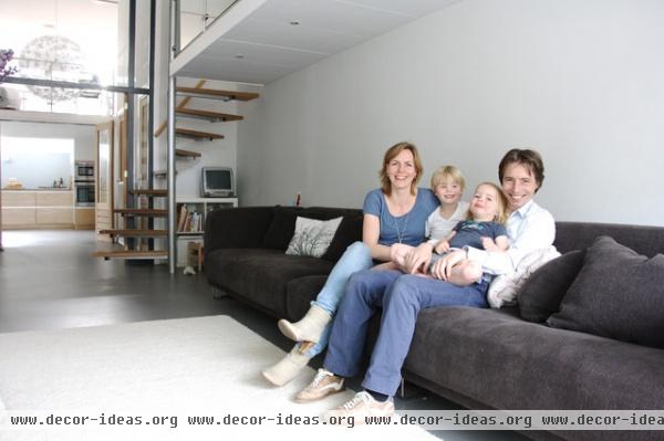
Karianne Peeters, Jan-Jan, Jikke and Erikjan De Wit share a moment in their light-filled living room.
See more photos of this house | Show us your home
Browse more homes by style:
Small Homes | Colorful Homes | Eclectic Homes | Modern Homes | Contemporary Homes
Midcentury Homes | Ranch Homes | Traditional Homes | Barn Homes
Townhouses | Apartments | Lofts | Vacation Homes
Related Articles Recommended


