4 Zurich Projects Build on High-Rise Livability
On a recent trip to Zurich, I spent a good deal of my free time checking out new housing developments that share some characteristics: They are located just west of the central city (in the Albisrieden and Friesenberg neighborhoods); they have multiple buildings placed across designed landscapes, building on the Garden City ideas of the middle of the 20th century; they provide amenities for the primarily middle-class families occupying them; and they incorporate terraces to provide individual outdoor spaces, in addition to the shared outdoor spaces between buildings.
This ideabook tours four of the housing developments, focusing on the buildings and the spaces in between. Where possible, I've linked to floor plans, to help you understand how the units relate to the exteriors and how they provide for the families living in them. In many ways the projects remind me of mid-20th-century multifamily developments in the American suburbs, but the Swiss projects improve upon some of the negative and limited aspects (surface parking, catering to singles rather than families etc.) that made those developments short-lived. In this sense these four projects offer some alternatives for how families can live together in nice settings.
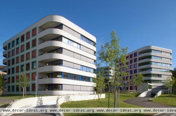
Sunnige Hof, 2012
Burkhalter Sumi Architects
Vogt Landscape Architects
This project adds density to a 1950s cooperative housing settlement designed by architects Sauter and Dirler, which placed three- to five-story buildings loosely across the landscape. The Garden City ideals are continued in the six new buildings, which are taller, larger and more colorful than the existing buildings.
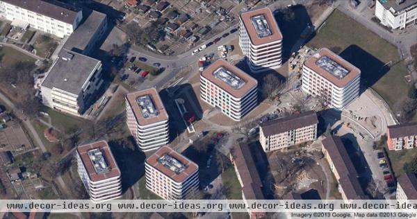
The six new buildings are replacements for the same number of existing buildings that were demolished; this is about a third of the 1950s cooperative. The new rectangular buildings have rounded corners and are also placed informally across the landscape, as if they were shaped and located by hypothetical currents of water flowing across the site. Their form and placement allow for views, sunlight and variety.
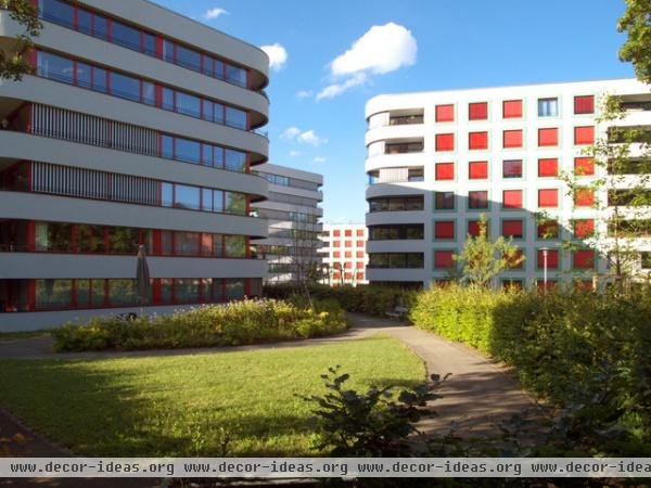
The placement and orientation of the buildings allow for a variety of views through and across the site. In this case we can see four buildings receding into the distance. The landscape architecture helps to define outdoor "rooms" adjacent to the buildings that can be used for a variety of purposes; on my visit a dinner was taking place in one of these areas, and lots of kids were running around.
In addition to a community room on the ground floor of one of the buildings, each of the six buildings includes a room for strollers and one for bikes near the entrance.
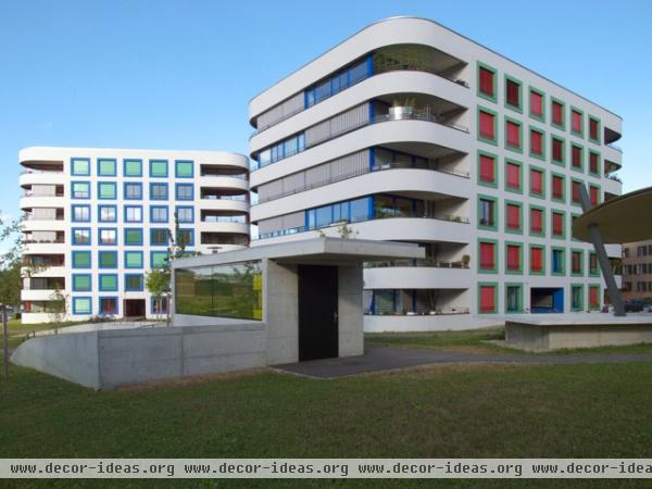
This view says a lot about the planning of the new development, as well as a little bit about the units themselves. In the foreground we can see a small concrete pavilion of sorts; it is actually an entrance to the below-grade parking garage, a common element in each of the developments I visited. Given the remove from the central city, cars are common and therefore provided for in a way that allows for the areas between the buildings to be used for things besides parking. That said, this project is a short five-minute walk from trams and buses that bring one to other parts of the city. (The transit systems is very thorough and efficient, if expensive — like everything else in the city.)
Color is used to distinguish one building from another, on the frames, the surrounds and the shutters. The latter are ubiquitous in Switzerland, given the lack of air conditioning (not needed, given the short summer). Blocking the summer sun is the best way to cool down interiors, and this applies to the corner terraces as well, which have curtains for additional shade.
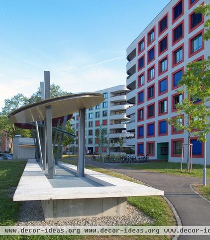
Running from one garage entry to another is this piece of sculpture that caps the vent for the garage. It both celebrates and covers (imagine the view from above, both with and without the canopies) what is happening below, which would otherwise be just a long grate.
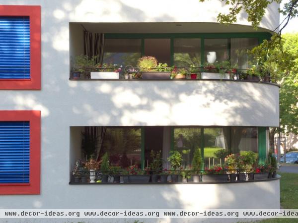
Given the rounded corners of the buildings, it makes sense that generous balconies would happen here. Per some typical floor plans, four units are provided on each floor, most with two or three bedrooms and two bathrooms. The corner terraces are adjacent to living-dining areas that are not overly large but are generous when the outdoor space is taken into account.
Ersatzneubauten Triemli, 2011
Von Ballmoos Krucker Architects
Vi.vo Landscape Architects
This large residential development of 200 units replaces a number of buildings from a 1940s Garden City housing development designed by Karl and Wilhelm Müller. The development is located at the intersection of two busy streets (and a major transit hub) and takes its name from the nearby Triemli Hospital. Its location also benefits from the mountain that overlooks it on the west.
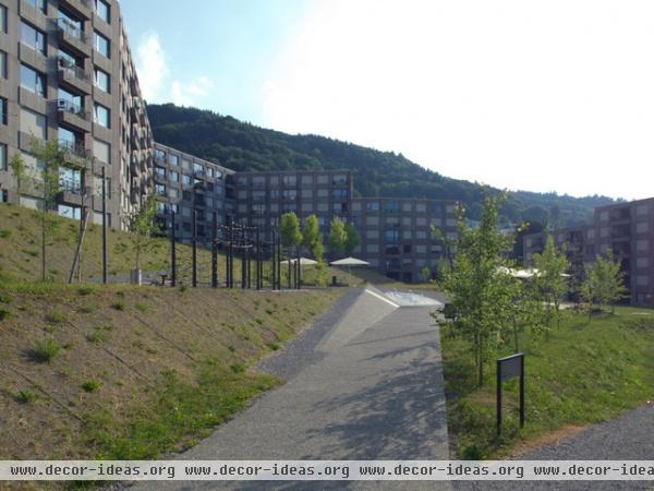
The focus of the development is a large landscaped open space that, like the buildings, is broken down to appear smaller and include separate zones. But instead of stepping like the buildings do, the landscape has angled planes and ramps to link, in this view, a playground to a fountain and to connect the buildings to different parts of the landscape.
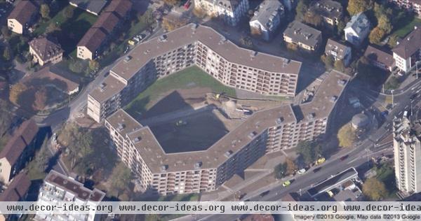
Unlike Sunnige Hof's tactic of breaking up the development into a number of buildings, this development is composed of two large buildings that snake around the perimeter of the site to define the large, open space in between and provide access to it.
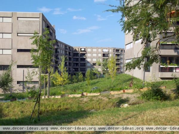
The landscape isn't limited to the space between the buildings; it also includes the area around it. Here, looking toward the interior zone from the west, we can see some planters that form a community garden.
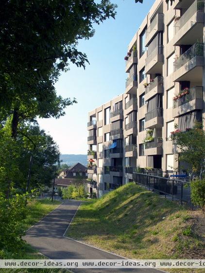
Two 100-unit concrete buildings certainly sound overwhelming, but as executed the project is anything but. This is due to the landscape architecture, the way the buildings follow the topography, the entries that break up the length while they provide access from one side of the building to another (also featuring stroller and bike storage), and the breaking up of the mass through inset and Juliet balconies. As with the other developments, subterranean parking allows the landscape, rather than parked cars, to be a major part of the design.
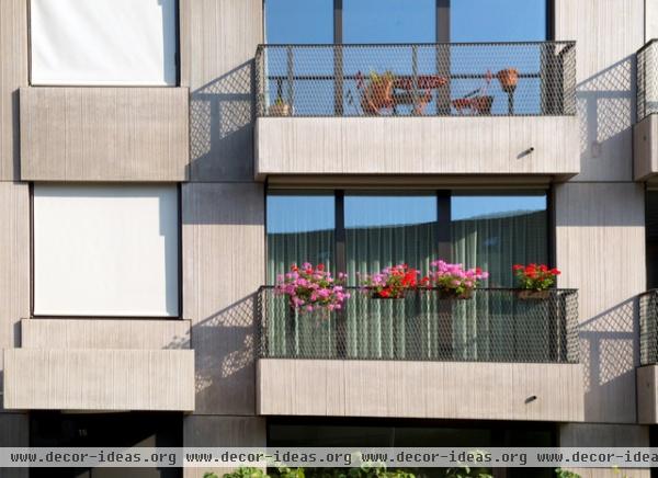
If we take a look at a typical unit floor plan, we can see that the apartments extend from one facade to the other. This means that each unit (the one linked has two bedrooms, two baths and a den) has one terrace and one balcony, and a south-facing elevation. The shallower balconies (some are shown here) still enable one to sit outside and to have planters.
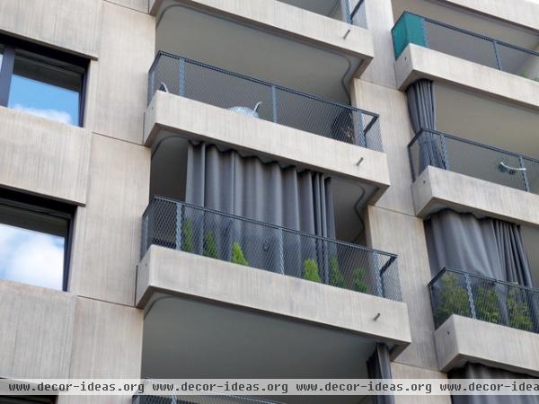
The terraces, on the other hand, are quite generous and are much more of an extension of the living space. Curtains on tracks allow residents to cut down on direct sunlight and maintain privacy.
Siedlung Grünmatt FGZ, 2014
Graber Pulver Architects
4d AG Landscape Architects
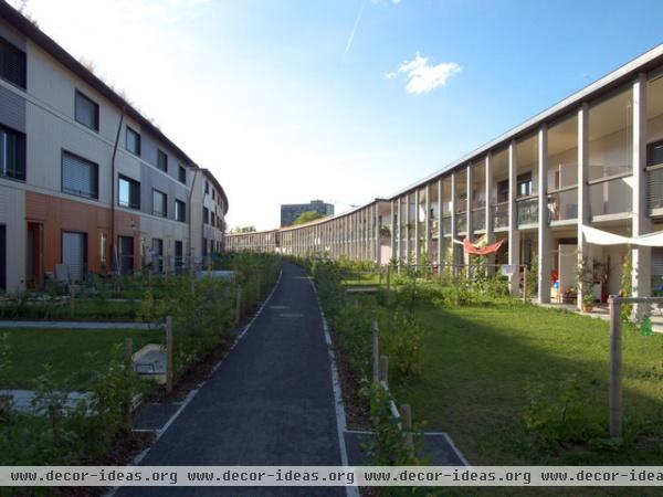
This project, about two-thirds of the way through construction, is made up of four parallel, curving strips that follow the landscape and also embrace the sunlight. North-facing elevations (left) are primarily solid and flat, while the sides facing south (right) are deep and marked by columns in front of terraces. In between are walkways between yards that are sometimes recreational and sometimes plots for small-scale urban farming.
Note that each building is a split level: Three stories face north, and two stories face south, following the sloped topography of the site.
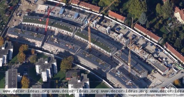
Each curving bar is actually composed of a number of buildings, allowing access from one level of outdoor space to the next. On my visit these spaces in between (two of three of them are occupied) were abuzz with children playing, parents making dinner and people just relaxing outside in the sun.
As with the other developments, parking is below the buildings, freeing up the space in between buildings for landscaped yards. Additionally, garbage and other communal facilities (such as composting) are located at the ends of each bar.
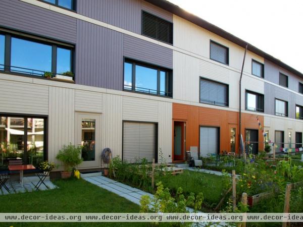
The units are a mix of wide single-story apartments (the linked plan shows a two-bedroom, 1½-bath unit and a three-bedroom, two-bath unit) and narrow, three-story row houses (the linked plan has 3 bedrooms and two baths). Every unit, like in the Triemli development, extends from front to back, meaning that light and air are maximized, and some units have both a front yard and a backyard.
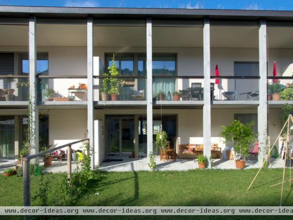
The south-facing elevations are the nicest part of the buildings, creating some depth and giving terraces to residents on the upper floors, who do not have a yard.
Wohnüberbauung Wasserschöpfi, 2011
Althammer Hochuli Architects
Vogt Landscape Architects
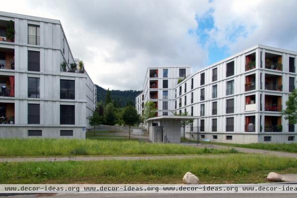
This last development echoes many of the features of the other projects (multiple buildings around landscaped grounds, subterranean parking, individual terraces, Garden City roots etc.) though on a slightly larger scale — 11 buildings with four stories each.
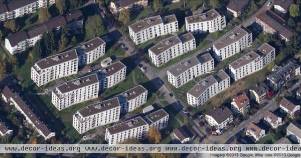
The parallel buildings bend in plan to provide some variety and follow the sloping topography of the site. The project is just steps away from a train (the tracks can be seen in the lower left, and the station is just out of sight below them) with quick access to central Zurich. But as with the other projects, parking is provided below grade; the small pavilion in the previous photo is one access point to the garage.
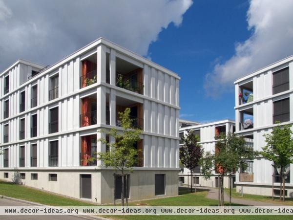
Concrete was used for the exterior, specifically glass fiber reinforced concrete (GFRC) in lightweight panels with a white surface color. As in the Sunnige Hof earlier, terraces are cut into the corners, which makes for pleasing outdoor spaces and some privacy, since the terraces look in the same direction and therefore not directly at one another.
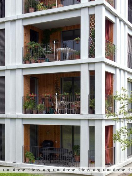
A floor plan of one of the 11 buildings shows the placement of these predominantly corner terraces, which correspond to fairly large units — four three- and four-bedroom apartments to a floor. Units on the end benefit from three frontages, while those in the middle still have front and back facades, meaning light and air are maximized.
The project is indicative of a popular trend in Zurich to give middle-class families decent-size units within pleasing settings, close to transportation yet still with the benefit of a place to store a car. It's the best of both worlds, the urban and suburban, of buildings and landscape.


