Houzz Tour: Updates Honor a 1930s Cottage's History
The couple who live in this house had each lived in this San Diego–area neighborhood for 20 years before they met. After meeting at a party, they fell in love and got married — and then had to choose which of their two homes to live in.
After evaluating both houses for potential expansion, they and architect Richard Gatling determined that the husband's charming cottage with its long, narrow lot was the better choice, and they got to work designing their new shared home.
The pair thought teardowns and McMansions were wreaking havoc on the historic neighborhood, so they wanted to honor the original 1932 cottage and keep the front facade almost exactly the same.
Houzz at a Glance
Who lives here: A retired couple
Location: Just outside San Diego
Size: 1,900 square feet; 2 bedrooms, 2 bathrooms
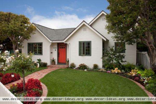
"The home is the West Coast's version of the colonial," Gatling says. It combines East Coast colonial revival style with elements of California Craftsman.
While this job was essentially a teardown (the front facade was left up while they renovated around it, then replaced it), Gatling was true to the original home's look, right down to matching the original siding. One new difference out front: crank windows, which allow for cooling cross breezes to pass through the home.
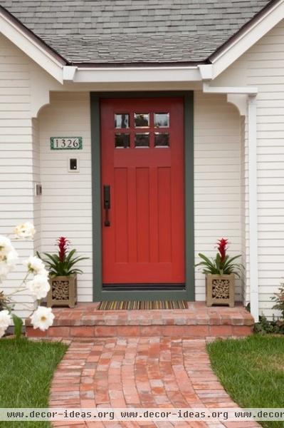
When Teddy Roosevelt's post-presidency secretary built this home for his own retirement in 1936, the cottage was only 700 square feet; over the years, it had expanded to 1,300, and Gatling's renovation added an additional 600. The couple nixed the idea of a second floor; they want to grow old here, and there was not room for an elevator.
They looked at many colors for the front door and found the perfect red in a Matisse painting at the Museum of Modern Art. Gatling had the paint custom-matched to Matisse's hue.
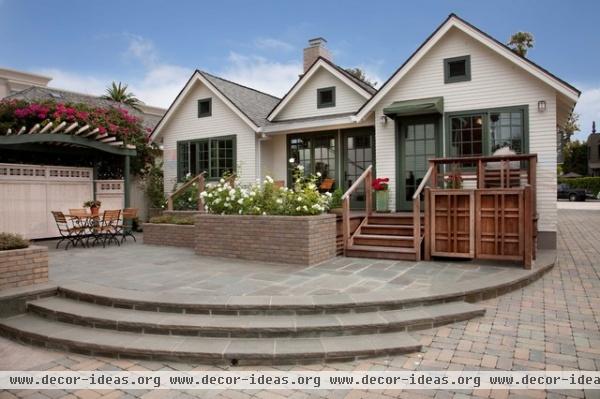
The sawtooth facade works from front to back. The three pitched roof structures are staggered along the back. "This gives it a lot of life and tension, carries through from the front and makes things more interesting than a flat facade," Gatling says.
The new patio is New York bluestone; its green tint picks up on the home's Craftsman green trim. The Mangaris wood deck has Craftsman-style detailing. "We added some old-school elements, like the canvas awning, to honor 1930s style," Gatling says.
The yard's slope from the street to the back had caused flooding problems in the past. Gatling took care of this by using permeable bricks on the driveway and parking pad, which catch the water and let it slowly leach out into the yard.
Sustainability was another priority. The house is very well insulated and is not air conditioned, as the cross breezes keep it cool. The water heater and furnace are high efficiency, there is a centralized energy system, they used no- and low-VOC paints and the floors are renewable bamboo.
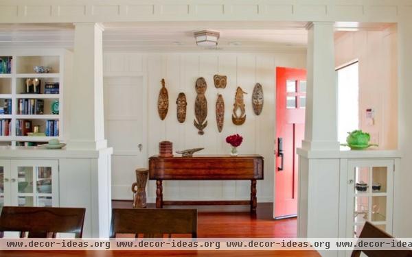
While the Gatling design team also completed the interior design, it is full of the couple's personal touches, such as Polynesian masks and an African drum from the husband's travels.
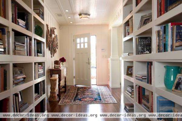
Thick walls in the entryway contain simple Craftsman-style bookshelves. Gatling carefully copied the board and batten paneling from the home's original paneling, extending it across all the walls and ceilings. To get the desired 1930s look, instead of drywall he used sanded plywood, painted with hand-brushed thinned coats of paint. The brushstrokes created an aged feel and texture similar to what was in the original home.
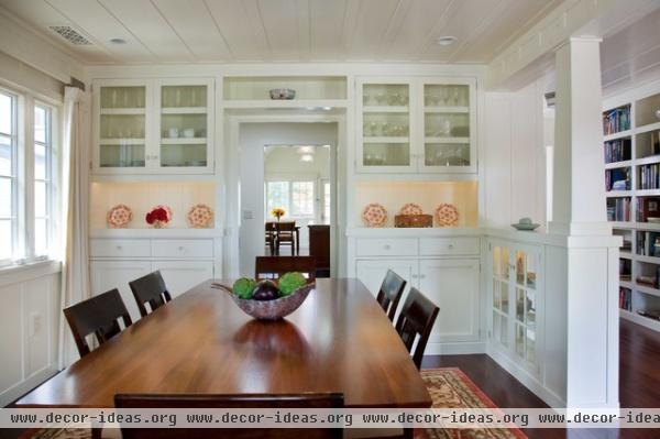
The hallway opens into the dining room, featuring 1930s-style built-in glass cabinets containing the wife's china collection.
Beyond the china cabinets, a butler's pantry with laundry connects to the kitchen. One can view the backyard all the way from the dining room.
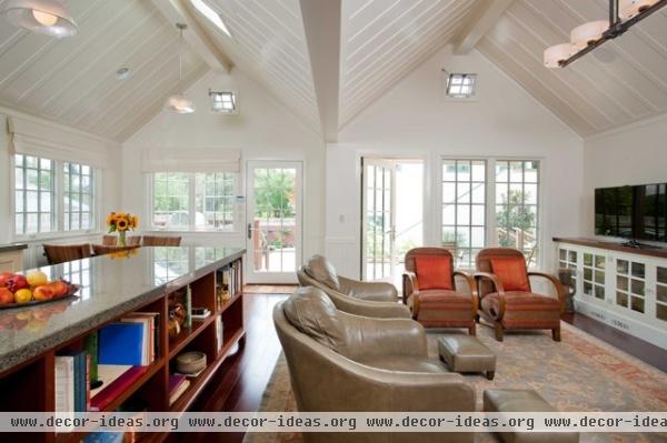
While Gatling was true to the original home's exterior facades and interior detailing, he designed the spaces for the couples' modern lifestyle, getting rid of the original low ceilings and small rooms. The compressed entryway dramatically opens up into this large, open living space with two vaulted 13-foot ceilings and views to the back of the lot, 125 feet away.
"I never want a house to look 'decorated' but prefer that it look as though items were collected over time," Gatling says. The leather chairs are Josef Hoffman, and the wood chairs are French art deco chairs from the 1930s. "All of the furniture is basically period furniture; we didn't want to go cottage-y with white slip-covered sofas and such."
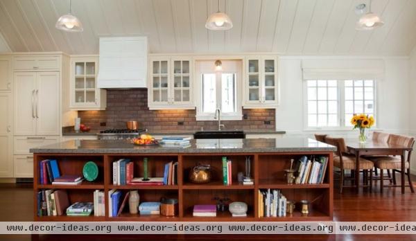
The kitchen and living room are subtly divided within the same space. This side of the kitchen island has cherry bookshelves for the living room. Gatling opted not to put a sink in the island so that it would not look as though it belonged to the kitchen more than to the living room.
On the kitchen side, the countertop and island's end line up, defining a breakfast area just beyond. "Several times when I met with the clients, I could see that sitting with coffee and three newspapers and having discussions was important to them; breakfast together was the center of their day," he says. Thus, he made the area carved out and comfortable, with a Brazilian palissandre table and upholstered chairs.
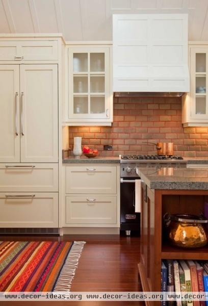
The backsplash tile was handmade by the well-known local Laird Plumleigh Studio.
Range: Viking
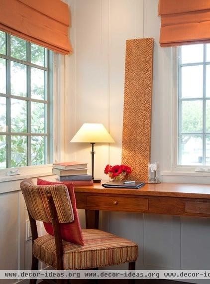
For the wife's office, the team commissioned this desk, which spans 9½ feet across the wall.
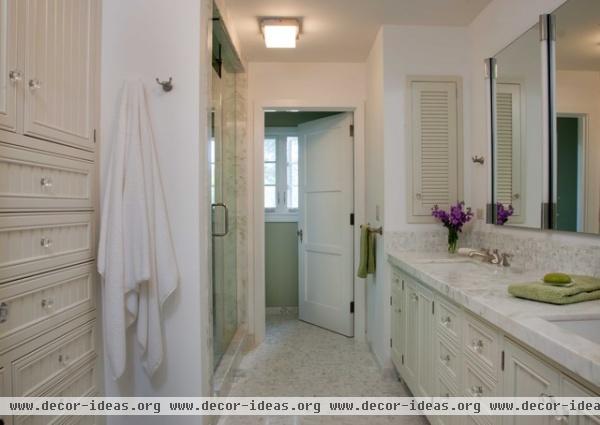
They made the most of storage in the master bath — the cabinet on the left is 7 feet tall and 30 inches deep. "It's like a giant dresser," Gatling says. The mirrors on the right conceal 8-inch-deep medicine cabinets, and the shuttered door holds everyday items such as toothbrushes.
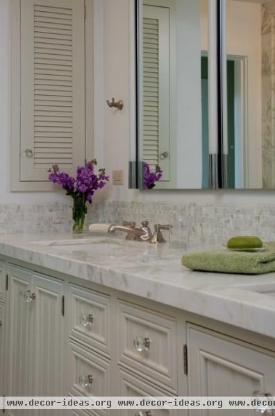
Beadboard cabinets stay in keeping with the period. Matching the floor and backsplash tiles helped streamline the room. The counters are Alba Chiara marble.
Mirrors: Roburn
Because the couple had no interest in having a bathtub, the shower is a generous 4 by 5 feet, and there was room for a separate toilet room. There is a bathtub in the guesthouse.
"You have to listen carefully to clients and the words they choose," Gatling says. "These clients did not want a brand-new house, nor did they want a complete restoration."
The result is something in between, with the best of both approaches: a comfortable, energy-efficient home full of charming touches that respect its history and context, without any of the not-so-wonderful vintage elements such as low ceilings and dark, cramped rooms.
Next: Explore 20th century minimalist traditional home styles


