Houzz Tour: Visit a Modern Update in Oakland
http://decor-ideas.org 08/17/2013 00:05 Decor Ideas
Architect Matthew Baran was called in by Heather Raney of REO Homes to turn a Spanish-style home in North Oakland into something more modern that spoke to the eclectic warehouse edginess of the surrounding neighborhood. Built on spec and working on a tight budget against a three-month deadline, he first had to remove an illegal add-on unit, then update the space with industrial windows, a contemporary paint job and a spacious backyard with a terraced patio.
Houzz at a Glance:
Location: North Oakland, California
Size: 1,200 square feet; two bedrooms, 1 full bathroom and 2 half bathrooms
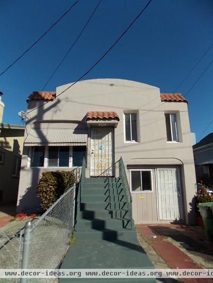
BEFORE: Baran felt the previous home was a "hacked together Spanish style," with an illegal addition that turned the garage into a one-bedroom unit with a separate door to the street and backyard.
Baran had to work quickly to bring the building up to code by removing the illegal unit and returning it to a garage space.
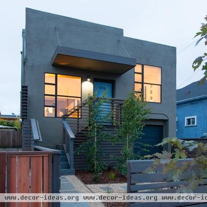
AFTER: The architect wanted to create something that had a relationship to the urban environment surrounding it. So he removed the sloped arch parapet, sloped roof pieces, overhang and awning and built up the shell of the building into something more clean, stark and modern, with large square aluminum windows that resemble the industrial design of the warehouses in the neighborhood.
While he removed the deep line archway on the left side to be flush with the facade, the one on the right remains, something Baran regretted in the beginning but has come to appreciate over time. "It leaves a trace of a previous life of the house," he says.
To soften the stark elements, Baran added painted redwood railing and landscaping by Miguel Nunez at M.A.N. Landscape for a natural feel. Heather Raney for REO Homes oversaw the renovation.
Exterior paint: Benjamin Moore HC-103 Cromwell Gray
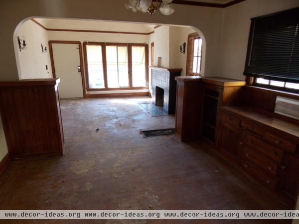
BEFORE: Structurally, the interiors were in good condition, if a little dated. Raney collaborated with Scott Silvera of Scout Design to modernize the interior while still maintaining most of the home's classic architectural elements. They stained the original oak floors and added a more industrial-recalling window designed by Baran that faces the street.
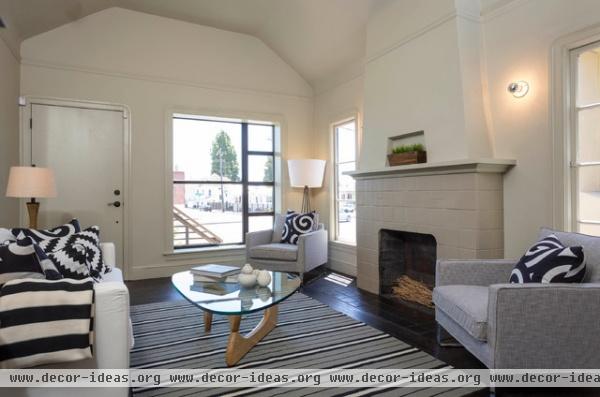
AFTER: For the most part, the group kept the rest of the interior elements intact. The wood trim and tiled fireplace were all painted and the floors stained dark for a more contemporary feel that brightens the previously dark vibe. (Silvera furnished and styled the house.)
Floor stain: Minwax Jacobean
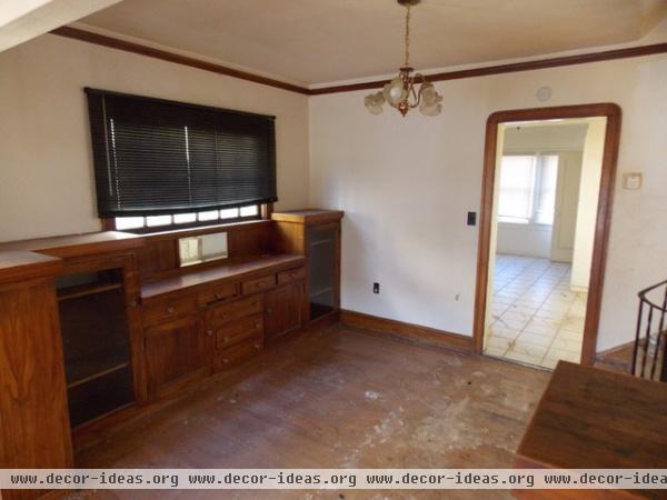
BEFORE: Raney had originally wanted to remove the built-in cabinetry, but upon hearing that it was gum wood and much desired by homeowners, she and Silvera decided to restore it instead.
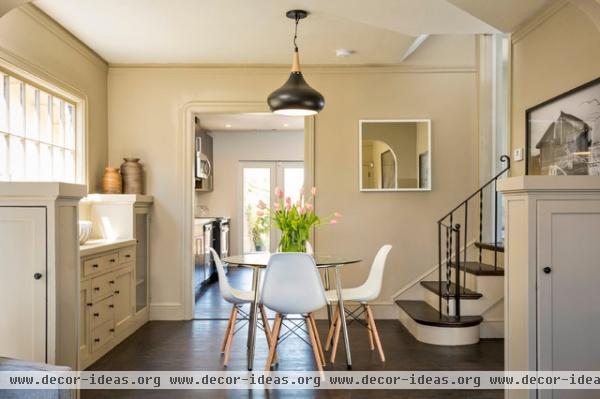
AFTER: A fresh coat of paint and new hardware lightened and updated the original built-ins. The home is a split level — the garage is on the ground floor; the kitchen, dining and living rooms are on the middle level; and the two bedrooms are on the top floor.
Light: Noir pendant from CB-2
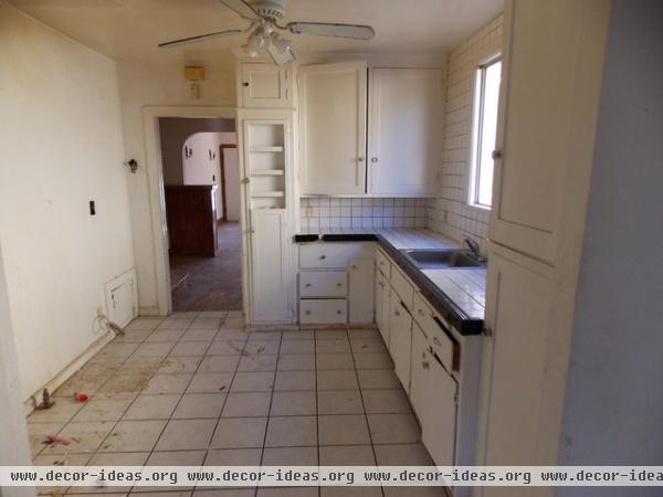
BEFORE: The kitchen was narrow and full of dated tile and cabinets, all of which Baran ripped out.
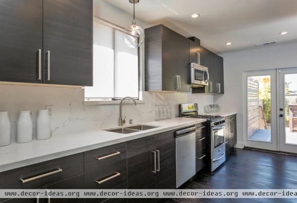
AFTER: Baran expanded the space by pushing all the kitchen components to one wall, creating enough extra room to add a half bathroom and bar on the other side.
Kitchen cabinets: Ikea; light fixture: globe pendant from West Elm
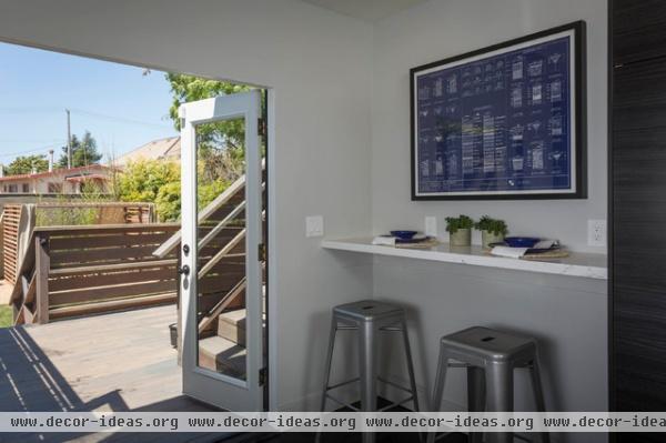
The bar area acts as a breakfast nook that opens to a backyard terrace and outdoor dining space.
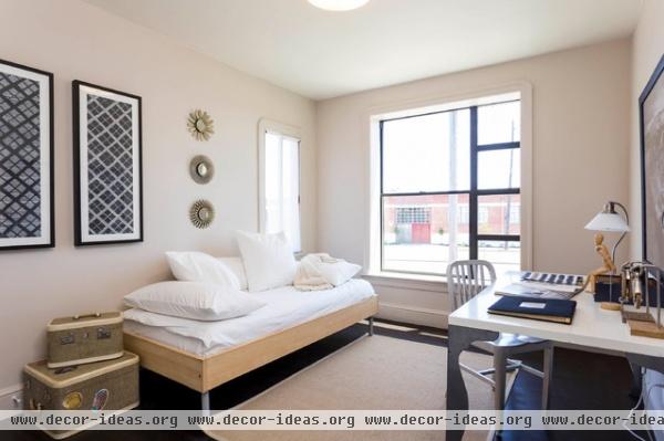
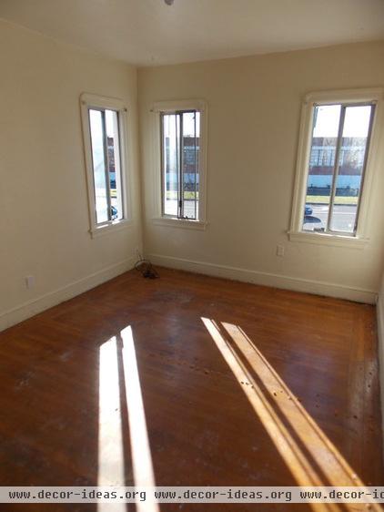
BEFORE: Another square aluminum window designed by Baran was added to the street-facing guest bedroom. The floors were also stained dark. One of the original windows remains on the left side.
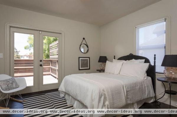
AFTER: The main bedroom opens to a private terrace that leads down to the backyard and outdoor dining space.
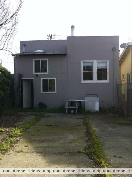
BEFORE: The previous structure's exterior was somewhat depressing, with paved-over landscaping and an illegal addition (on the left) that led to a separate living space. The main home was virtually closed off from the spacious outdoor area.
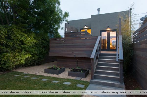
AFTER: Baran's plans removed the illegal addition and added French doors off the kitchen and a main bedroom to connect the home to the outdoors. "I saw an opportunity to open the back of the house," he says. Instead of having just one monotonous yard space, Raney decided to separate the backyard into different zones that would correlate to rooms in a house. The planter boxes with vegetables represent the kitchen.
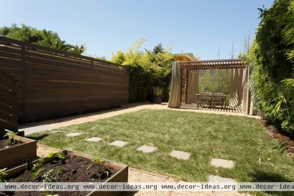
The open grass space acts as a living room.
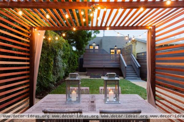
A redwood trellis-covered dining area acts as a formal dining room separate from the casual eating space on the terraced patio.
Related Articles Recommended


