Houzz Tour: Complexity Hides Inside a Concrete Box
http://decor-ideas.org 07/22/2013 16:20 Decor Ideas
The design of this house in Quebec is driven by the structure and needs of the family — namely, some privacy for the teenage children and some family gathering spaces. Architect Paul duBellet Kariouk's result may seem harsh at first glance, but the monolithic exterior hides an interior that is open, light and more complex than it might seem from the outside.
This ideabook takes a tour around and inside the house, revealing the careful layout that allows each family member to be alone — but also come together in an uplifting space.
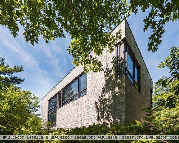
Kariouk calls the masonry box the "foundation of the family." The home sits above a river valley, and it's apparent from the outside that the upper floor captures the views through its large windows; the lower floor is predominantly solid.
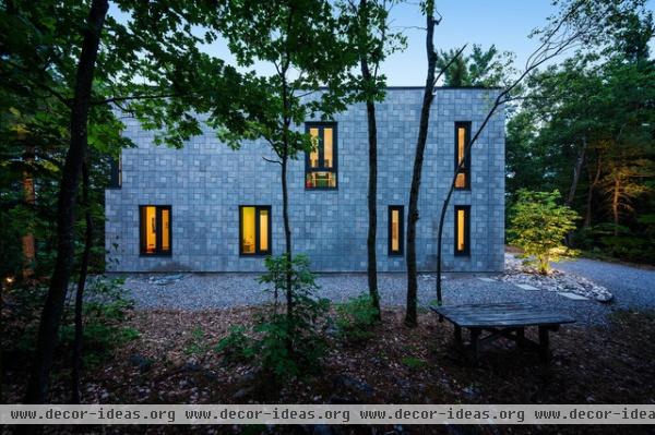
The other side of the shoebox-shape house is made up of smaller windows, hinting at where the sun tracks its path. The large windows soak up the sun, but this side tries to contain as much heat as possible — important anywhere in Canada.
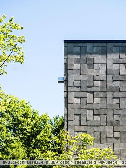
While the concrete-block exterior appears monolithic at first glance, Kariouk composed the blocks into a pinwheel pattern that gives the building a dramatic texture.
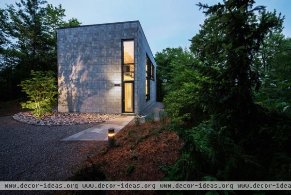
The entrance is located on one of the short sides, called out by a glass strip, a walkway and a vertical bollard light set in the ground. The glass above the door hints at some of the spatial complexity happening inside.
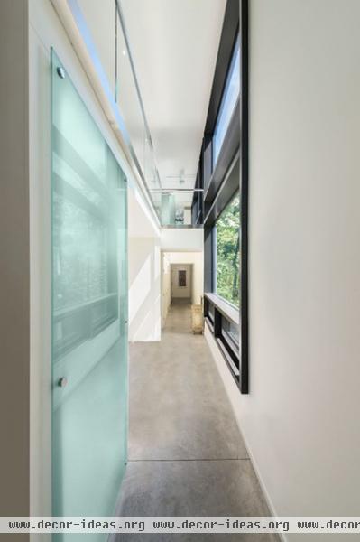
One step into the house and the reason for the glass above the door is clear: A double-height space extends from the entrance all the way to the other end of the house. Therefore the two floors of the house are linked spatially; the zone for the kids is downstairs and that for the parents and gathering is upstairs.
Downstairs the finishes are simple (radiant concrete floors, painted drywall), but as we'll see they are more refined upstairs.
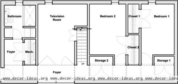
Before we look at the rest of the house, it's good to see the floor plans to understand how the rooms work and how the floors relate. The dashed lines along the hallway at the bottom of the plan are floors above the hallway that extend to the exterior wall. All of the rooms are off the hallway: two bedrooms, a bathroom, mechanical, storage and a TV room that can be open or closed off.
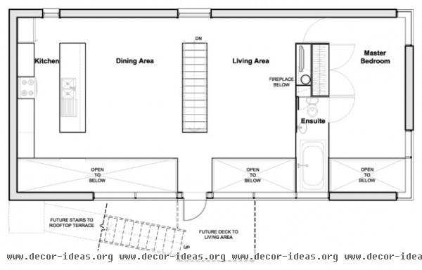
Upstairs is basically an open-plan living space with the master bedroom at the far end. One of the floor extensions (the dashed areas in the previous plan) will be a connection to a roof garden that has yet to be built — the roof will lift the homeowners above the trees, giving them a great spot for outdoor dining and relaxing. The other floor extension is a bathtub for the master bedroom, an interesting condition (the architect calls it the house's "one significant cushy indulgence") that will be explained later.
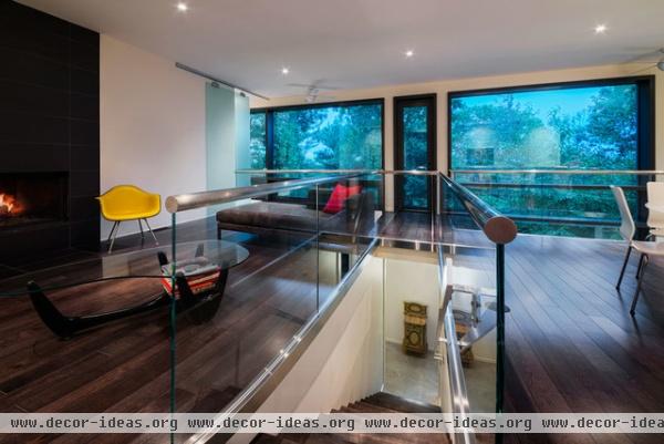
The stairs in the middle of the plan bring us up to the open living space. Behind us is a small window on the elevation seen earlier (there is a logic to the windows that is apparent in the floor plans). Opposite is the door that will eventually provide access to the roof garden.
The concrete floors of downstairs give way to wood floors and glass, found in the railings and in a frosted-glass door visible on the wall at left (more on that later).
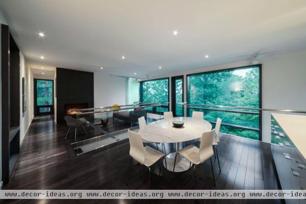
The stairway serves double duty, both bringing people upstairs and defining smaller spaces in the open plan — the dining area is in the foreground and the living room beyond. The kitchen overlooks the living area, and all of the spaces look out onto the trees through the large windows.
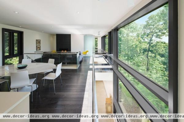
This vantage point from the kitchen accentuates the openness of the plan, as well as what is gained by opening part of the floor between the two levels. Not only are the two floors connected through sound and space, but they have a stronger connection to the outdoors through the large windows.
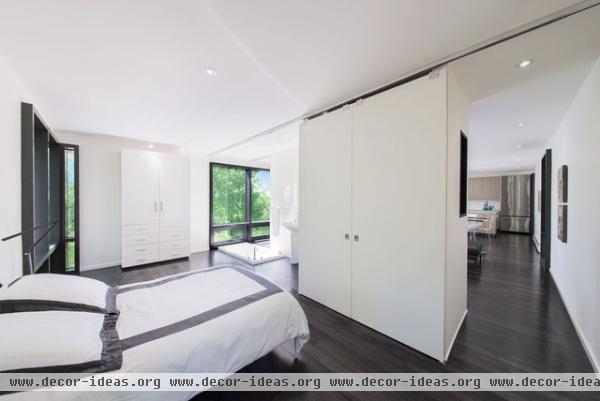
Like the overall house, the master bedroom is compact. Sliding doors serve the closet in front of the bed as well as closing off the room from the living area beyond, providing some privacy in the bathroom (note the ceiling track running the width of the room). Also note that the floor extends to the far wall. It is not open to below, as the plan indicates, but something interesting is happening in the bathroom.
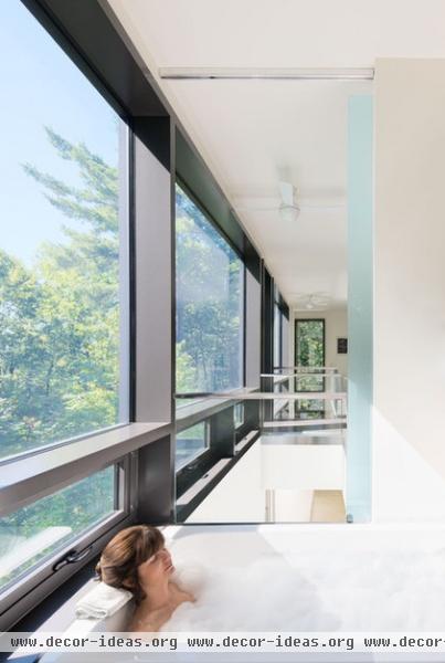
As mentioned earlier, the "cushy" addition to the house is a sunken tub that projects over the double-height space. One can look from the tub through the house and out the expansive windows. The frosted-glass panel seen earlier allows some privacy, something that happens both upstairs and downstairs.
Next: Explore more modern homes
Related Articles Recommended


