Saving Facades: Modern Gems Merge Old and New
Modern architecture is the misunderstood, trouble-making child of the built world. I discovered just how much trouble modern architecture makes for people after writing this article for Houzz, where the Comments section quickly filled with strong opinions — my own included.
The current perception of modern architecture is one of steel, glass and museum-like space. I believe that modern architecture is a greater idea — one that represents how we live today. The dictionary definition of modern is: "Of, relating to, or characteristic of the present or the immediate past as opposed to the remote past."
That said, how should we address the aging population of historical buildings? Should they simply be torn down because they represent a previous age and lifestyle that is no longer relevant to the current homeowners? Is it possible to achieve a modern work of architecture while maintaining an aged historical facade?
Here are several projects that have achieved exactly that — historical structures made relevant by merging the old and the new.
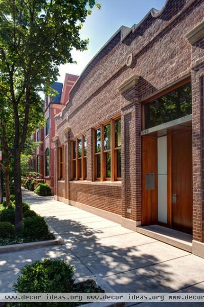
1. Mid North Residence, Vinci | Hamp Architects
This masonry building in Chicago used to be a dairy distribution center, but was renovated into a beautiful, modern home that wraps around an interior courtyard. The complex masonry detailing of the front facade (which is so difficult to duplicate today) was preserved, while the interior was rethought and redesigned.
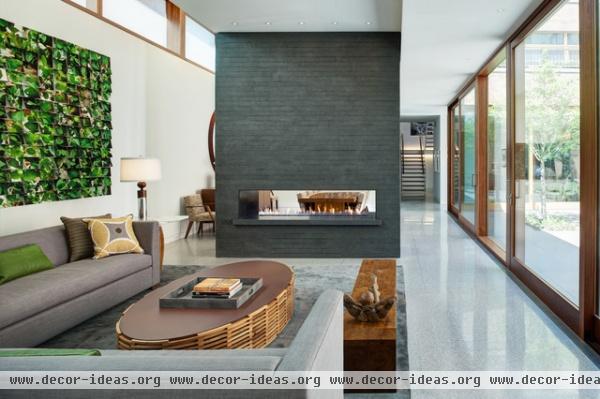
The newly designed living space inside this former warehouse opens to the courtyard with large glass doors, filling the space with light and views. It's a modern space that represents the lifestyle of its occupants.
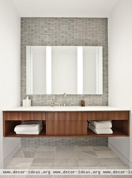
I love this home's wonderfully detailed bath vanity. It's simple and beautiful. A mirror uncluttered by extraneous lights mounts to the wall, with the lights woven into the mirror design.
The detailing of this bath vanity complements the exterior aesthetic as a welcomed modern update.
See more of this home's design
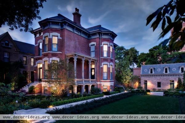
2. Wicker Park Residence, Vinci | Hamp Architects
Here's an Italianate mansion and coach house conversion by the same architect as the previous project. Part of the home, including the entry and living space, was restored while other spaces were remodeled in a more modern aesthetic.
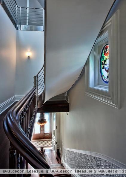
The marriage of the old and the new can be clearly seen here. A decorative wood stair handrail quickly converts into a more modern stainless steel style. The stair leads to an open and sky-lit playroom.
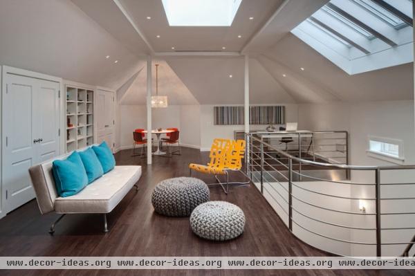
After seeing the exterior, you might imagine a dark and spooky attic space, akin to your favorite horror film, at the top of this home. Instead, the architect provided a beautifully open and light-filled multifunctional playroom.
See more of this house
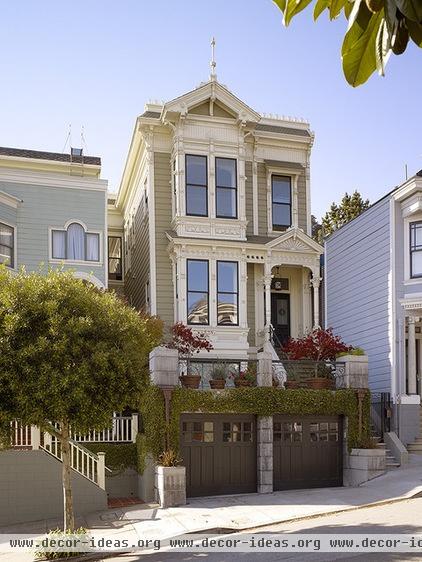
3. Buena Vista Residence, Schwartz and Architecture
Historical homes often fail to provide for modern amenities — such as a functional kitchen. This is not surprising, given how we now cook far differently then when the homes were originally built. This San Francisco Victorian was no different, requiring an upgrade to its outdated kitchen.
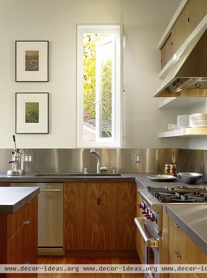
In this photo, you can see the juxtaposition of the new and the old as the wood from the new cabinetry rises above the older hardwood floor. The kitchen is detailed in a modern, clean aesthetic. The architect took advantage of the existing windows to fill the kitchen with light.
See more of this house
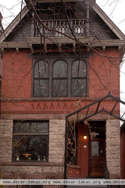
4. Parkdale Victorian Renewal
Sometimes, a modern renovation to a historical home is not in the details, but in the function of the space. This three-story Victorian in Toronto would fall into that category. The house didn't work with the couple's style, so they went through a year of renovations to open up the six bedroom home into a more modern, family space.
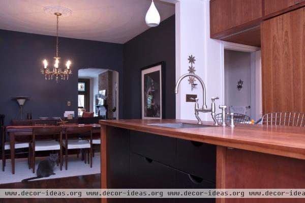
Here, the kitchen opens to the dining room — a decidedly modern idea. The kitchen faucet is updated in its function, but aesthetically closer to the home's original Victorian style.
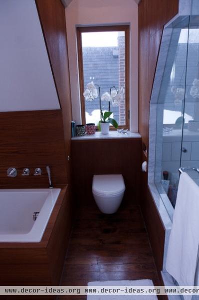
The designer used a small window to bring light and airiness into the bathroom — a room that's typically under thought in older Victorians. See more of this house.
These projects indicate that new can marry with the historical — functionally and aesthetically.
We'd love to see your mix of old and new. Please show us your house in the Comments section below.


