My Houzz: An Opposite-Tastes Couple Finds a Happy Medium
For couples, choosing and decorating a home is all about compromise. But let’s face it, that can be difficult, especially if your tastes and your partner’s are polar opposites.
Take first-time homeowners Mike and Kathryn Zabik. He prefers a big urban loft. She prefers a historic farmhouse. He likes modern fixtures and an open floor plan. She likes to incorporate her grandmother’s antiques and a feeling of intimacy in her spaces.
So when they bought their condo, they knew they would have to strike a balance. Kathryn began by toning down what she describes as the home's "bachelor feel" by painting the walls, adding wallpaper to the main bath, installing light fixtures and dimmers, and hanging art. "I stayed away from anything too girly or preppy," she says.
She then tapped her friend, designer Brynn Olson, to help them fuse the old-world pieces with contemporary furnishings by adding wall and window treatments and accessories. "I love historical pieces, but I understand how intimidating they can be,” Kathryn says. “I make a lot of decisions around how to make them appear comfortable and natural in our contemporary space."
Houzz at a Glance
Who lives here: Mike and Kathryn Zabik, and their miniature dachshund, Charlie
Location: Bucktown neighborhood of Chicago
Size: 1,500 square feet; 2 bedrooms, 2 bathrooms
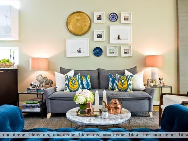
Many of the couple's decor items are gifts from Kathryn's grandmother, including the copper accessories on the coffee table. "My grandmother is probably the first person to teach me the beauty in simplicity," Kathryn says. She went with neutral gray walls to ground the living space, while a royal-blue daybed bench helps define the area. "I love an open floor plan but crave intimacy," she says.
Sofa: Bliss Down-Filled, West Elm; coffee table: Smart Round Marble Top, CB2; side tables: Vittsjö, Ikea; paint: Hazy Skies, Benjamin Moore; settee: Camille Tufted in Indigo Velvet, Restoration Hardware
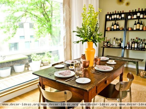
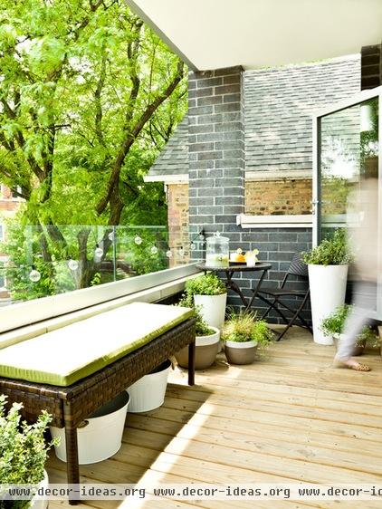
Kathryn tried to strike a balance between mixing contemporary pieces with antiques. In the dining area, brushed-nickel chairs surround a farmhouse-style table with china and more copper accessories from her grandmother. "I gravitate towards objects with family history or fond memories," she says. The dining room opens to a city patio.
Table: Pennsylvania House; chairs: Fleet Brushed Nickel, CB2; shelving: Sloane, Crate & Barrel
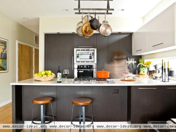
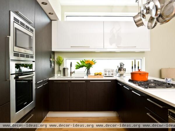
The open kitchen allows whoever's cooking to connect with guests. "I always wanted a pot rack, so that was the first thing I installed," she says. "It is surprisingly convenient, and the knife rack is just genius."
Bar stools: Industrial Stool, West Elm; pot rack: Enclume; appliances: Bosch
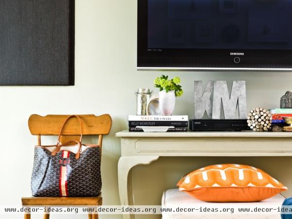
"I aspire to be Martha Stewart and have everything neatly filed and alphabetized, but it’s just never going to happen," Kathryn says. "I’ve given myself permission to have an untidy pantry/linen closet provided the main areas are clean."
She had large cabinets installed to the left of the television and uses them as catchalls to keep things hidden. The developer originally intended the space to be deep shelving.
Midcentury chair, footrest: Rago Auctions
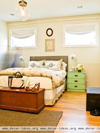
The main bedroom is soft and cozy. The dresser was a DIY project made using a Rast unit from Ikea. See a tutorial for a similar project here.
Paint: Pale Oak and Seapearl, Benjamin Moore
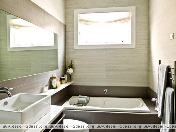
When the couple moved in, Kathryn toned down the bachelor feel of the main bath by adding wallpaper.
Wallpaper: grass cloth, Brewster
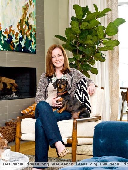
Kathryn, shown here, wanted to make sure the space could accommodate many guests and her miniature dachshund, Charlie, who likes to use all the furniture. And designer Olson was a huge help. "She was a lifesaver with our layout, beautifully transitioning from a big dinner party to just Mike and I watching TV on the couch," Kathryn says.
See more photos of this house | Show us your house
Browse more home tours by type:
Small Homes | Colorful Homes | Eclectic Homes | Lofts
Contemporary Homes | Modern Homes | Transitional Homes
Traditional Homes | Midcentury Homes | Ranch Homes | Vacation Homes


