A Makeover Turns Wasted Space Into a Dream Master Bath
http://decor-ideas.org 07/22/2013 03:25 Decor Ideas
It is as though the original layout of this 1980s condominium's master suite was a puzzle someone put together the wrong way, and 30-some years later an architect came in and put all the pieces where they always should have been. Architect Amy Alper took a badly laid-out master suite and reconfigured it into a smaller bedroom with a new bathtub and sink room, a hallway and a closet. The owners are empty nesters who live in Los Angeles, and they bought the Sonoma, California, condominium to have a second home near their children; they're planning to live there full time eventually.
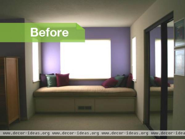
This condominium was designed in the 1980s, a time that embraced extra expanses of square footage in the bedroom. "There was an undefined sitting area adjacent to the bedroom that was a big, empty space," Alper says. Meanwhile, the adjoining bathrooms were small and utilitarian.
The space between the double-door entry to the room and the window seat was empty and unused. The bed is just to the left of the tall dresser (see expanded view).
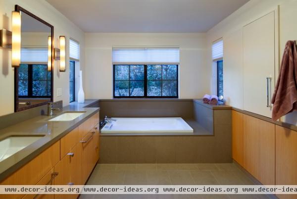
Alper scooped up this space and reassigned it to a new bathtub and vanity room. Now the tub sits in the bay where the window seat was. She reassigned the old mirrored closet to upper and lower recessed cabinets with touch-latch hardware; two of those cabinets are shown on the right side of this photo.
Alper balanced the room with a thoughtful flow of color and materials. The floor tile continues up the tub surround. The 1½-inch-thick Caesarstone from the countertop continues around the room as a sill. The same white oak lines all the lower cabinets on the right side of the room.
Sconces on dimmers create a flattering light.
Cabinets: custom, Hope Cabinetry and Builders; window treatments: Smith and Noble; sconces: Elf2 Bath Light; tile: Styles Tile and Stone; hardware: Sugatsune; sinks: Kohler; faucets: Axor Starck, Hansgrohe
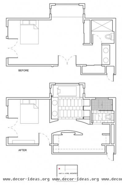
Before the remodel the couple had two relatively small closets. Alper moved the entrance to the room to the left, creating space for a new walk-in closet and hallway, as you can see in this plan.
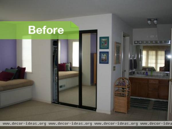
The space you see in this picture is now the master bathroom/hallway and walk-in closet. Alper shifted the double entry doors closer to the bed, as you can see in the floor plan. The toilet/shower room is still in the same place, behind the mirrored closet.
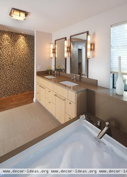
The owners wanted their home to have clean lines and textures, which Alper brought in via cork flooring and ceramic and glass tile.
Continuous edges give the room a contemporary feel, while the mix of textures and rich, neutral hues warms the space. The accent wall and tubular sconces bring in some welcome curves.
Ceiling light: Elf 8 Square Ceiling/Wall Light
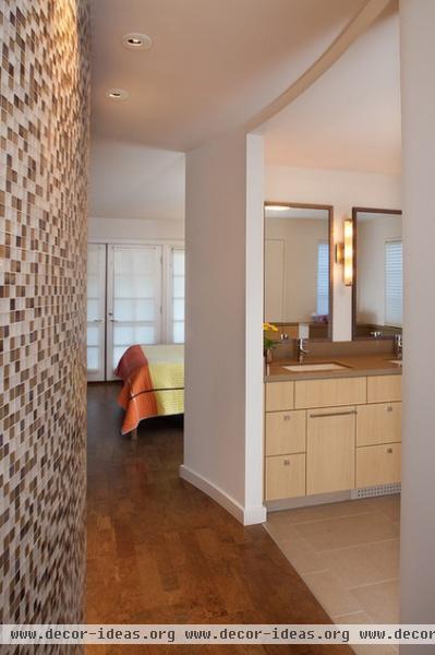
The mosaic glass tile on the curved wall can be viewed from the bathtub and from the bed. "It is the special piece and was worth the splurge," Alper says. "The space feels larger because it incorporates the hall with the glass wall as a backdrop to the room."
The cork flooring is comfortable underfoot, absorbs sound and adds soft texture and color.
Mosaic tile: Oceanside Glasstile
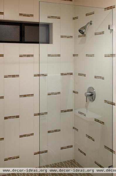
Dashed tile details play with pattern in the new shower. Though the dimensions of the shower room remain the same, the clear glass and new tile give it a more open feeling.
Shower fixtures: Axor Starck, Hansgrohe; tile: Styles Tile and Stone
Contractor: Rockridge Construction
Tell us: Have you reclaimed an awkward or unused space in your house? We'd love to see what you did.
Related Articles Recommended


