Kitchen of the Week: Going Elegant and Bright in a 1900s Home
This contemporary Atlanta kitchen wasn't working very well with the rest of the historic home. It had been renovated by previous owners, and few of the home's 1900s features remained in this part of the house. "The addition just felt very unfamiliar to the home's history," says designer Ili Nilsson.
Nilsson worked closely with the clients to design a new kitchen and attached lounge that better suit the house and their lives. Raising the dropped ceiling, putting in new windows and working with an elegant white palette created the classic look and practical function the family wanted.
Kitchen at a Glance
Who lives here: A couple and their 2 grown children
Location: Ansley Park neighborhood of Atlanta
Size: 750 square feet, including the attached lounge
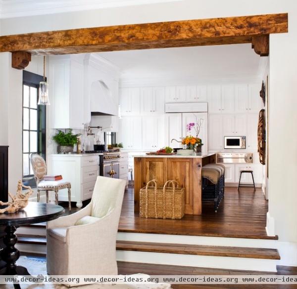
A cedar-wrapped beam visually divides the kitchen from the attached bar and lounge space. The kitchen didn't need the beams for support; they serve to define and highlight the area.
Structurally, the floor-level changes couldn't be adjusted, but Nilsson redesigned the existing steps to take up minimal floor space.
Pendants: South of Market
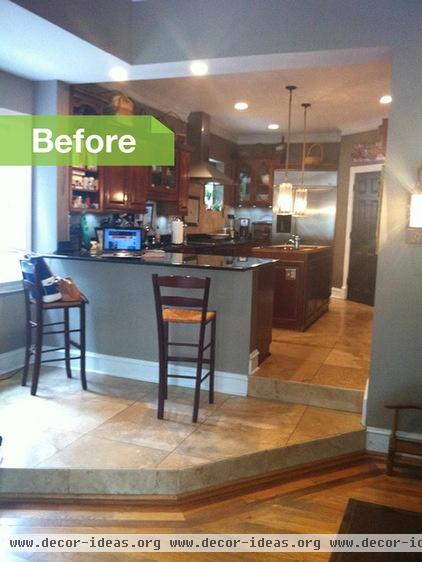
Renovated by previous owners, the dark space felt confined due to its awkward cabinetry layout and unnecessary corner pantry. A single window and a dropped ceiling (changed from 10 feet to 7½ feet during that renovation) had made the space feel even more dark and enclosed.
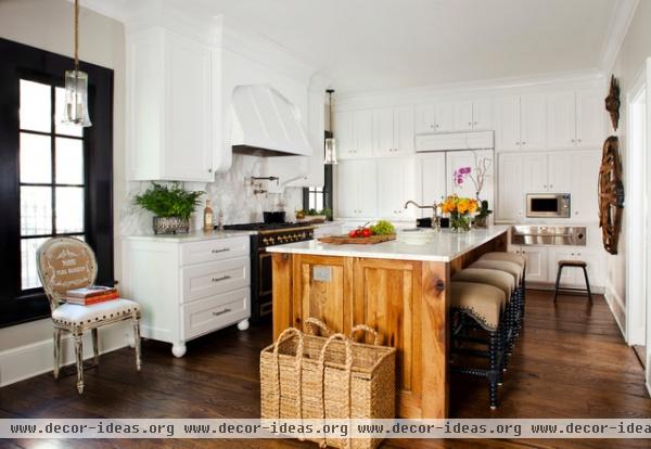
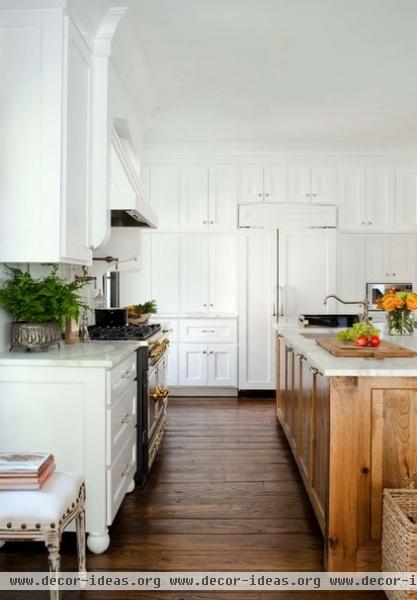
Nilsson raised the ceiling by a couple of feet (she couldn't raise it to the original 10-foot height due to new plumbing), took out the corner pantry and added two new windows for an open space. Replacing the dark built-ins with all-white cabinetry made the room feel more spacious.
Two new full-height windows on either side of the range add more light. The black window frames break up the white space and tie in with the dark La Cornue stove.
In place of the corner pantry, Nilsson put specialized pantry cabinets in quadrants around the refrigerator.
Cabinetry: Karl Alspach Construction; hardware: Restoration Hardware; refrigerator: Sub-Zero; microwave: Samsung
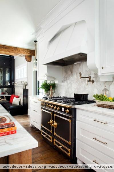
The clients purchased the gorgeous La Cornue stove before the remodel, but despite the French dimensions, it was easy to design into the new kitchen.
Hood: Vent-A-Hood; stove: CornuFé 110, La Cornue
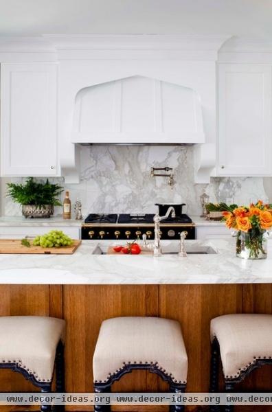
Ash paneling on the island adds a warm element to the white and black palette. The clients have two older children, and they all love to have friends over, so Nilsson designed the spacious island with plenty of counter and seating space.
Bar stools: Bungalow Classic; countertops, backsplash: Calacatta gold marble
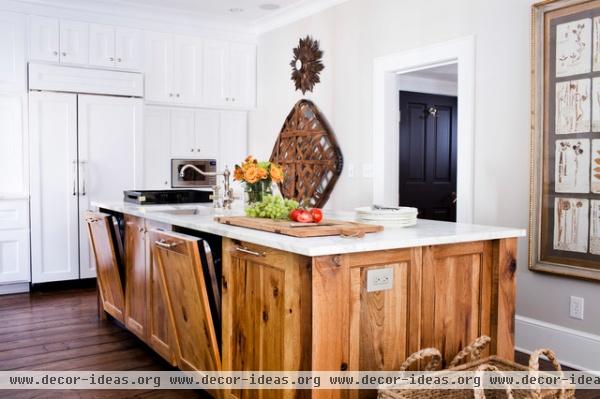
Two built-in dishwashers, extra storage, and recycling and trash receptacles in the island make postparty cleanup easy.
Dishwasher: KitchenAid; faucet, sink: Kohler
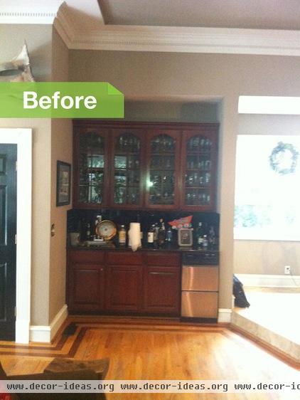
The previous kitchen's steps had dropped into a closed-off bar area, defining the two spaces with a change in elevation and floor finish.
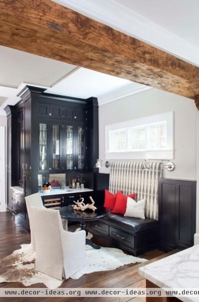
Now the two rooms are unified with wide-plank oak flooring and subtly separated with the cedar beam and steps. The bar and adjacent seating area face the kitchen, making for easy conversation between the two spaces.
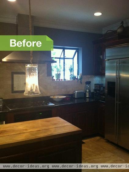
A single, tiny window and lots of dark cabinetry had made the previous kitchen feel much smaller.
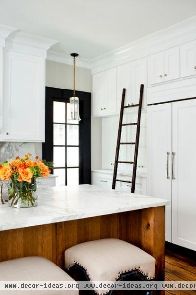
Nilsson wanted to maximize light and height, so she extended the cabinets to the ceiling. The top cabinets store little-used items; this vintage ladder lets the family access what they need.
Your turn: Tell us about your kitchen makeover!


