Check Out Our Sweepstakes Winners' 2-Room Makeover
Sue Ellen Ragsdale didn't believe her husband. Winning $50,000 for a new laundry room and bathroom? It sounded too good to be true. "She didn't believe me for a week or so," says Michael Ragsdale. "We've never had anything like this happen."
The Paducah, Kentucky, couple has lived in the same house for 18 years, raising three kids (one is still at home) in the three-bedroom, two-bathroom space. Years of wear and tear from children and grandchildren had taken its toll on the laundry room and guest bathroom.
Thanks to a remodeling sweepstakes from Houzz and Lowe's, the two rooms have gotten a fresh start. Designer Susan Seay and contractor Scott Walker have helped the Ragsdales make over both rooms, giving their home more space and better organization and style than they ever thought possible.
Photographer: Matthew McFarland, M Studio West
Products: Provided by Lowe's
Missed this one? Enter our current sweepstakes here!

The Laundry Room: New Storage Keeps Clutter From View
The Ragsdales, shown here, bought this red LG washer and dryer a year ago to update the laundry room, but they still didn't have much storage or any organization. "We don't exactly entertain in the laundry room," says Michael. "So fixing it up wasn't a priority for a while."
The winnings covered all labor, design services, taxes and materials for both rooms. At about $5,000, the cabinetry in the laundry room took the biggest chunk of the $20,000 materials budget.
Counter: Antique Mascarello Laminate, Formica; cabinetry: Amherst in maple, Diamond Reflections; flooring: Capri Natural Porcelain, Style Selections
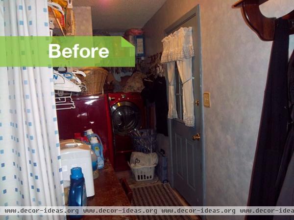
The couple uses the laundry room door as a side entrance from the detached garage and patio area, often leaving items in this room on their way to the family room around the corner. A curtain separated the two spaces, just barely hiding the view.
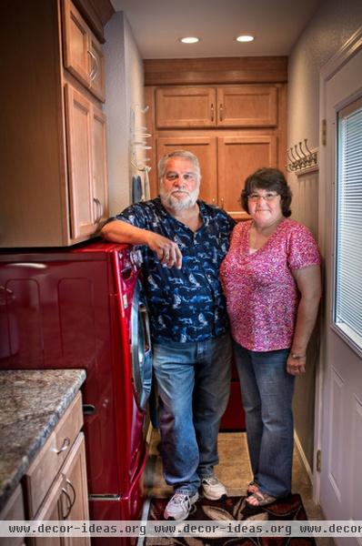
Michael focused on the practicality of the space and left the color and material choices to Sue Ellen and Seay. "It's one thing to look pretty, and it's another to be functional," he says.
Of course, Seay was concerned about practicality too — namely, if standard-size appliances and cabinets could all fit into this 5-foot-wide space.
Washer, dryer: LG; paint: Memory Lane, Olympic
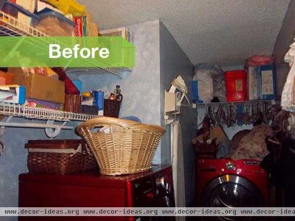
Flimsy white wire shelves barely contained the laundry room chaos and kept everthing in plain sight. The shelves' height made it hard to access necessities, too. "The Ragsdales knew that they didn't have any functionality in their present situation," says Seay.
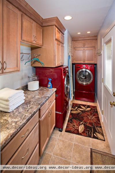
Using this long wall for the main bank of cabinetry, Seay added storage without crowding the walkway. Sturdy Formica countertops fit the budget and are now a workspace for folding and ironing.
Although the couple initially wanted a built-in ironing board, it wouldn't work with the narrow layout. Instead, Seay put a handy hook for the ironing board between the washer and dryer. "I do all the ironing in the house, so I love this new space," says Michael.
The newly organized laundry room has given the Ragsdales a different mind-set about their stuff. "I think it's helped them see that if you don't have a place for it, don't keep it," says Seay.
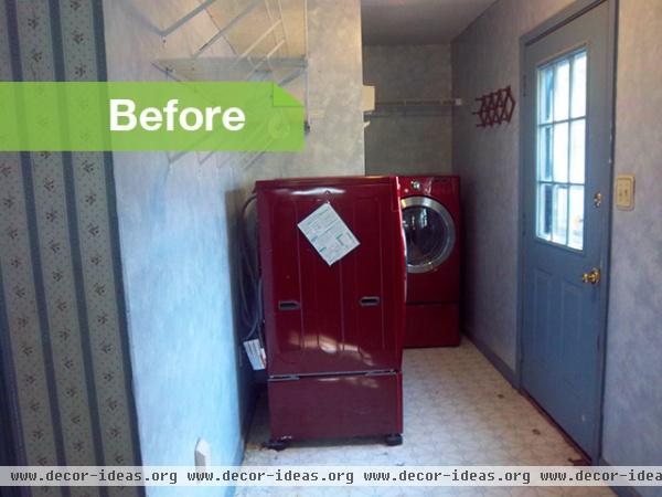
Sue Ellen loves blue and wanted to keep some of the old colors in her new laundry room.
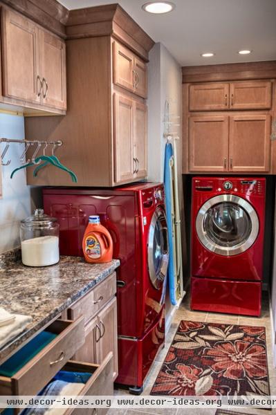
Seay took the icy blues from the old room down a notch, adding just a touch of gray to the wall color and balancing it out with neutral tones in the countertops and floor tile.
The Bathroom: A Whole New Layout and Look
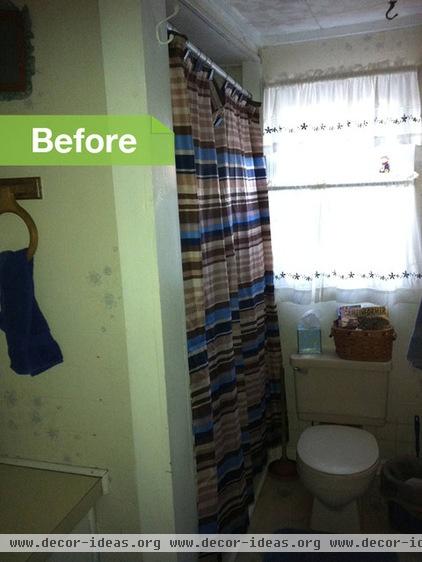
The cramped guest bathroom presented a whole other set of issues. Seay wanted to change its layout, so Walker gutted the space, tearing down the wall that separated the vanity from the shower and bathtub.
The demo revealed an unpleasant surprise in the flooring — termites and water had done some serious damage to the joists. Walker replaced the joists, bringing them up to code so they could support a new Jacuzzi tub.
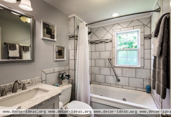
Turning the tub to sit against the back wall created more space for the vanity and toilet. "I just didn't want the toilet to be the first thing you saw when you opened the bathroom door," says Seay.
Floor tile: Floriana Heather glazed porcelain, Style Selections; wall and shower tile: Calacatta White glazed porcelain, Style Selections; shower accent tile: Floriana Heather Mosaic, Style Selections; showerhead, tub spout: Victorian Stainless Tub and Shower Faucet, Delta; fan: Brushed Nickel Bathroom Fan With Light, Harbor Breeze; bathtub: H Cetra 1 Person White Tub, Jacuzzi
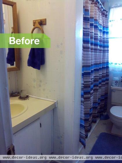
The previous layout made the bathroom look much smaller, and there was no separation between the toilet and the shower.
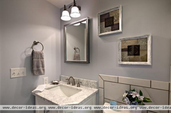
The vanity and the toilet now feel separate from the shower and tub. Seay used the same icy blue hue from the laundry room in the bathroom. Pewter accessories and gray-veined marble help the blue in the walls stand out.
Vanity: Delancy White Single Sink Vanity, allen + roth; faucet: Windemere Brushed Nickel 2-Handle WaterSense Faucet, Delta
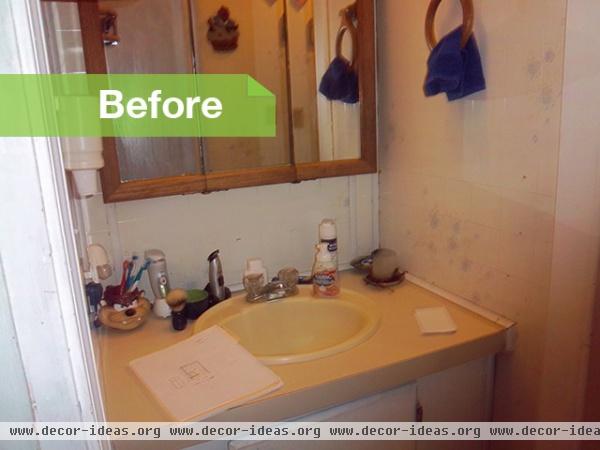
The previous short wall at the end of the shower made the vanity area feel cramped and dark.
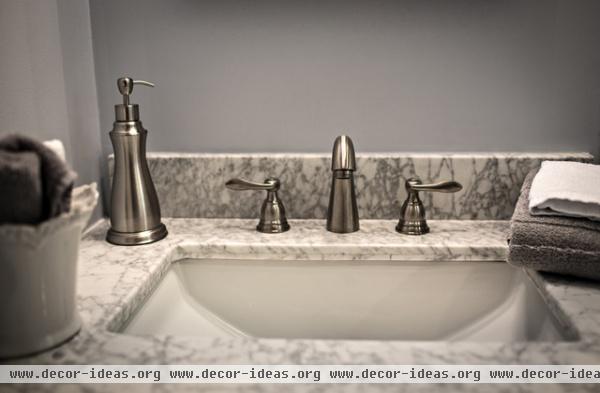
Removing the wall made a more open vanity space. Lighter materials make the space feel bigger, too.
The Ragsdales had never worked with a designer before and approached the process warily at first. "I didn't know Susan, and I didn't know Scott, so I had to take a leap of faith there," says Michael. "But it all turned out all right."
Vanity light: 2-Light Antique Nickel Vanity Light, Portfolio; medicine cabinet: 20-Inch Metal Medicine Cabinet, Kohler; toilet: Cimarron White WaterSense Comfort Height, Kohler
And now there's a new sweepstakes: Enter here


