Bathed in Color: When to Use Pink in the Bath
http://decor-ideas.org 07/21/2013 19:05 Decor Ideas
I may not have been a pink-loving girly girl in my younger years, but lately I've seen some fantastic uses of the color in bathrooms, and they've given me a new appreciation for the striking hue. Pink doesn't need to be limited to little girls' bathrooms, either. A deep raspberry color can look supersophisticated in a master or guest bathroom. If you pair it with crisp whites, strong grays or even jet black, it will have more of an edge to it.
Check out seven stylish bathrooms that are pretty in pink, along with tips on how to work with this bold color choice.
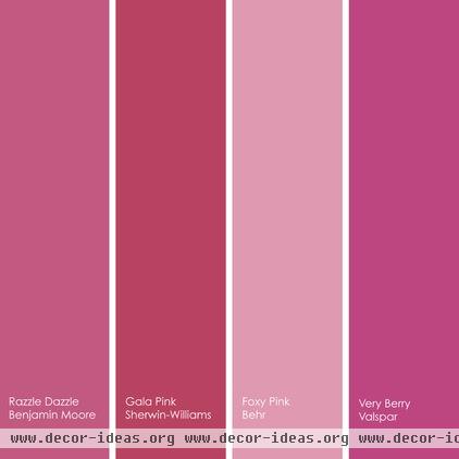
I tend to prefer bolder pinks, but if you do go lighter, find a shade that has some coolness to it — it will look less like cotton candy.
Pink paint picks for bathrooms (from left to right):
1. Razzle Dazzle 1348, Benjamin Moore
2. Gala Pink SW6579, Sherwin-Williams
3. Foxy Pink 110B-4, Behr
4. Very Berry 1002-1A, Valspar
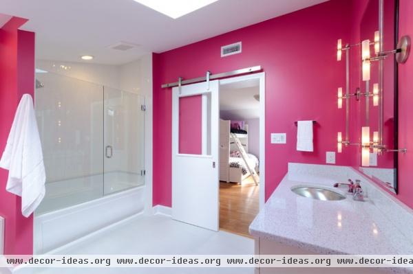
This saturated raspberry hue is all grown up. It's a nice background color for the crisp white finishes in the room. The charming barn door really stands out. Despite the intense hue on the walls, the space feels open and airy.
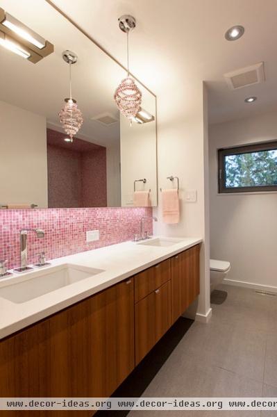
If you prefer a subtler touch of pink, take inspiration from this lovely bathroom with its soft pink mosaic tile backsplash. I think pink looks best paired with white and cool neutrals, but adding wood tones to the palette is a great way to help warm it up.
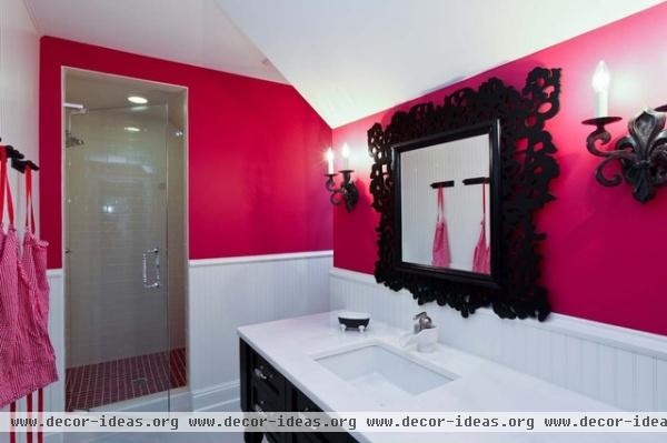
Hot pink and black make for a sexy and dramatic color combination. The bold accent-wall color and the fetching framed mirror are the eye-catching elements in this room. Keeping the ceiling, countertop, floors and lower part of the walls white has made the space feel light and open.
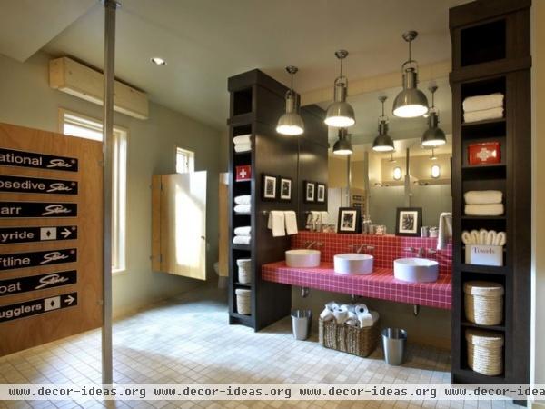
Here's proof that pink doesn't need to look too fussy or girly. This handsome bath gets a nice boost from the berry-pink tiled countertop and backsplash. Tile is typically a more economical choice than stone or quartz for countertops, so why not have a little fun with the color?
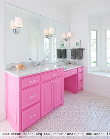
This is a daring color choice for a lavatory cabinet — I love when a homeowner is willing to break with safe neutrals and inject a favorite bold color into a room instead. This would be less successful if there were competing colors or elements in the space. But because the room has an otherwise restrained color palette and it's not overly decorated or cluttered, I think it looks fantastic.
Don't be afraid of using your favorite eye-catching hue. You can make it work if you balance it with the other colors and elements in the space.
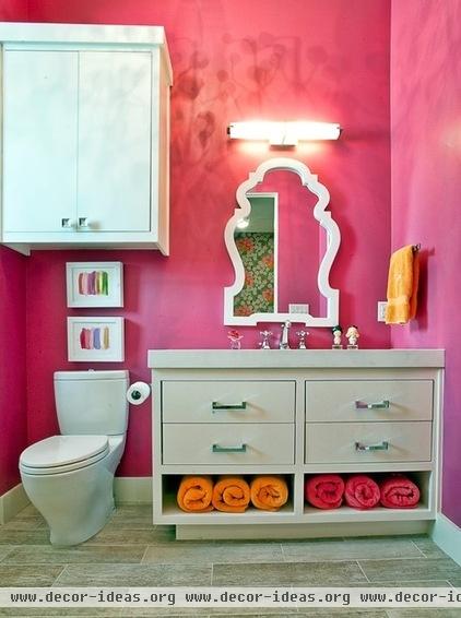
Hot pink and bold orange make for a fun and lively duo. It's a high-energy color combination that is not particularly soothing, but it works well in a space in which you won't be spending a lot of time lounging around, like a powder room or guest bathroom. This would also be a nice palette for a pink-loving teen's bathroom. Since wall paint and towels are easy and affordable items to change out, this bathroom can be effortlessly transformed down the road, should someone outgrow the pink.
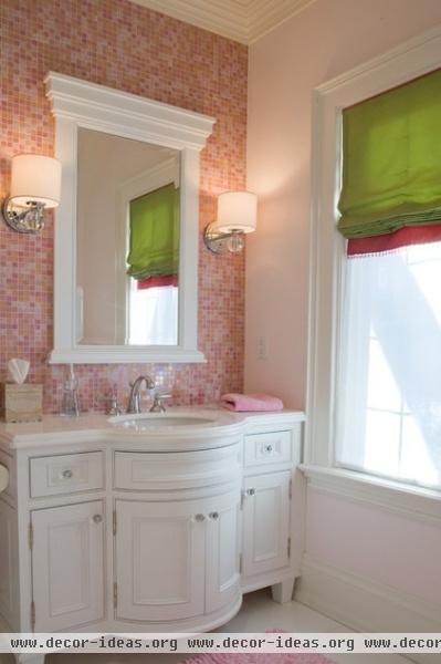
Pink with spring green is another of my favorite color combinations. This soft and pretty bathroom shows how to use pink in a way that doesn't hit you over the head and doesn't feel too sugary sweet. It strikes the right balance of soft, pretty and soothing yet chic.
Tell us: What do you think of pink?
Houzz color guides: More tricks to working with bold colors at home
Related Articles Recommended

