Pick-a-Paint Help: How to Create a Whole-House Color Palette
http://decor-ideas.org 07/21/2013 18:25 Decor Ideas
After looking at ways to work through paint-color procrastination and how to find color inspiration all around you, we are ready to tackle the last, and possibly most challenging, part of our color series: the whole-house paint palette.
If picking one paint color is tricky, how on earth do you find colors for an entire house? How can you know they will go together? Where do you even begin? Join us as we navigate the process of selecting colors for a whole house, and gather inspiration (and maybe a little courage) to tackle your own walls.
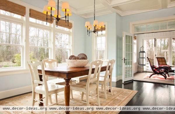
Note which rooms are visible to one another. Walk through your house and note which spaces you can see from each room. Use a floor plan (a rough sketch is fine) to keep track.
Adjoining rooms are part of this, but you may be able to see quite a bit farther — down a hall and into the kitchen, for instance. These notes will form the basis of your whole-house color plan, so keep them close at hand.
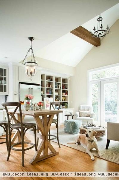
Start by picking a color for the biggest, most centrally located room. This will most likely be your living room or kitchen, and it's a great place to start working on your whole-house palette.
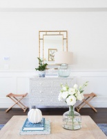
If picking colors has been stressing you out, choosing a soft, neutral hue for the main room will make picking the other colors easier. And you really can't go wrong with white.
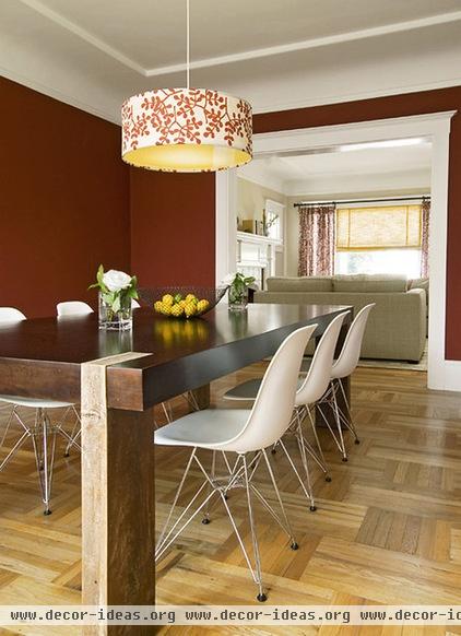
Or start with the room you want to paint the boldest color. If you love color and have a certain hue in mind for a specific room, you can start there instead. Looking out from the bold-hued room, choose a softer, more subdued color for the next rooms. You can, of course, put bold colors next to each other, but that does carry more risk — painter, beware!
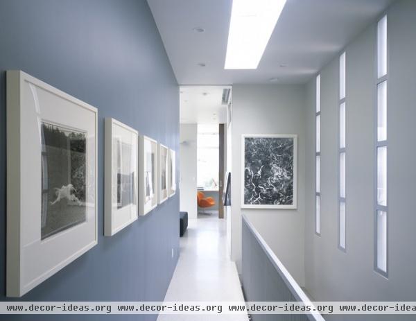
Build your palette with shades of the same hue. Once you have a paint color picked for your first room, one simple way to move on is to choose shades of the same hue for adjacent rooms or walls. You can choose a hue from a nearby paint chip, pick the next color up or down on the same paint chip, or even have the same color mixed at the paint store with white added to make a lighter version.
The beauty of this method is that, while it will give your home interest and depth, you also can rest assured that the colors will go well together.
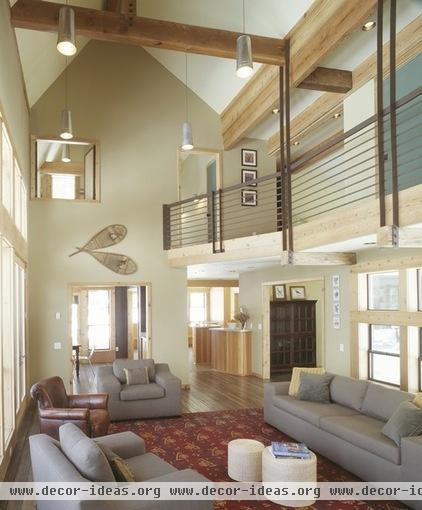
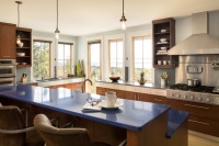
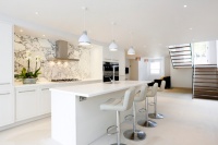
Have a strategy when picking colors for an open space. When much of the house is visible at once, as in the open plan space shown here, picking colors that work together is especially important. Using shades or tints (shades are darker; tints are lighter) of the same hue can work well in this type of space.
Another approach is to use an environment as inspiration for the whole space — we touched on this concept in part two of this series, using the beach as an example. The colors that go well together in nature will also work as paint colors.
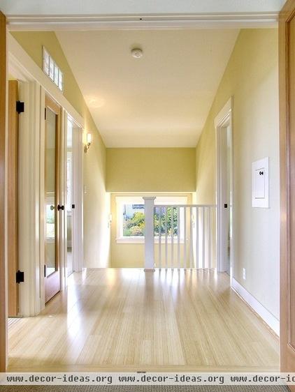
Work on upstairs and downstairs spaces separately. If there is a true separation between floors, you can easily create a different mood in the upstairs versus downstairs, rooted in the colors you choose. Plus, focusing on one floor at a time can help keep the task feeling more manageable.
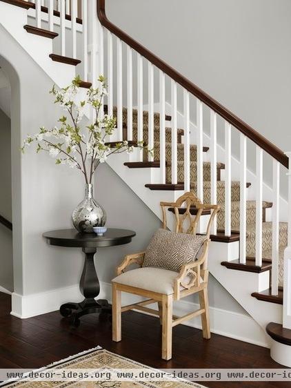
Consider keeping connecting spaces neutral. White, beige, greige and the like are fairly foolproof choices for halls and landings, and they give the eye a place to rest between areas of more saturated color.
On the other hand, if you have decided to stick with white or soft neutrals in your rooms, the halls and landings can be a great place to experiment with a richer hue. It doesn't need to be a big departure from the other colors you are using — just a shade or two darker is enough to make an impact.
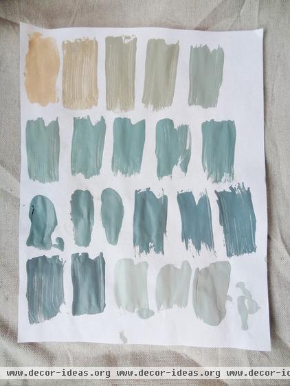
Test your potential palette. As you narrow down your color choices and think you may have some winners, bring home test pots of paint. Sample cards, even the big ones, can be deceptive.
Painting your own swatches will allow you to assess each color in the room it's meant for and check that the colors in visually linked spaces work together.
More:
Look to the lighting for beautiful interior colors
See a model home designed for color flow
Related Articles Recommended

