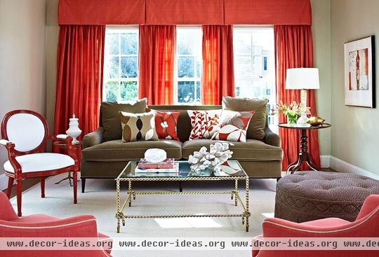
House with Vibrant Color and Light

House with Vibrant Color and Light
Design:
Julie Massucco Kleiner, Massucco Warner Miller Interior Design & Decoration, Los Angeles, 310/570-0084; San Francisco, 415/409-1997; Seattle, 206/455-3078, massuccowarnermiller.com.
Text by Amy Elbert
Photographs by Werner Straube
From their first meeting, interior designer Julie Massucco Kleiner knew that Joe and Kim Boswell loved color--and lots of it. "Joe wears bright green or pink Polo shirts or cable-knit sweaters," the designer relates. "The inspirational photos they shared with me were rooms with purple and lavender and another with oranges and corals." And when Kleiner suggested a hot pink or coral living room, Joe said, "Go for it!"
Both Joe and Kim grew up in sun-drenched Florida, so when they bought their early-1900s house in often foggy San Francisco, light was an issue. While the south-facing living and dining rooms are flooded with light, the kitchen and other back rooms were dark and claustrophobic. "There was a maze of rooms at the back of the house, with a cramped, dark kitchen, a teeny, tiny bathroom, and a closet-like guest room," Kleiner says.
Working with Kleiner and architect Scott McGlashan, the Boswells knocked out walls to open the dining room to the kitchen and to create a sunny breakfast room. "The task was to make the flow of the rooms more comfortable and to make use of small rooms, such as the guest bedroom and guest bath/powder room, converting them to something more stylish, youthful, and bright," Kleiner says.
In Joe's plain speak: "We gutted almost the entire house." New windows and insulation were added throughout to make the place more energy efficient, so "pretty much every room had at least one wall removed," he adds. Demolition was just under way when--surprise!--Kim discovered she was pregnant. Joe and Kim were thrilled, of course, but they were both working full-time, living in the basement with a makeshift kitchen in the garage, and facing daily design decisions.
To ease possible conflicts, the couple agreed that only one of them should oversee the project. "Kim and I both work, and we're both opinionated, so we thought it would be better if one of us took control of the process," Joe says. "Also, Kim is a better saver than I am--she doesn't like writing checks. She knows renovating and decorating requires investment, though, and she trusted me to make those decisions." Daily bouts of morning sickness only confirmed the wisdom of naming Joe the designated design driver. Unable to stomach daily meetings, Kim was more than willing to opt out of the process, and Joe's efforts evolved into a gift to her. "Kim likes surprises, so for her the final design was a surprise," Joe says, "almost like a Christmas gift (which was about the time the job was done)."
As Joe and the designer flipped through fabric swatches and paint chips, the mantra was "grown-up but not grandmotherly." Respect the traditional style of the house, yes, but make it inviting and suited for the rough-and-tumble life of a young family. "I like classic style a lot, but we didn't want a home that felt like a museum," Joe says. "We wanted the house to reflect our generation."
There is nothing grandmotherly about the youthful color palette rich with corals, yellows, and edgy yellow-greens. "The colors are sunny and bright when skies are really blue, and they also lift the mood inside if it's gray outside," Kleiner says. "Joe wanted really saturated and warm colors so the house would be inviting." Walls are painted varying shades of khaki, pale yellow, and other neutrals that allow the bright colors to sing. To unify the house's scheme, Kleiner subtly repeated colors from room to room. The yellow of the dining room shows up in the living room on pale yellow-green lamps and a ribbon trim on the X-base stools. The living room's coral appears on chair seats in the breakfast nook, and the bedroom's blue returns on the nook's banquette.
Lacquered, metallic, glass, and other high-gloss finishes--on tables, lamps, and even a red Louis XIV side chair--reflect artificial and natural light, keeping rooms bright and vibrant night and day.
Tradition steps in with elegant silk draperies that swathe the living and dining rooms with color. Crown moldings and window trims were re-created to match original architectural features. The guest room, with its blue-and-white chinoiserie wall covering, is classic but not stuffy. In the living room, sofa pillows are decorated with crewel-like designs in modern motifs. "The needlework method is traditional, but the patterns are totally modern," Kleiner says.
After nearly seven months, the project was completed, and Joe walked his wife through the rooms. "She had no idea that we were going with a carmine-pink theme in the living room," he says. "When she realized her football-loving, engineer-of-a-husband chose that scheme, she was very surprised and, ultimately, happy."


