Classic House, Major Renovation

Classic House, Major Renovation
Design:
Interior designer: Bob Williams, Mitchell Gold + Bob Williams, mgbwhome.com.
Contractor: Glaze Construction Co., 828/324-9255.
Photographs by Colleen Duffley
Text by Jenny Bradley
Produced by Andrea Caughey
It's your typical home renovation story--besotted homeowners; a charming yet seriously outdated home long admired from afar; the obligatory snowball effect; and a "quick update" that became a three-and-a-half-year overhaul.
While the renovation process was par for the course, the results were anything but predictable. The 1947 Georgian Colonial in Hickory, North Carolina, painstakingly refurbished by Bob Williams and Stephen Heavner, is now a colorful yet calming home abundant with conversation pieces and collections.
"For 20 years, I admired this house sitting up on the hill," says Bob, cofounder of furniture manufacturer Mitchell Gold + Bob Williams. "I was just so impressed by it. We were looking for something more grown-up and sophisticated, and this house had all of that."
Unfortunately, it also had an abundance of wallpaper. "At first we thought we could transform the house by simply painting it," says Bob. "But every room except the den was wallpapered. Little had been done to the interiors since the '70s. So, one thing led to another, and we figured if you're in for a dime, you're in for a dollar. Once we started thinking about all the possibilities, we just went for the total change."
Soft taupes and shades of blue now prevail, replacing a profusion of jewel tones and floral wallpaper. Navy, robin's-egg, and teal--harmonious but never repetitive--lend their calming air to almost every room.
In the living room, ice-blue walls act as a counterpoint to the warm wood of case goods and original parquet floors. Dark taupe-and-white Chinese toile curtains lend a traditional spin to a not-so-traditional mix of furnishings. New pieces from Mitchell Gold + Bob Williams mingle with treasured vintage finds--a Lucite chair, an Eames-style white leather armchair, and a Frank Gehry cardboard chair. Splashes of orange offer a warm contrast to the cool blue walls.
"It's all about the mix, isn't it?" says Bob. "It's like wearing a pair of jeans with a sport coat or a great pair of designer shoes with jeans and a black T-shirt. It's really about mixing textures and colors and then adding something that gives a bit of an accent to set it off."
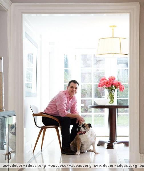
Nowhere is that mix more evident than in the den--reminiscent of a moody gentleman's club for the cool crowd. It's the perfect spot to ease into an oversized leather club chair with Sunday paper in hand and a friendly 72-pound English bulldog named Stella-Lou-Bella curled up at your feet.
Teal blue walls, inspired by the home's original blue/green scheme but darkened a shade or two for a more intimate feel, act as a foil for an inviting, loungey mix of furnishings with a definitive masculine edge. It's here that Bob's passion for collecting becomes apparent. This passion ripples throughout the house, manifested in an assortment of groupings: midcentury modern chairs, antique lighters gathered on an orange lacquered tray, black-and-white photographs, bulldog figurines, miniatures of the Eiffel Tower and Statue of Liberty, McCoy pottery. The assemblage is varied and prodigious.
In the less colorful yet equally chic dining room, blue becomes the wingman for once--lending its cool encouragement to the taupe-gray walls. "We painted the dining room a darker color to make it more intimate," says Bob. "Then we added the upholstered bench to break up the monotony of a matching suite of chairs."
While updates were made throughout the first floor--from additional doorways and recessed lighting to a summer's worth of wallpaper removal--most structural changes were saved for the kitchen.
"The original kitchen was a true cook's kitchen--very narrow and really built just for cooking," says Bob. "Now it's where it all happens. It's a bright and happy room, and we just love being in there. It's by far the most used room in the house."
A medley of materials works together to create a modern kitchen with a distinctly traditional feel--a little bit Ozzie and Harriet, a little bit Top Chef. A mix of countertops, from Carrara marble to butcher block, adds élan. The backsplash's oversized subway tiles temper the diminutive octagonal Carrara marble floor tile. Vintage touches (and the obligatory collections) add individuality. A walk-in Butcher Boy cooler was converted to a dry pantry, the original door refinished in mahogany, and the original hardware rechromed. A restored 1936 Magic Chef range with eight burners and four ovens makes cooking for a crowd a snap. An antique Toast-O-Lator toaster, vintage canisters, and McCoy pottery congregate on counters.
"We tried to keep the interior somewhat reflective of the period of the house," notes Bob, "keeping to its traditional roots while making it fresh and modern."
Upstairs, renovations revolved around creating that more grown-up, sophisticated house long dreamed of. "Our previous house was a bungalow without a proper master bath or closet," says Bob. "Having a spacious master bath with storage and a great big bathtub was more important than having a big bedroom, so we turned the old master bedroom into the bath."
The result is a clean-lined closet and blissful bath that are equal parts practicality and luxury. A washer and dryer were added to the closet because, well, "it just makes good, practical sense," says Bob. Floor-to-ceiling cabinets with glass panels lined in shirred linen offer a plenitude of storage in the bath. A jaw-dropping, supersized tub enveloped in marble enigmatically "floats" atop the matching marble floor--the pièce de résistance in a singular space that somehow fits this cool blue house perfectly.


