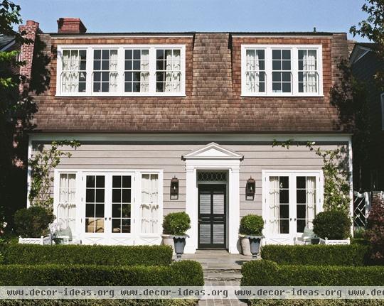
House with Comfort and Elegance

House with Comfort and Elegance
Design:
Architectural designer; landscape designer: Virgil W. McDowell, Virgil W. McDowell Inc., 15304 Sunset Blvd., Suite 202, Pacific Palisades, CA 90272; 310/459-8838, virgilmcdowell.com. Contractor: Lars-Erik Ljungh Builder, 332 Monte Vista, Costa Mesa, CA 92627; 949/375-4900 and 949/650-5333.
Photographs by Joe Schmelzer
Text by Candace Ord Manroe
Produced by Andrea Caughey
Rare is the occasion when a vintage house like the 1950s Dutch Colonial in California's Newport Beach presents its buyers with a blank slate inside. Scrubbed clean of earlier mistakes, dated trends, and anyone else's taste--all of which have a way of lingering like stale odors--the interior offered a blissfully fresh start. The 60-year-old exterior, meanwhile, imparted inimitable character and grace, hard-won with age. For the new owner--art teacher and painter Ellen Small--how to complete the house was obvious: Take cues from the original exterior to imbue the unfinished interior with charm. Ellen's husband, Cody, and their teenage daughter, Natalie, were confident her vision was spot-on.
"A designer had bought the home, gutted it, and then changed her mind about completing the remodeling," Ellen explains. "I knew I wanted to improve the exterior's traditional Dutch Colonial style and then continue it on the inside, staying true to the architecture." In addition, she wanted to make the home feel airy and open and to bring the outdoors in to fully enjoy the California lifestyle.
To implement her vision, Ellen turned to Los Angeles architectural designer Virgil W. McDowell. He is known for his residential work in the classical tradition, with a special emphasis on details and a deep respect for historical precedents.
"Virgil is responsible for the design and space planning, including all the beautiful custom moldings that give the house its special character," says Ellen. "He also determined the palette and decided details like the hardware." The only exceptions are the fabrics on some furnishings moved from the Smalls' previous home. "The living room sofa and toile chairs in front of the fireplace were pieces we already had," says Ellen. "Their fabrics were chosen by designer Hanna Skjonsby, who's my golf buddy."
"I push the architecture--I'm not a decorator," McDowell insists, "but when clients ask for a turnkey job, I always say yes." So while he sketched designs for the custom yellow-upholstered club chairs in the living room, he never lost focus on the bigger picture. One of his first tasks was to transform the facade into a truer representation of Dutch Colonial design.
"It was the worst house in the neighborhood," the designer recalls. "The roofline was all wrong. The eaves were maybe 6 feet higher than they are now. I corrected the proportions, and then feathered in the shingles to make it more authentic, like a home you would find in South Africa." He also added the front portico and designed the landscaping.
Indoors, he used wood for many surfaces, injecting other materials sparingly for impact. He replaced the all-brick fireplace wall with a simple wood mantel and frame for the brick firebox; he was careful not to overuse marble in the bathroom, confining it to accents. "Aside from the distinctive roofline, the most important trait of Dutch Colonial design is modesty and restraint," McDowell says. "These homes were usually built by the homeowners. They utilized natural, local materials because it was a vernacular architecture. That's the same philosophy we brought to this house."
That philosophy resonated deeply with Ellen. "The last thing we wanted to do was come into this neighborhood and create a McMansion," she says. "Simplicity was our goal." They kept the house's square footage to 3,000 feet, but enhanced its sense of privacy. "Even though the houses are very close together, there's no sense of being crowded," notes Ellen.
One reason is McDowell's decision to elevate the second story to take advantage of bay views. "Raising the ceilings wouldn't have accomplished anything," he explains. "We had to come in and raise the second-story floors, creating a crawl space between the downstairs ceiling and the upstairs floors." The result is Ellen's favorite feature of the home: "The treetops seem to be a part of our bedroom now," she says. "All of the windows and doors allow the ocean breezes to blow through. I love the fact that we can see the bay from our bedroom."
The breezy island feel is conveyed by materials such as the plank floors, sisal rugs, beadboard walls, and strié paint treatments. The living room's coffered wood-plank ceiling--a trait of Dutch Colonial design and the house's only extant feature from the 1950s--was painted a glossy white to bounce sunlight.The unusual selection of a mirror for the kitchen serves the same end: "It reflects the garden," explains McDowell. When he first suggested it, Ellen was unconvinced.
"I thought, 'Virgil--a mirror in the kitchen?' But I absolutely love it. It's one more way of bringing the outdoors in, which is what this house is about."
Sources:
Siding: color achieved through natural aging.
Trim paint: custom.
Door paint ("Black Blue" #95): Farrow & Ball, 888/511-1121, farrow-ball.com.
Lighting: Charles Edwards, charlesedwards.com.
Topiaries: Roger's Gardens, 800/647-2356, rogersgardens.com.


