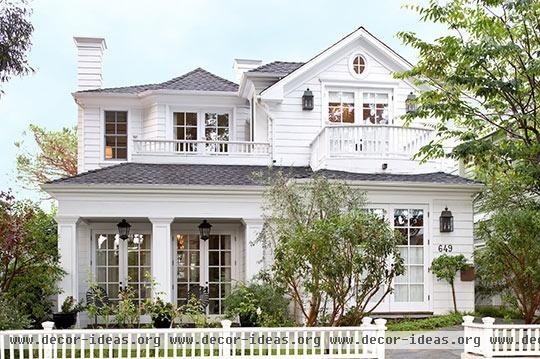
Comfortable and Light-Filled in California

Comfortable and Light-Filled in California
Design:
Architect: Douglas Leach, Douglas J. Leach Architects Inc.,119 W. Torrance Blvd., Suite 24, Redondo Beach, CA 90277; 310/372-5580.
Interior designer: Mark Williams, Mark J. Williams Interior Design, 212 N. Plymouth Blvd., Los Angeles, CA 90004; 323/856-9089, markjwilliamsdesign.com.
Builder: Matt Morris Development, 3508 Highland Ave., Manhattan Beach, CA 90266; 310/546-4300, mattmorrisdevelopment.com.
Photographs by Michael Garland
Text by Jenny Bradley
Dorothy said it best: There’s no place like home. Although, in John and Jill Kohler’s case, that familiar phrase refers not to their beloved home state of Kansas but to their adopted state of California. After years on the road--including stints in New York City, the Hamptons, London, and, yes, Kansas--the couple felt it was time to put down roots. Not in their native Midwest but in Manhattan Beach.
And who can blame them? With the beach just blocks away, a quiet tree-lined street that feels far removed from the hustle and bustle of nearby Los Angeles, and an idyllic clapboard home (complete with a white “picket” fence), it’s the perfect spot to settle in and raise their two children--Lily, 9, and Charlie, 7.
“Manhattan Beach is a lovely community,” says Jill. “L.A. is so close, yet so far away. It’s nice to know that it’s out there, but honestly, I rarely leave Manhattan Beach. It has a very small, familiar feel. We walk to town, walk to the beach. That is unheard of in L.A., and it’s a big draw for us, having lived in big cities before.”
After many nomadic years shuttling from one city to the next, John and Jill knew exactly what they were looking for in a home. And what they weren’t.
“Our first home was Craftsman style. I wanted this to be the antithesis of that,” says Jill. “I’ve always wanted a home that was white and light. Having moved here from London, I wanted the house to feel classic, but I also wanted the furnishings to feel less formal. More like a Hamptons-style beach house. Classic and sophisticated.”
After finding a lot on a street coveted for its towering eucalyptus trees, John and Jill enlisted architect Douglas Leach, builder Matt Morris, and interior designer Mark Williams to create their London-meets-Hamptons-meets-Southern California dream home. The couple’s design direction for the interiors was simple yet stringent: Less is more.
“I asked Mark for a very muted palette--sand and sea--but minus the predictable beachy elements,” recalls Jill. “No seashells, no cabana stripes, no nautical knickknacks. Just clean lines, relaxing and serene, comfortable yet striking.”
On the main level, white woodwork and a muted palette prevail, creating a combination of traditional and contemporary. Midwestern no-nonsense meets California chic. Rooms spill into one another--each opening onto the next through expansive doorways. Layer upon layer of sun-drenched spaces flow effortlessly, aided by the continuity of wide-plank hickory/pecan floors, hints of subtle sea-glass blue, and crisp linen upholstery.
The palette is straightforward and then some. Williams swathed every room on the first floor in the same creamy shade of white--allowing the architecture and artwork to find their voice without competing with bold color. Patterns and upholstery are kept subtle, with the only hints of beach-inspired hues introduced through the turquoise accessories and gray-blue rugs and textiles. Mantels and shelves are left uncluttered so that beloved items from the family’s travels get the attention they deserve. The furniture is architectural--and mostly custom-designed by Williams. A quiet elegance prevails.
“I tried to design furniture with clean lines and warm, traditional woods,” says Williams. “Each piece had to be simple in design, yet have a point of view. With such great architectural details throughout the house, when it came to the furniture, we stuck with the ‘less is more’ attitude.”
No space heralds this attitude more strongly than the living room, with its sparse furnishings and restrained palette. There’s one cozy seating area--a tailored sofa and a pair of linen-clad chairs--plus two elegant sculptural tables and a smattering of accessories.
Through the dining room, with access to the backyard and kitchen, is the fuss-free family room, the living room’s slightly less formal fraternal twin--and the most lived-in room in the house.
Anchoring the monochromatic space is a custom-designed mahogany coffee table, its intricate angles rebelling against the family room’s simplicity. Sandy tones prevail, keeping the room in harmony with the rest of the house, especially the adjoining kitchen. “We live in the kitchen and family room,” Jill notes. “I love that I can stand at my kitchen counter and be a part of the action.”
Both Williams and Jill agree that the roomy upholstered benches at the kitchen island are favorite elements. Ample enough for two and covered in a charming fabric that plays off the island’s cool blue, they’re the best seats in the house.
“They’re unpredictable,” Jill explains, “and totally practical. They are easy to keep straight and always look nice and neat rather than cluttered, like bar stools.”
Upstairs, in the master suite, the sand-and-sea-inspired color scheme balances the starched London formality with a bit of Bridgehampton beach nonchalance. A turned-wood four-poster and English painted camphorwood chest seem restrained under the lofty beadboard ceiling, offset by the room’s soft palette.
The Kohlers’ take on the final result? They may not be in Kansas anymore, but they couldn’t feel more at home. They have the light-filled, welcoming house that they’ve always dreamed of. A little bit classic, a little bit rolling stone.
URL: Comfortable and Light-Filled in California http://decor-ideas.org/cases-view-id-1293.html


