SUNNY SOPHISTICATE(2)

SUNNY SOPHISTICATE
"I've never lived in a house with 11-foot ceilings before," says Virginia. "It takes a special eye to find pieces of furniture that will work on this scale." Two such pieces of furniture are the mirrors above the living room fireplace and above the chest in the upstairs landing. "I'd been looking at this great 18th-century carved English mirror for about three years," says Carithers of the landing's mirror. "I was waiting to find a space with enough scale for it to work." The antique living room mirror required some convincing by Carithers to win over his clients. "They said, 'But, Dan. It's falling apart!'" recalls Carithers. But he insisted the 18th-century Italian piece exhibited "what I call 'good crud.' It adds a wonderful patina."
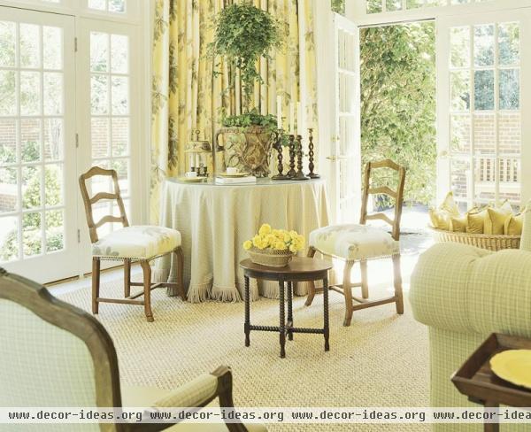
In addition to juxtaposing the humble with the fine, another tool Carithers employs to ease the starch in a roomful of 18th- century objects is color. Sunshine yellow saturates the home, creating an upbeat first impression in the entry. "Yellow is soft, and it looks good anywhere, anytime, and in any climate," insists Carithers. Yellow also makes a beautiful backdrop for the blue-and-white porcelains Carithers loves to collect for his clients. "I've always liked blue and white," notes Virginia, "but I had never lived with it. Now I love it combined with the yellow."
Downstairs, yellow is the dominant color, with blue and white as accents. But in the master bedroom, blue and white take the lead. "I used a lot of blue-and-white toile, then brought in some relief with the bed curtain's woven embroidery lining," Carithers observes. He detailed the bed and window valances with scallops, then repeated the scalloped shape to trim out a fauteuil. He also painted the Ellises' mahogany Chippendale-style sofa and Martha Washington chairs white. "I can't stand a room full of brown furniture," Carithers says, crediting this as perhaps one more reason his period-rich rooms feel fresh.
Other strategies are not so easily pegged. How did he know, for instance, that covering the dining room's Chippendale chairs in a velvet-and-woven check would lighten up their weighty stature? Or that using small drinking goblets for bouquets would be more effective than a massive centerpiece that competed with the scale of the fine English silver candelabras? "A lot of it is just tried and true," Carithers says dismissively of his intuitive touch. Displaying 18th-century delft on brackets above a period bull's-eye mirror in the dining room, he illustrates, is simply more interesting than "lining it all up along the sideboard."
"I don't know how he does it," says Virginia. "The checked fabric on the dining room chairs certainly isn't the most formal choice or the one most people would think of, given this architecture and furniture, but it makes the room feel younger. And that's what we wanted." Sparkly beaded fringe on a pair of chairs in the sunroom also adds more zing.
"We are a young family," says Virginia. "We wanted a formal home, but we wanted it to feel youthful. That's what we got."
URL: SUNNY SOPHISTICATE(2) http://decor-ideas.org/cases-view-id-1227_2.html


